The Manual and Its Argument
In 1970 the New York City Transit Authority published a standards manual for the subway's entire sign system, the product of work by Unimark International — the Chicago-based firm co-founded by Massimo Vignelli and Bob Noorda, among others. The document specified Helvetica as the sole typeface, set column grids to govern the placement of every word and symbol, and assigned colours to each line to make navigation legible without requiring a rider to read. The thinking was Swiss in origin: the International Style conviction that objective information, neutrally presented, was both more honest and more functional than the typographic noise that had accumulated across the system over decades.
The manual's logic was precise. Helvetica — then still a relatively recent face, released by the Haas Type Foundry in 1957 — was chosen because its even stroke weight and open apertures read well at speed. Letter spacing, type size, and colour contrast were all specified against the conditions of a moving platform and a glancing eye. Noorda in particular had experience designing for rapid transit: his earlier work on the Milan Metro, completed in the mid-1960s, had already tested many of the same principles under live operating conditions.

Beck drew the first diagram in his own time and on his own initiative, as a temporary draughtsman in the signals office.
Photo: Harry Beck 1902 -1974 designer of the London Underground map was born here · Wikimedia Commons
What the Stations Actually Got
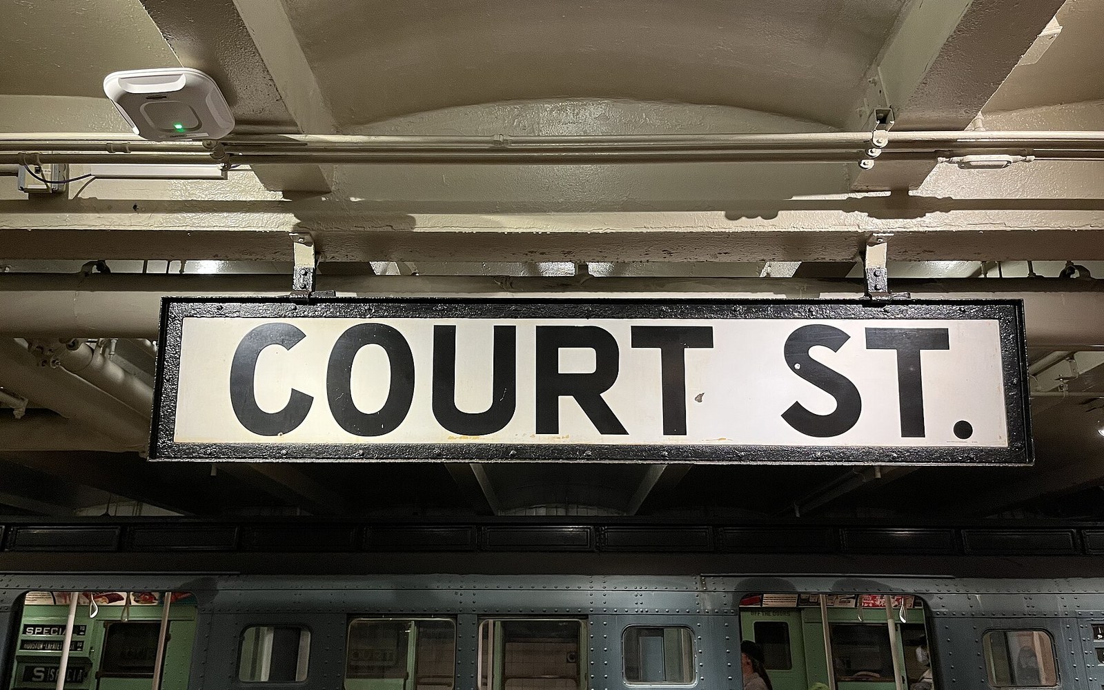
The 1970 manual was a document of intentions. The Transit Authority's stations were old, structurally varied, and maintained by separate crews who often substituted materials or ignored specifications when the correct components were unavailable. White on black, black on white, and coloured-band identifiers all appeared in inconsistent sizes and positions across the network. Some stations received the full system; others were patched with legacy signage that stayed in place for years. The result was a wayfinding environment that acknowledged the manual's logic in places and contradicted it in others — a lesson in the distance between a standards document and its real-world implementation.
The 2012 facsimile reissue of the manual by designers Jesse Reed and Hamish Smyth brought the document wide attention, confirming its status as a landmark of systematic design thinking even as historians noted how rarely the system matched the specification on the ground.