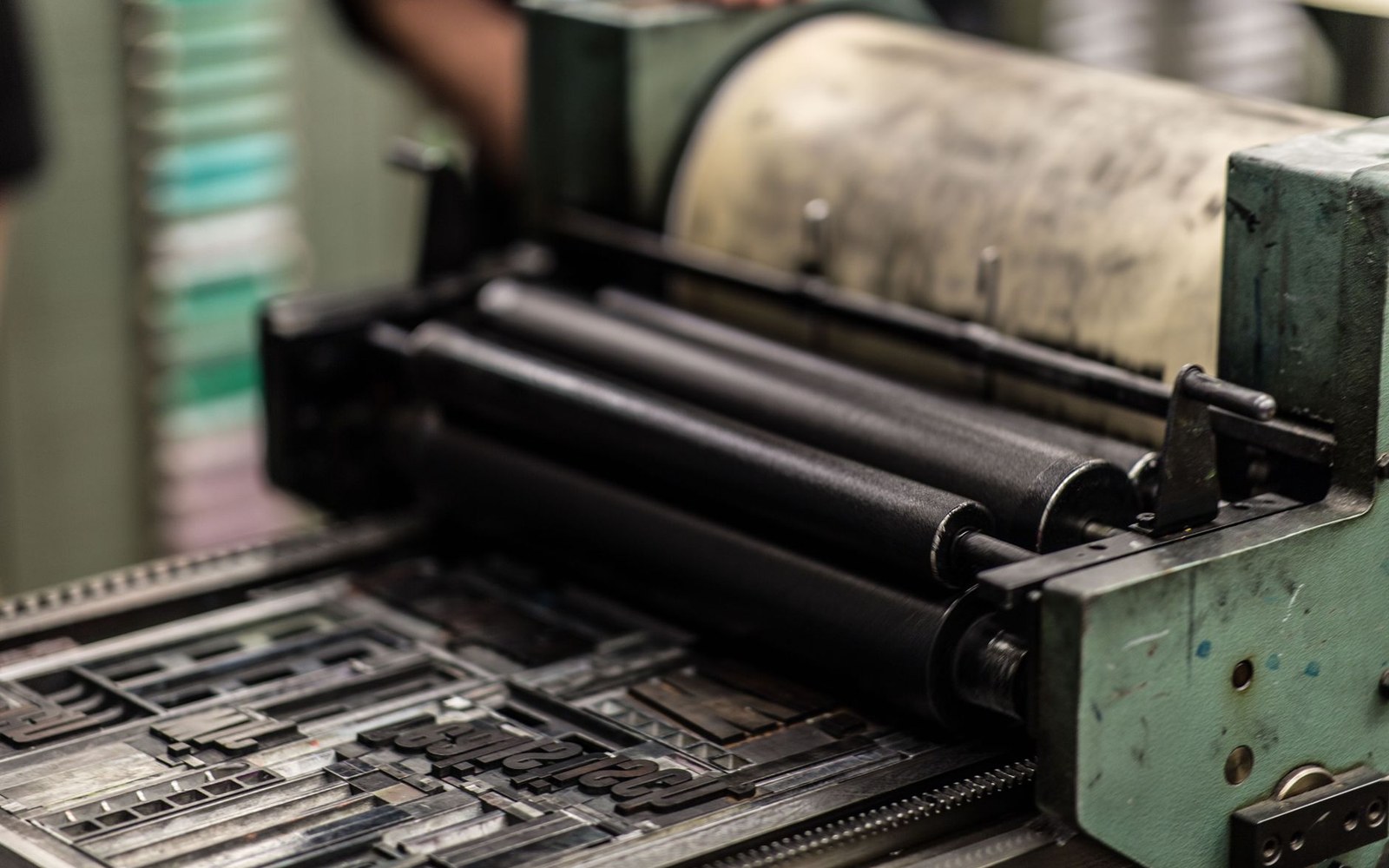
From Job Type to International Style
The Berthold foundry released Akzidenz-Grotesk in Berlin in 1896, marketing it as workaday commercial type — Akzidenz meaning jobbing or incidental print rather than fine book work. Its letterforms were drawn from the nineteenth-century grotesque tradition: consistent stroke weight, no serifs, closed apertures, and a large x-height that held up well in small sizes. Berthold expanded the family through the early twentieth century, adding weights and widths until it covered most practical demands.
The face's transformation from utilitarian staple to design ideology happened in Switzerland in the 1950s. Josef Müller-Brockmann and Armin Hofmann, working separately in Zurich and Basel, adopted Akzidenz-Grotesk as the natural partner to the grid system: its neutrality served the International Style's demand that type transmit information without historical or emotional interference. Their published work, exhibition posters, and teaching embedded the typeface in a generation of designers.
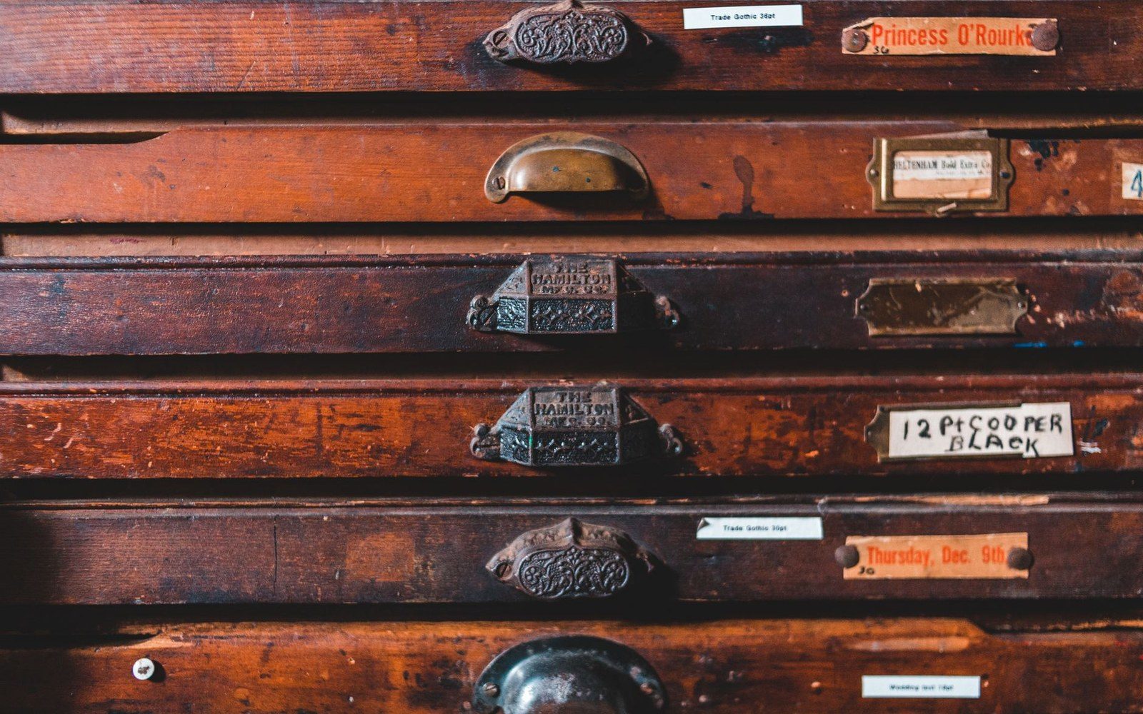
Wood type was cut for sizes too large to cast in metal, and sorted by face and size rather than by alphabet.
Photo: Erik Mclean / Pexels
It was precisely this dominance that prompted Eduard Hoffmann at the Haas Type Foundry in Münchenstein to commission Max Miedinger to draw a competitor in 1956. Helvetica, released 1957, answered Akzidenz-Grotesk on nearly every measurement: both share a similarly closed lowercase e, comparable cap height, and a neutral roman structure. The differences are deliberate refinements — Helvetica's terminals are cut horizontally rather than at an angle, its spacing is tighter, and its overall geometry is more regularised. At display sizes, the two faces are readily distinguishable; at nine-point text, the distinction collapses for most readers.
Akzidenz-Grotesk remained in continuous production. Berthold revised and digitised it, and the family as available today retains its pre-Helvetica character — slightly less polished, slightly more varied in its stroke relationships — which is exactly what designers reach for when they want the Swiss moment without the corporate smoothness Helvetica subsequently acquired.