
Mathematics as Argument
When Josef Müller-Brockmann began designing posters for the Zurich Tonhalle's Musica Viva concert series in 1951, he was not solving a layout problem. He was making a claim — that mathematical order was not merely useful but morally superior to the subjective choices of the individual designer. The grid system he deployed across those posters was, in his own framing, a way of removing the self from the work: an act of discipline as much as composition.
The Musica Viva series ran across the 1950s and into the 1960s, and the posters produced for it — spare, geometrically structured, set in Akzidenz-Grotesk and later Helvetica — became the most visible demonstration of what the International Style looked like in practice. Typography aligned to a strict grid. No illustration, no ornament. Form reduced to type, ruled geometry, and unprinted space deployed with the precision of a musical score.
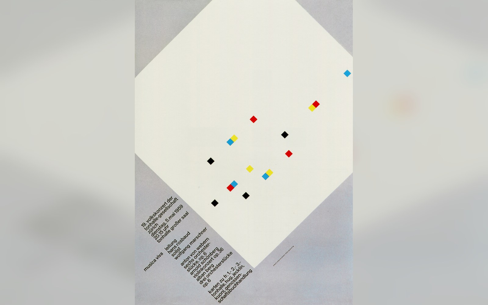
The Zurich concert posters were printed to one format and pasted in runs, so the grid had to hold at a glance.
Photo: Musica Viva. Müller-Brockmann · Wikimedia Commons
The Published Stance
What distinguished Müller-Brockmann from other practitioners of Swiss typography was his willingness to argue the position in print. His 1961 book Gestaltungsprobleme des Grafikers — translated into English as The Graphic Artist and His Design Problems — and, more definitively, his 1981 Grid Systems in Graphic Design treated the grid not as a professional convenience but as an epistemological commitment. The designer who submitted to the grid accepted that objective structure could produce better communication than personal expression. The designer who refused it was, implicitly, indulging the ego.
This was a polemical move, and it was recognised as one. Müller-Brockmann was working in the same Basel–Zurich orbit as Armin Hofmann, whose teaching at the Basel School of Design similarly insisted on formal rigour, and alongside colleagues shaped by the same postwar conviction that design's task was clarity, not personality. The International Style's ethics were Cold War ethics: a neutral visual language, stripped of rhetoric, for a damaged world.
The grid system received perhaps its most sustained real-world argument not in Zurich but in New York, where Massimo Vignelli would later apply comparable logic to the subway. But Müller-Brockmann's posters predate that project by two decades and remain the purest statements of the principle — partly because a concert poster, unlike a wayfinding system, has no pragmatic alibi. There was no functional reason the Musica Viva posters had to be so austere. The austerity was the argument.
What the Grid Actually Said
Each Musica Viva poster performs the same logic: the compositional field is divided into a rational module, type is set on that module without exception, and the spatial relationships between elements follow mathematical rather than intuitive ratios. Josef Müller-Brockmann documented this process in detailed working sketches, treating the grid's coordinates as a compositional notation equivalent to the musical notation the posters advertised.
The ethical claim compressed into this method runs roughly as follows: if a composition can be generated from shared, explicable principles rather than from the designer's private sensibility, it is communicable to a wider public without condescension and free from the manipulation that rhetoric — typographic or otherwise — permits. Design, on this account, is a form of honesty.
Critics pointed out — accurately — that choosing a particular grid module was itself a subjective act, and that the apparent neutrality of the Swiss grid carried its own cultural and political freight. The clean sans-serif page was not ideology-free; it was the ideology of a particular moment in European modernism. That objection did not shake the grid's influence, but it complicated the moral claim considerably.
What endured was the discipline. Müller-Brockmann's Musica Viva posters remain among the most studied objects in postwar graphic design precisely because they refuse to separate method from meaning. The grid was not where the thinking stopped. It was where the thinking was.

The next plate in Posters: Mexico 1968: When the Olympic Identity Became a System.
Photo: YL Lew / Pexels