
The Commission and Its Sources
In 1966, the Mexican government held an international design competition for the visual identity of the 1968 Summer Olympics. Lance Wyman, a young American designer working in New York, entered with a partner and won. The brief was straightforward in name and extraordinary in scope: a mark that could be legible across a city, readable on a medal and on the side of a building, and unmistakably tied to Mexico rather than to the generic internationalism of earlier Games.
Wyman's solution began with the five Olympic rings and the numerals "68," but the formal logic underneath them came from two sources he studied after arriving in Mexico City: pre-Columbian geometric pattern-making — specifically the optical, concentric-line motifs visible in Huichol yarn paintings and in the carved stone decorations of sites like Teotihuacán — and the Op Art movement then at its international peak. Bridget Riley's work had been shown at the 1965 MoMA exhibition The Responsive Eye, and the visual vocabulary of radiating parallel lines was in active circulation. Wyman pulled those two traditions together: the logotype's letterforms expand outward in concentric rings, so that "MEXICO68" reads simultaneously as text and as a field of optical vibration. The mark was not decorative applied to type; the type was the decoration.
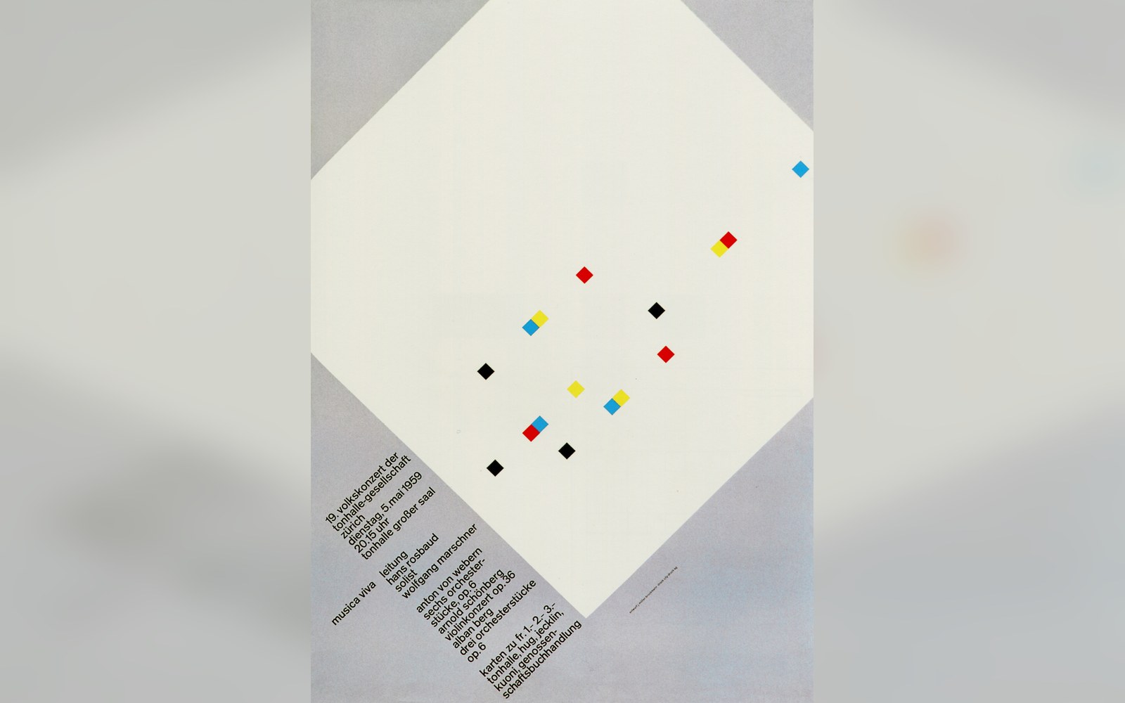
The Zurich concert posters were printed to one format and pasted in runs, so the grid had to hold at a glance.
Photo: Musica Viva. Müller-Brockmann · Wikimedia Commons
A Colour System and a Typeface
What elevated Mexico 68 from a strong logotype to a genuine design system was the decision to extend its formal grammar into every ancillary element. Wyman and his collaborators — the Mexican graphic designer Eduardo Terrazas took a central role — developed a colour palette of intense, high-contrast hues: magenta, orange, pink, green, turquoise, black. These were not arbitrary. They referenced the saturated colours found in Mexican folk craft and Huichol textile traditions, and they were applied consistently across all printed matter, environmental graphics, and merchandise.
Alongside the palette, Wyman drew a dedicated display typeface for the Games. Its letterforms echoed the concentric-line logic of the logotype — characters built from parallel curves that give the alphabet the same optical energy as the mark itself. The typeface appeared on wayfinding, ticketing, posters, and publications throughout the Games, ensuring that even a directional sign shared visual DNA with the official emblem. This kind of typographic consistency had no real precedent in Olympic history: previous Games had used existing typefaces or ad hoc lettering without coordinating them into a single voice.
Pictograms and the Total Environment
The Mexico identity also introduced a pictogram system for the sports — simplified, high-contrast silhouettes drawn on a consistent grid — that owed something to the Otl Aicher-led programme being developed simultaneously for Munich 1972, though the Mexico set appeared first. Where Aicher's Munich pictograms would become the canonical template for all subsequent Games, Wyman's Mexico set carried that principle forward: a unified iconographic family, drawn to a single rule, covering every sport on the programme.
The environmental application of the system was equally total. Stadium interiors, buses, vehicles, and athlete uniforms all carried the concentric-line pattern or the palette in some form. Wyman produced what amounted to a branded urban environment — a concept that design practice now calls a total identity, but which had rarely been executed at city scale before 1968.
Why It Held
The Mexico 68 identity has proved unusually durable. Its legibility at small scale and its spectacle at large scale are products of the same formal decision: letterforms defined by line weight and rhythm rather than by outline alone. That decision also made the system reproducible without loss across wildly different surfaces and reproduction methods, from silk-screen to monumental painting. It was, in retrospect, a systems-thinking solution arrived at through formal and cultural research rather than through any explicit methodology — which is perhaps why it still reads as designed rather than engineered.