Section 01 · 5 plates
Somebody cut every letter you have ever read, and most of them signed the work
The designers behind the typefaces — from Garamond's punches to Miedinger's drawings for Haas.
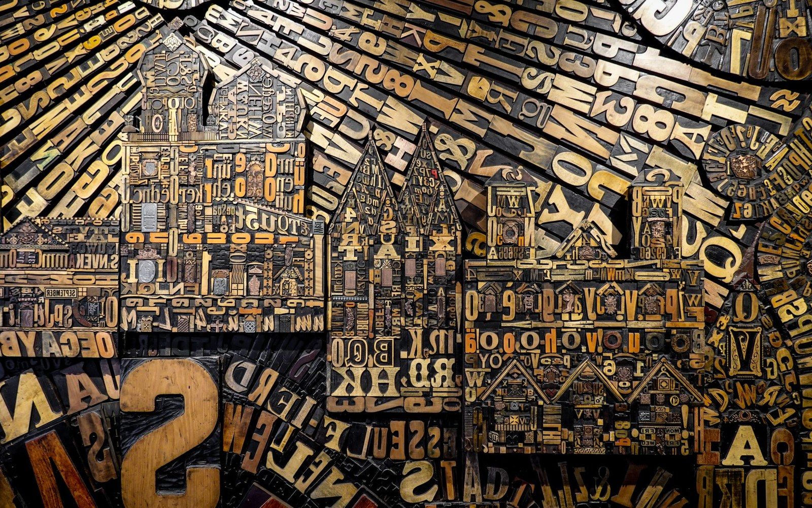
Metal and wood type were sorted, stored and locked up by face and size — the composing room was a filing system before it was a press.
Photo: Magda Ehlers / Pexels
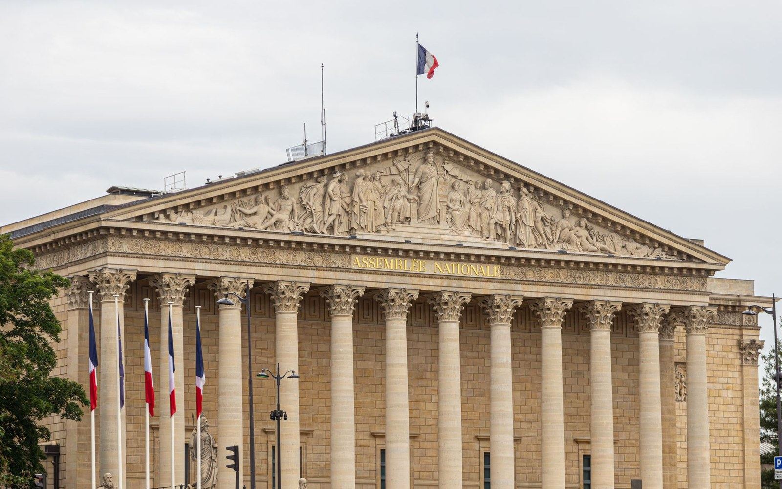
Plate 01 · leads the section
What Garamond Cut and What Came After
Traces Claude Garamond's sixteenth-century punches through the Imprimerie Royale matrices and into the twentieth-century revival by the Stempel foundry. Argues that nearly every 'Garamond' in circulation is a revival of a revival, and identifies which specimen sheet each version actually derives from.
Read the piece-
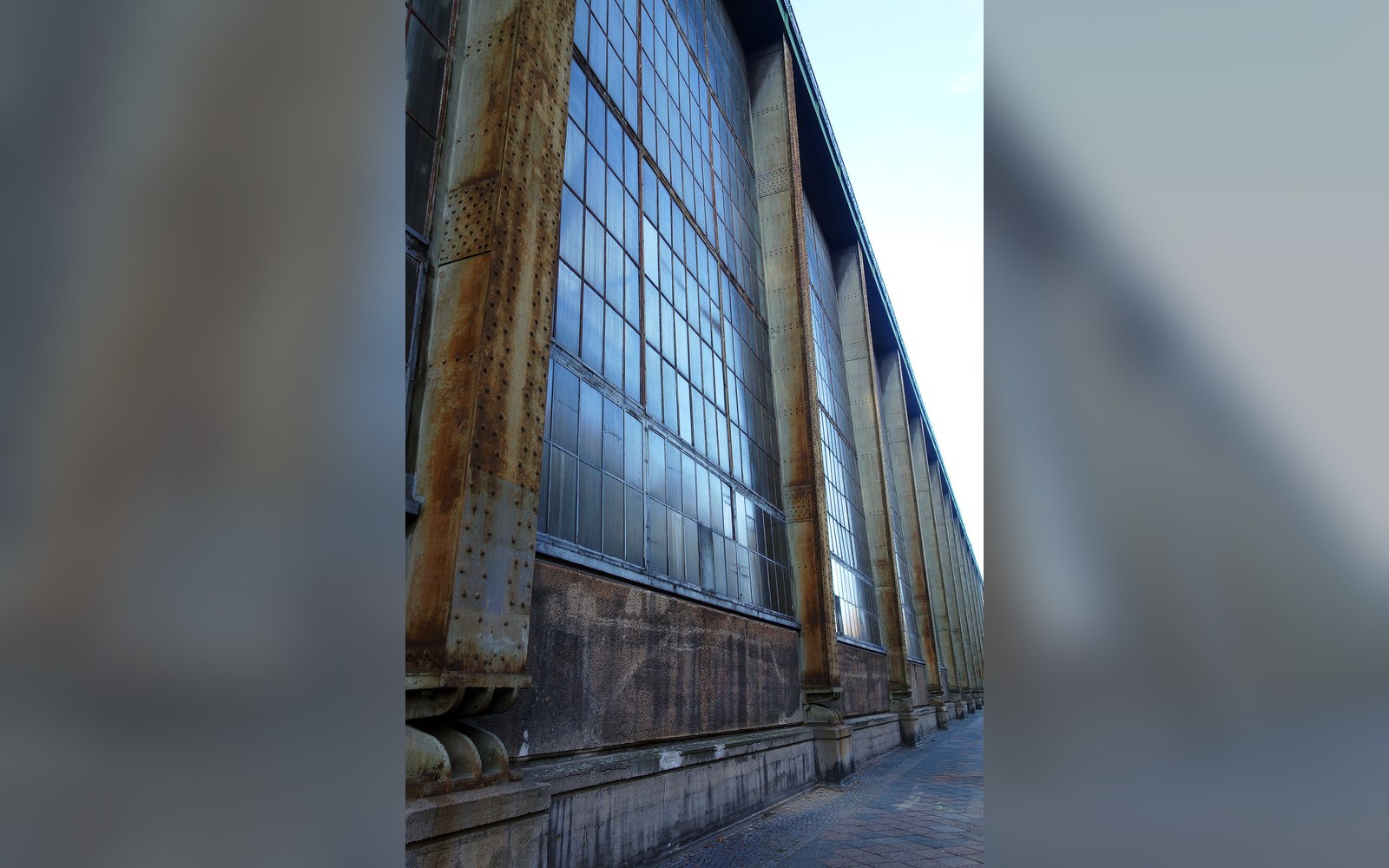
Peter Behrens at AEG, 1907
Describes how Behrens — appointed artistic director to AEG in 1907 — unified the company's typeface, product design, and architecture into a single visual argument, and why this is routinely called the first corporate identity programme.
Plate 02 -
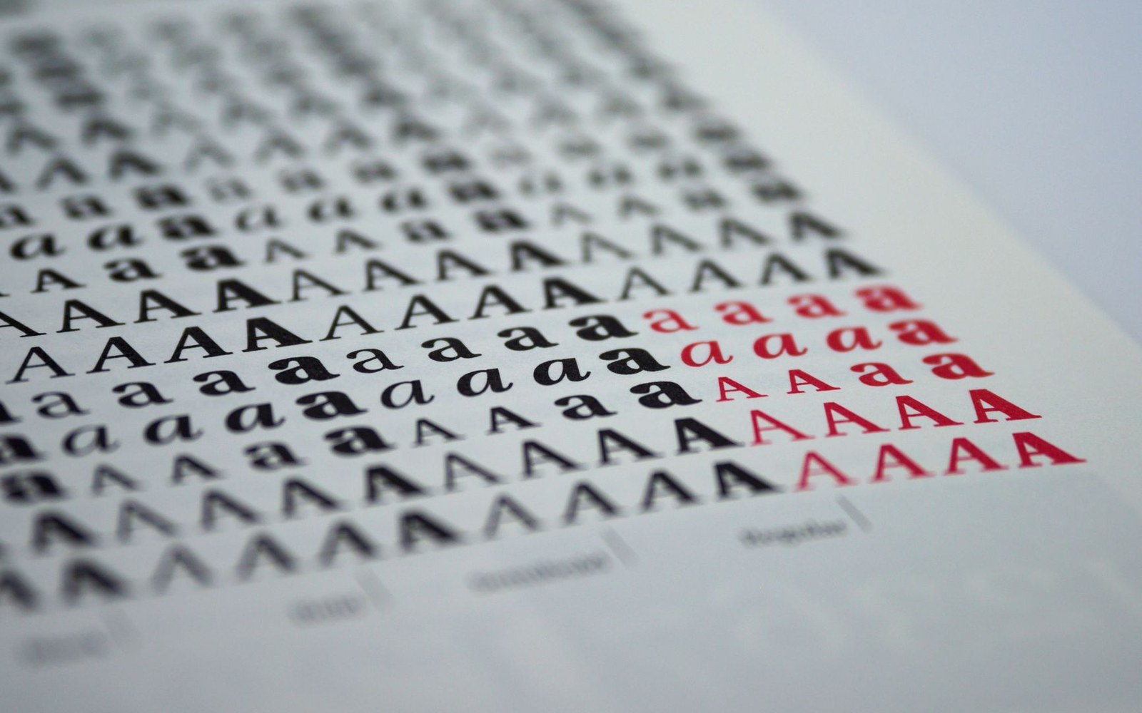
Miedinger, Hoffmann, and the Haas Brief
Reconstructs the 1956–57 commission that produced Helvetica: Eduard Hoffmann's notes at the Haas Type Foundry in Münchenbuchsee, Max Miedinger's drawings, and the decision to market the face under a Latin name rather than a Swiss one.
Plate 03 -
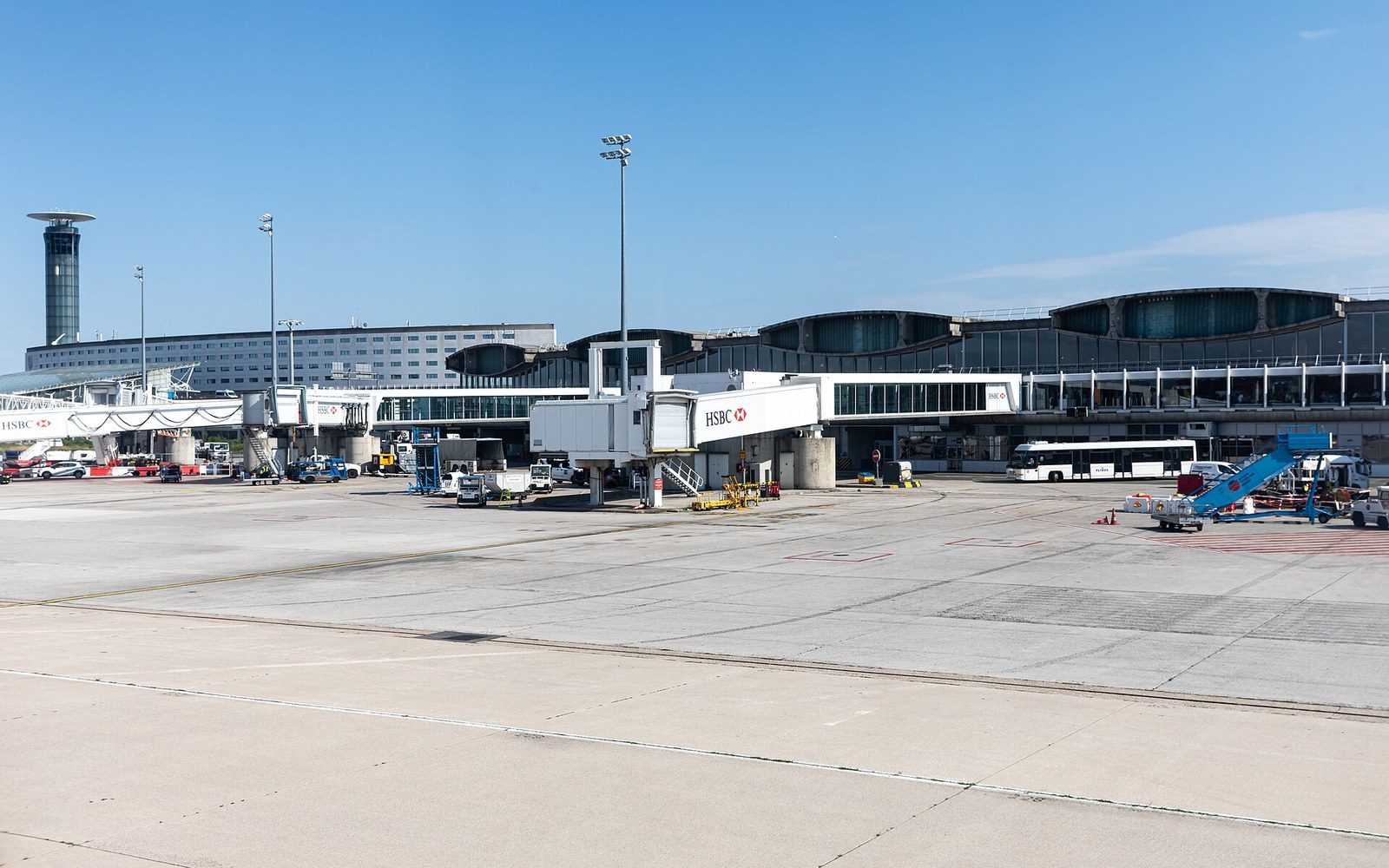
Frutiger at Roissy: One Airport, Then the World
Follows Adrian Frutiger's 1968 commission to letter-sign Charles de Gaulle Airport at Roissy, and the subsequent release of the Frutiger typeface by Linotype in 1976 for general use.
Plate 04 -
Tschichold's Reversal
Examines the arc from Jan Tschichold's 1928 manifesto Die neue Typographie — with its rules against serif type and centred composition — to his 1947–49 tenure at Penguin Books, where he reformed the covers using classical symmetry and Times New Roman.
Plate 05
The other sections