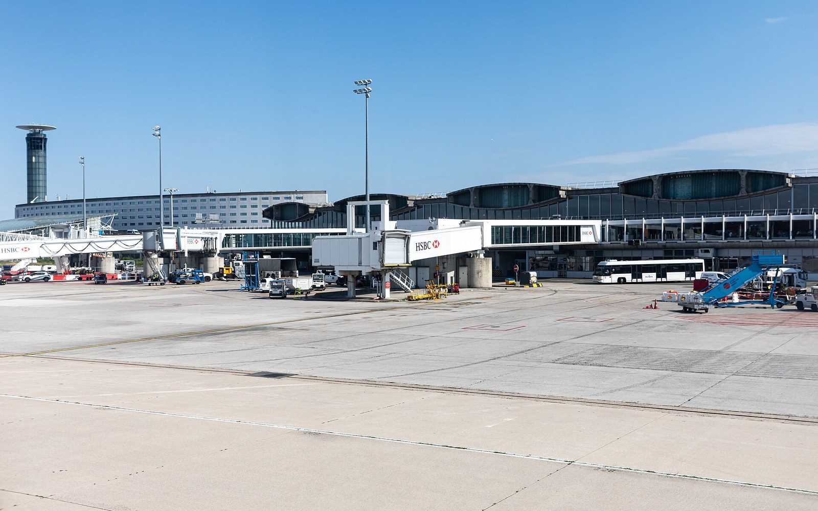
A wayfinding commission that became a typeface
In 1968, Adrian Frutiger received a commission to design the signage lettering for Charles de Gaulle Airport at Roissy, then under construction north of Paris. The brief was strictly functional: a sans-serif letterform legible at speed, at distance, and under the disorienting conditions of a busy terminal. Frutiger drew a humanist grotesque — open apertures, subtly varied stroke widths, letterforms that stayed distinct even when glimpsed peripherally. The result worked so well on the airport's walls and overhead panels that Deberny & Peignot, and subsequently Linotype, saw something beyond wayfinding: a text typeface waiting to be released.
Linotype published Frutiger as a commercial typeface in 1976, eight years after the airport drawings and nearly two decades after Frutiger had designed Univers for Deberny & Peignot in 1957. Where Univers was a systematic grid of twenty-one weights and widths — cool, architectural, deliberate — Frutiger was warmer in origin. Its counters (the enclosed or partially enclosed spaces inside letters such as c, e, and a) were wider and rounder than those of Helvetica or Univers, a direct consequence of the legibility demands placed on signage type read from moving bodies at variable distances.
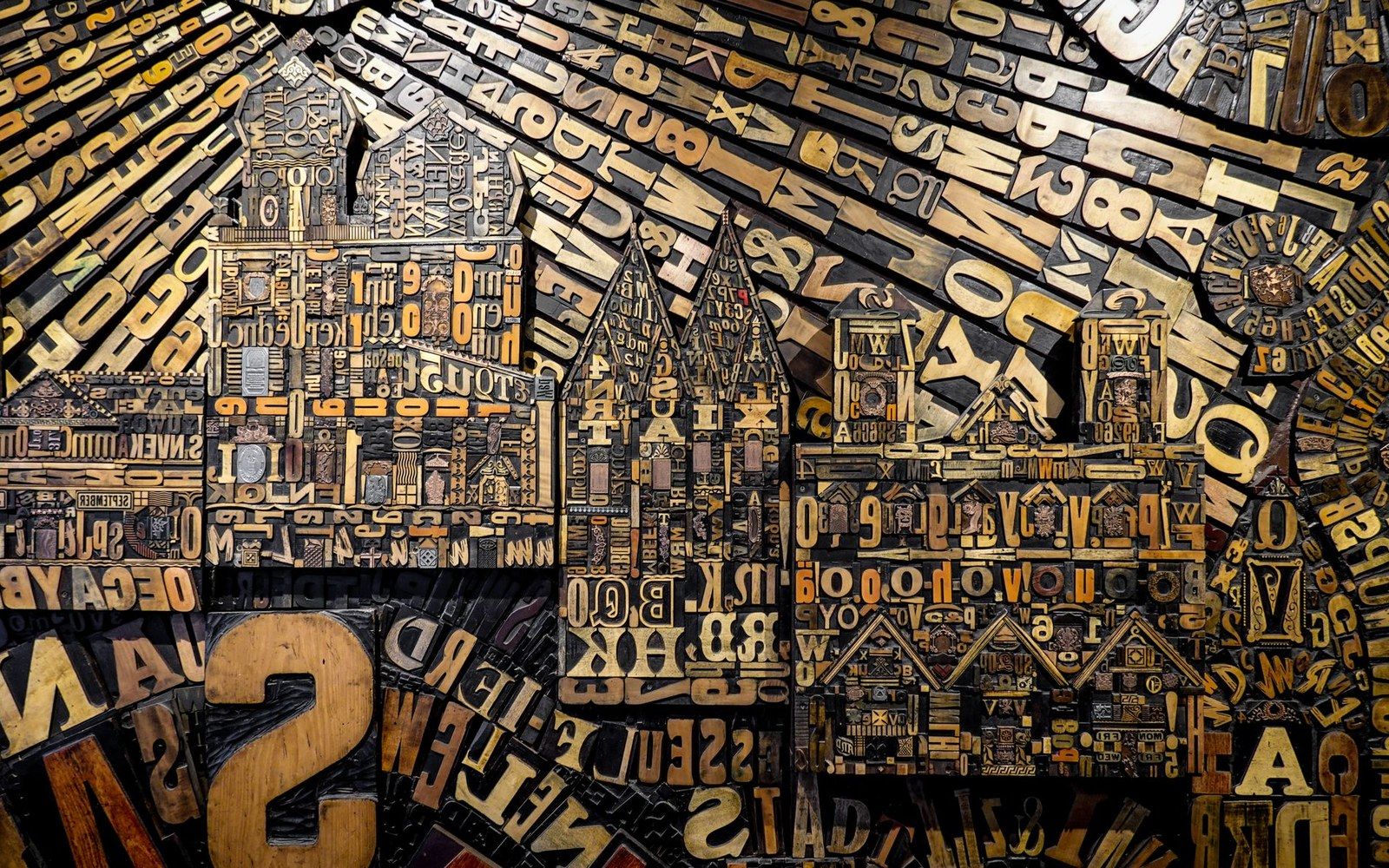
Metal and wood type were sorted, stored and locked up by face and size — the composing room was a filing system before it was a press.
Photo: Magda Ehlers / Pexels
The 1976 release gave the typeface a full family for print: roman and italic, several weights, text and display sizes. Hospitals, transit systems, and public institutions across Europe and North America adopted it through the late 1970s and 1980s, attracted by the same open legibility that had recommended it to an airport. Linotype issued a substantially revised version, Frutiger Next, in 2000, adding true italics and an extended glyph set. A further revision, Neue Frutiger, followed in 2009 in collaboration with Akira Kobayashi.
What the Roissy commission demonstrated — and what the Frutiger typeface confirmed — was that the most durable sans-serifs are often not theoretical propositions but solutions extracted from a hard practical problem and then recognised, after the fact, as something more.