One Design Backward, One Forward
Helvetica and Univers arrived in the same year from different countries and entirely unlike working methods. Eduard Hoffmann at the Haas Type Foundry in Münchenbuchsee, Switzerland, commissioned Max Miedinger to refine an existing typeface — the house grotesque then called Haas Grotesk — into something cleaner and more commercially competitive. Miedinger worked iteratively, adjusting proportions that already existed, tightening the spacing, and arriving at a design grounded in the Akzidenz-Grotesk tradition the Berthold foundry had established in 1896. The process was empirical and additive: corrections made to a standing model.
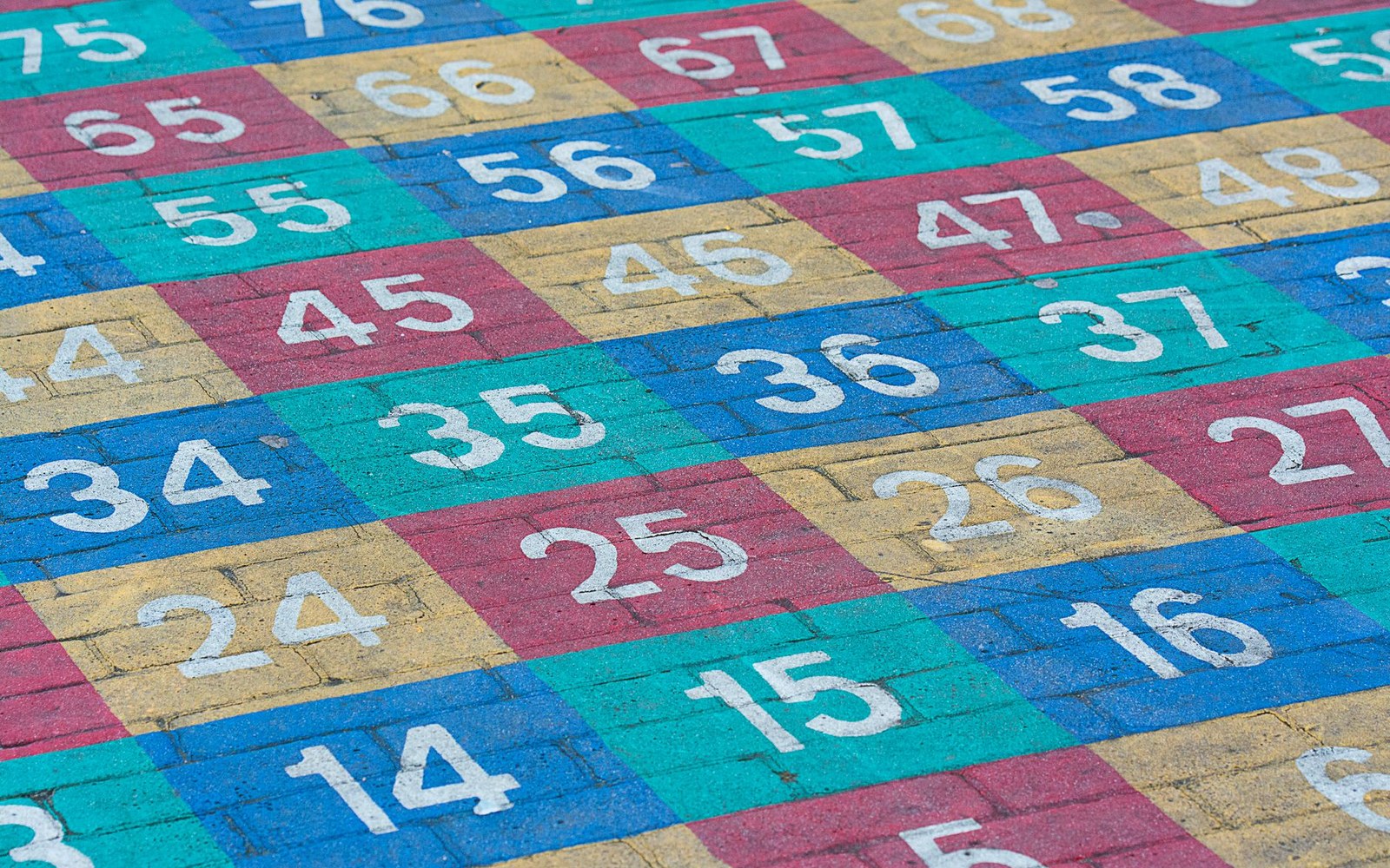
Adrian Frutiger, working for Deberny & Peignot in Paris, began from the opposite end. Before drawing a single finished letter, he mapped a coordinated system of twenty-one variants — five weights crossed against width and posture — and assigned each a two-digit number. The tens digit described weight (3 for light, 8 for extra-bold); the units digit described width and roman or italic orientation, with odd numbers for upright cuts and even numbers for obliques. The number grid was printed as a diagram and distributed as a promotional sheet; it was itself a typographic object, a schematic of the family's internal logic made visible before the type was in wide circulation. Univers 55 occupied the centre — the regular roman — and the whole system radiated outward from that anchor.
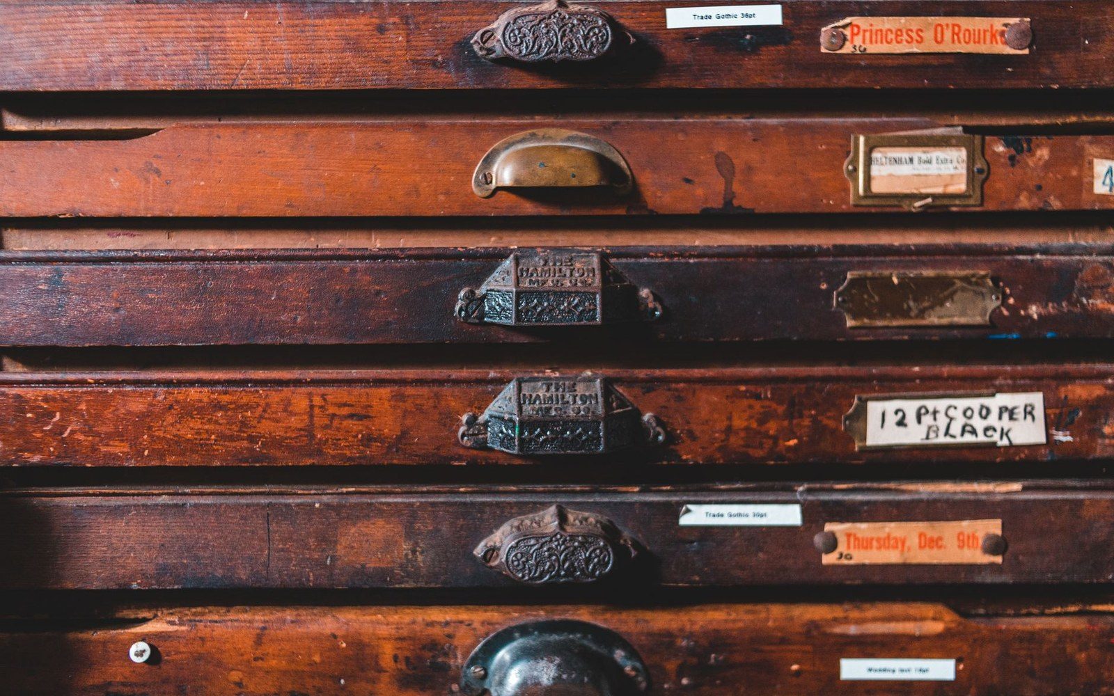
Wood type was cut for sizes too large to cast in metal, and sorted by face and size rather than by alphabet.
Photo: Erik Mclean / Pexels
What the Numbering Changed
The practical consequence of Frutiger's method was consistency of texture across the family. Because all twenty-one variants were designed together from a shared skeleton, the stroke relationships and x-height held constant as weight and width changed. A designer could mix Univers 45, 55, and 65 in a single layout and the voices would blend without friction. Helvetica, released the same year by Haas and licensed soon after to the Stempel foundry and then to Linotype for wider distribution, grew its family more incrementally: new weights added over subsequent years by different hands, producing occasional inconsistencies in spacing and letterform detail that Helvetica's heaviest users — corporate identity practices, transit authorities — sometimes had to work around.
The numbering system itself shifted professional vocabulary. Earlier type families used verbal descriptors: light, book, medium, bold, condensed, extended. These terms had no fixed reference points and meant different things at different foundries. Frutiger's grid replaced impression with coordinate, a move consistent with the rationalist spirit of the International Style then consolidating in Switzerland and across continental Europe. The system was later adapted — with modifications — by Frutiger when he named his own eponymous family, and the logic influenced how font families have been catalogued and named ever since.
1957, Two Uses
Both typefaces became dominant, but in different territories. Helvetica attached itself to corporate identity — its neutrality made it the default choice for companies wanting legibility without personality, from airlines to pharmaceuticals to transit systems. Univers found consistent favour in large-scale typographic programmes where systematic variation across weights was operationally necessary: signage, publishing, complex documents requiring visual hierarchy built from a single type family. Adrian Frutiger's later commission to letter-sign Charles de Gaulle Airport drew on the discipline he had refined designing Univers, where every decision about a letter had to hold at many scales simultaneously.
That both faces emerged in 1957 is not coincidence. Phototypesetting was beginning to displace metal, and foundries across Europe were competing to place their typefaces in a new reproduction system that would reward well-spaced, optically refined designs. The market pressure was the same; the responses were not. Miedinger and Hoffmann refined a tradition. Frutiger designed a system — and published the diagram of the system before the type itself was fully in production. That is the difference, and it is still legible in both faces today.