Section 02 · 6 plates
A typeface has a foundry, a year and a brief behind it — hold it as an object, not a style
Named faces as dated objects — the specimen sheet, the foundry, the year, the brief that produced them.
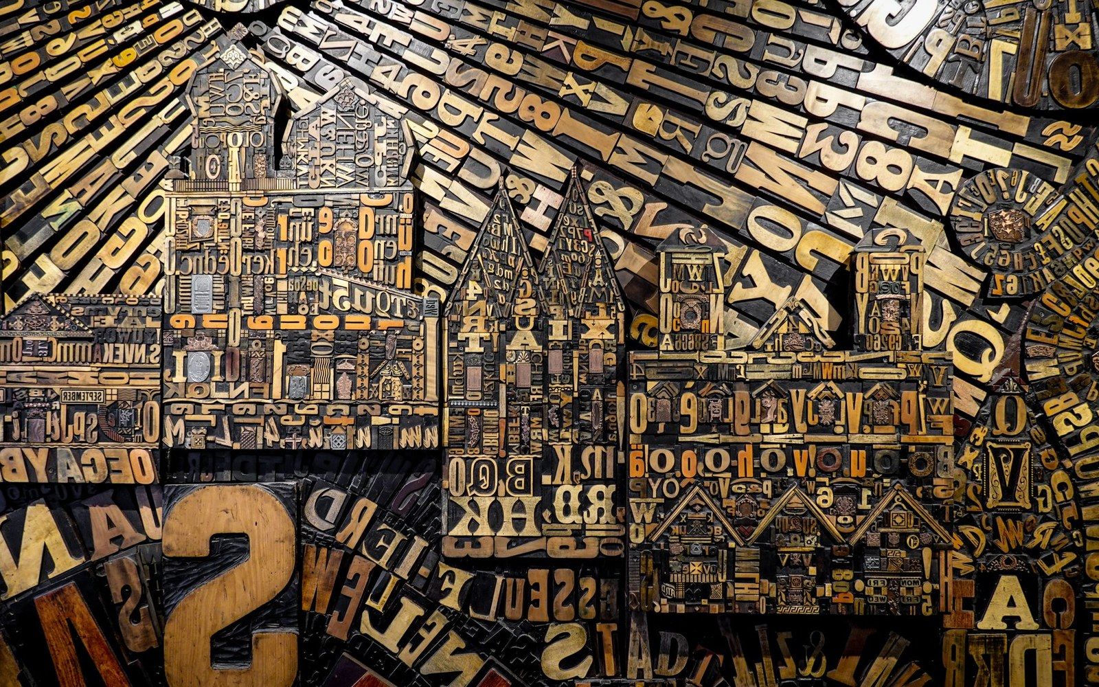
Metal and wood type were sorted, stored and locked up by face and size — the composing room was a filing system before it was a press.
Photo: Magda Ehlers / Pexels
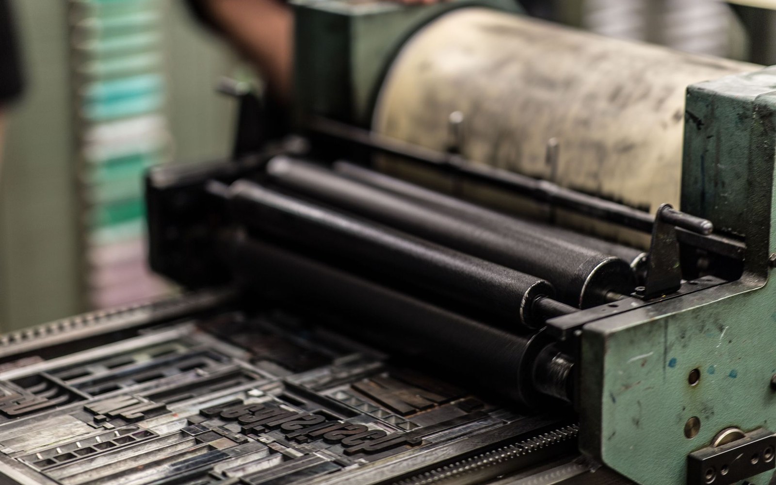
Plate 06 · leads the section
Akzidenz-Grotesk: The Face Helvetica Answered
Dates Akzidenz-Grotesk to the Berthold foundry's 1896 release, traces its adoption by Swiss designers in the 1950s as the de facto International Style text face, and establishes its direct relationship to the Helvetica commission. A short comparison of the two faces at the same point size, using named specimens.
Read the piece-
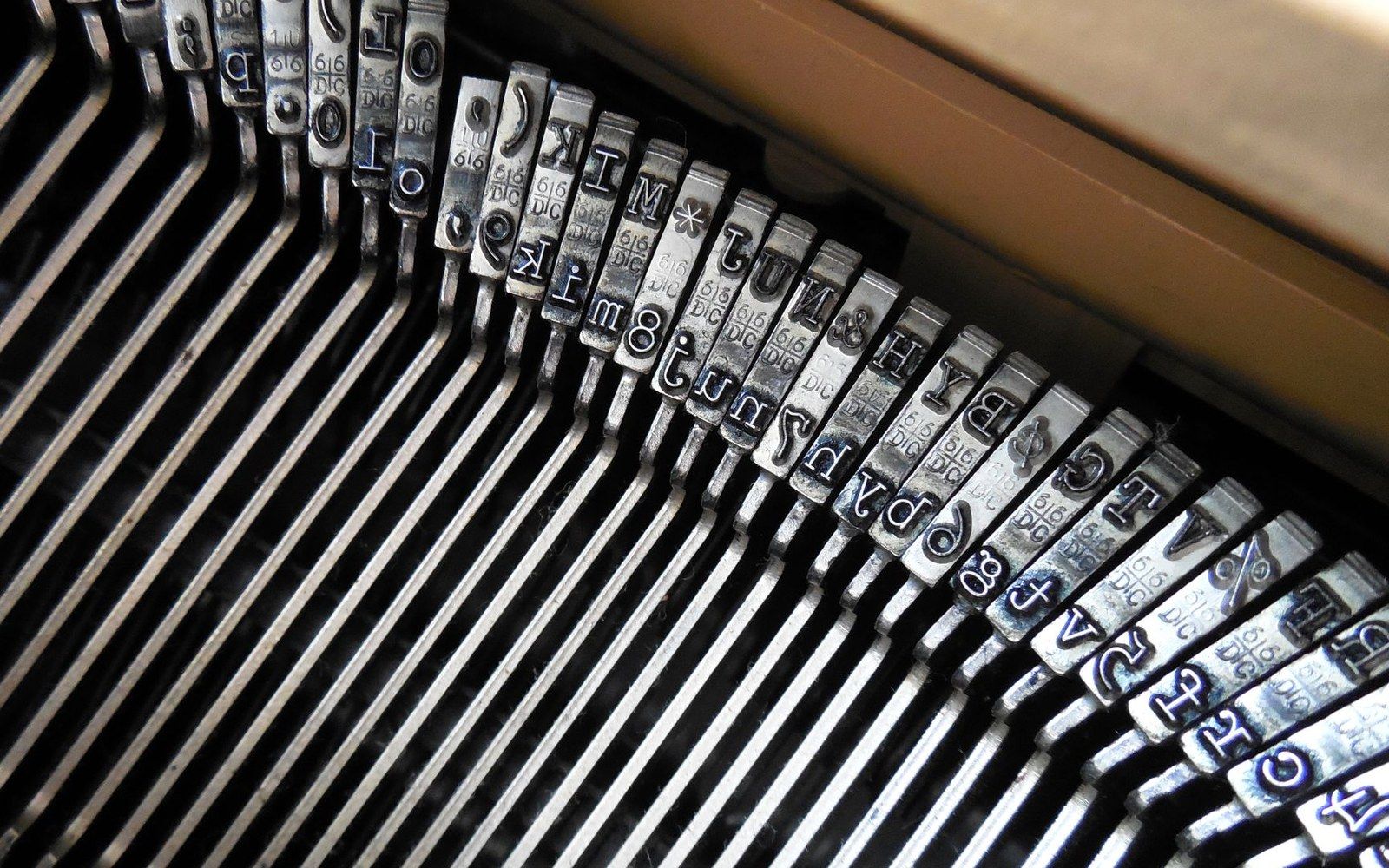
Futura Was an Argument, Not a Fashion
Reads Paul Renner's 1927 typeface as a position in a debate about what a German letter should be — geometric, universal, free of historical ornament — and traces the Bauer foundry's campaign to sell it internationally.
Plate 07 -
The Same Year, Two Different Systems
Compares Helvetica (Haas, 1957) and Univers (Deberny & Peignot, 1957) as products of the same moment and different philosophies: Miedinger working from an existing grotesque tradition, Frutiger designing a coordinated family of twenty-one weights from a single concept before drawing the first letter.
Plate 08 -
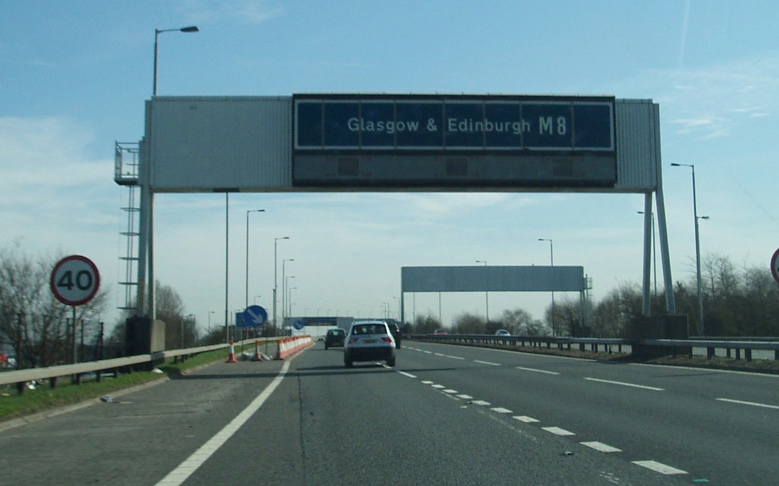
Transport: The Typeface Driven Into Every British Road
Covers the 1958–63 development of Transport by Jock Kinneir and Margaret Calvert for the British motorway and trunk-road sign system, the legibility tests run on the A1, and why mixed-case lettering was chosen over capitals.
Plate 09 -
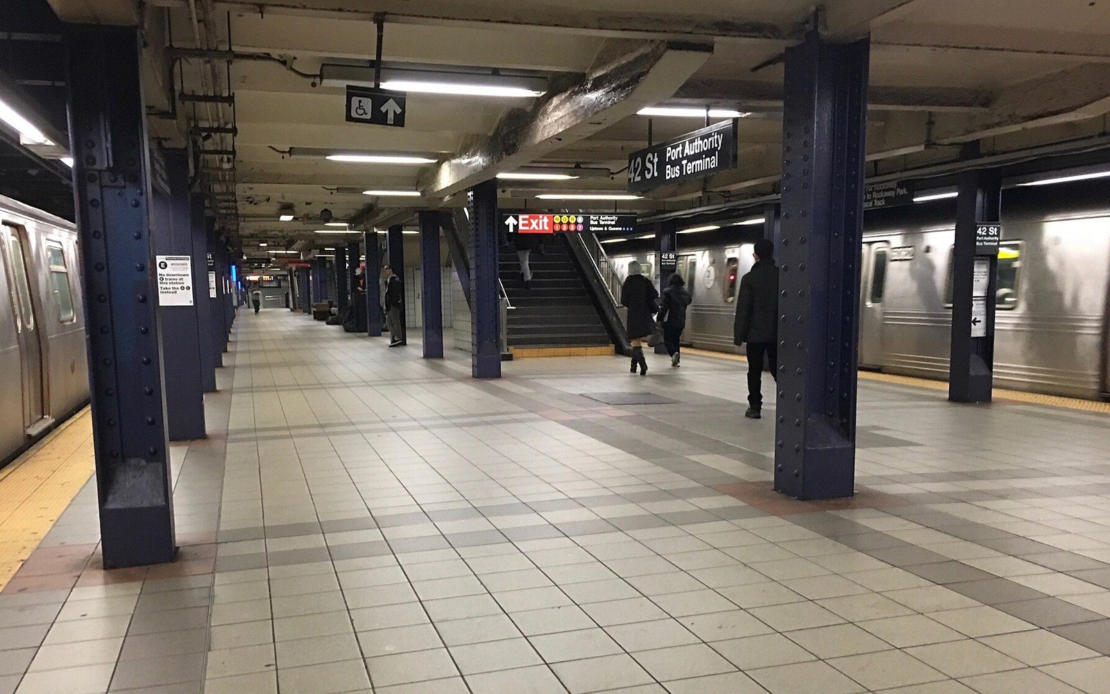
Gotham Came from a Building, Not a Concept
Traces Hoefler & Frere-Jones's Gotham (2000) back to the mid-century sans-serif lettering on New York Port Authority buildings and transit infrastructure, establishing the photographic survey that preceded the drawings.
Plate 10 -
Verdana and Georgia Were Designed for a Problem That No Longer Exists
Describes Matthew Carter's 1996 commission from Microsoft to produce typefaces readable at screen resolutions below 100 dpi, the hinting decisions that distinguish them from print faces, and what happened to their design rationale when screens surpassed 200 dpi.
Plate 11
The other sections