Section 05 · 5 plates
The designed book had to survive being sold by the million
From the Kelmscott Chaucer to Penguin paperbacks — the designed book as a mass object.
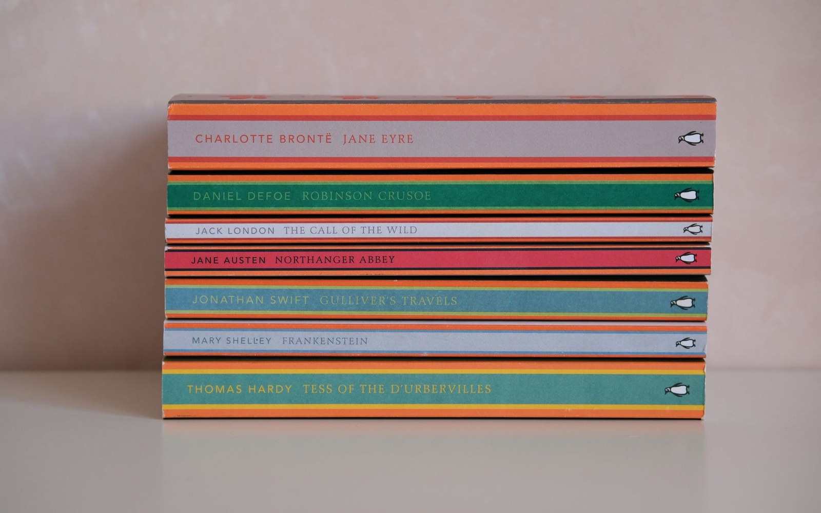
The band colour did the shelving: orange fiction, green crime, blue biography, decided before the cover was designed.
Photo: Esra Afşar / Pexels
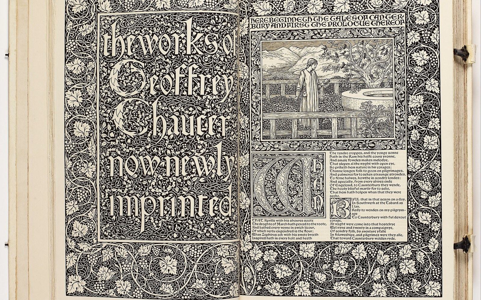
Plate 21 · leads the section
The Kelmscott Chaucer: Four Years, 556 Pages
Documents the production of the 1896 Kelmscott Chaucer — William Morris's collaboration with Edward Burne-Jones, the Golden type cut from a Jenson model, the hand-made paper from Joseph Batchelor, the 87 woodcut illustrations — as a specific physical object whose making was itself an argument against industrial printing. Cites the Kelmscott Press colophon and the British Library copy as primary sources.
Read the piece-

Penguin's Three Bands and What They Said
Traces Edward Young's 1935 tripartite cover grid — orange for fiction, green for crime, blue for biography — through Tschichold's 1947 refinement of the typography and Romek Marber's 1961 grid for the Penguin Crime series, showing how a system designed for print economy became a design identity.
Plate 22 -
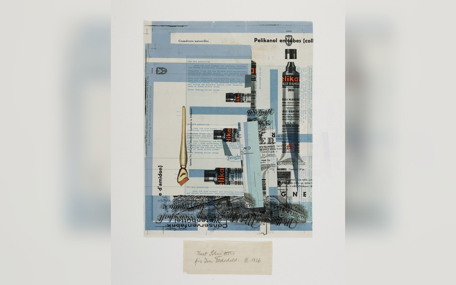
Die neue Typographie: What It Said and What It Banned
Reads Tschichold's 1928 book as a polemical document — its prohibition on serif type, centred composition, and historical ornament — and identifies which of its positions he later publicly retracted and which held.
Plate 23 -
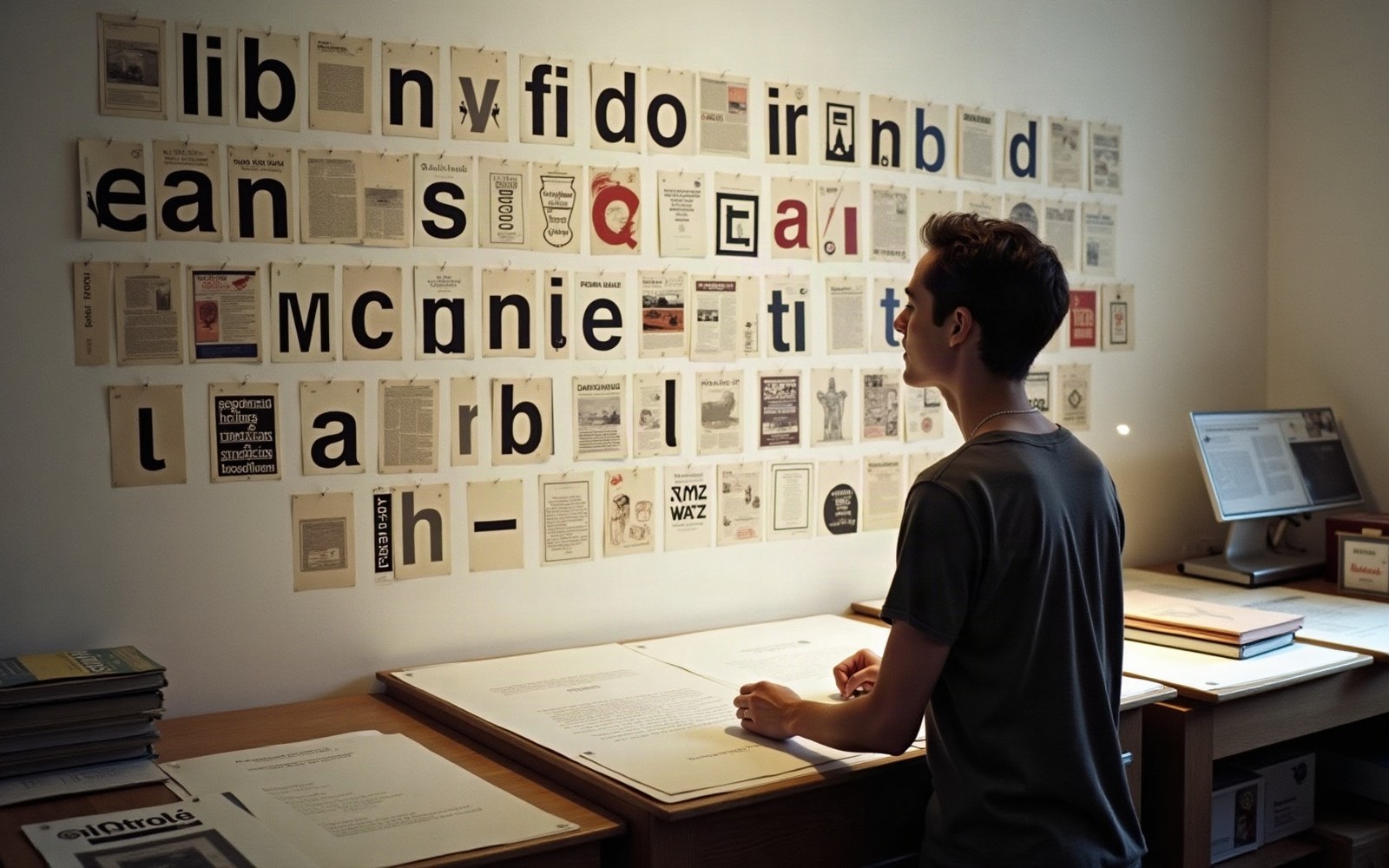
Émigré Magazine and the Fonts It Published First
Covers Rudy VanderLans and Zuzana Licko's Émigré magazine from its 1984 launch through its role as the primary venue for postmodern typography debate in the United States — the bitmap fonts Licko designed for low-resolution printing, the essays by Jeffery Keedy and Ed Fella, the foundry that grew from the magazine.
Plate 24 -

Ray Gun, 1992–95: When Illegibility Was the Point
Documents David Carson's art direction of Ray Gun magazine — the rotated columns, the typefaces set at wrong sizes, the interview printed in Dingbats — as a sustained argument that visual interest preceded readability, and places it against the grunge typography movement at the same moment.
Plate 25
The other sections