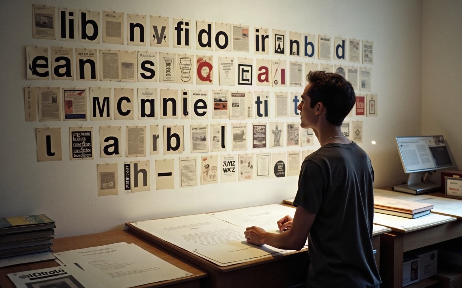
A Magazine Built Around What the Machine Could Do
Rudy VanderLans and Zuzana Licko launched Émigré in Berkeley, California, in 1984 — the same year Apple shipped the first Macintosh. The timing was not incidental. The original Macintosh printed at 72 dots per inch on screen and 144 dpi on the ImageWriter; those were not specifications to work around but, in Licko's reading, parameters to design within. Her earliest bitmap typefaces — Matrix, Emigre (the face, distinct from the magazine), and Oakland — were drawn on a pixel grid, their letterforms built from the coarse raster rather than disguised beneath it. Where conventional typographers saw a limitation to apologise for, Licko saw a new constructive unit.
The logic was architectural rather than calligraphic. Diagonal curves, the traditional proof of a type designer's skill, were expensive at low resolution: they aliased into staircases. Licko's early designs embraced the staircase. Oakland came in specific pixel sizes calibrated to screen and printer output; Matrix used a geometry that turned the grid's rigidity into a formal quality rather than a defect. The faces looked unlike anything cut in metal or set by phototype, and they looked that way deliberately. Émigré the magazine was the vehicle that demonstrated them at scale, issue after issue, in editorial contexts that mainstream typography journals would not touch.
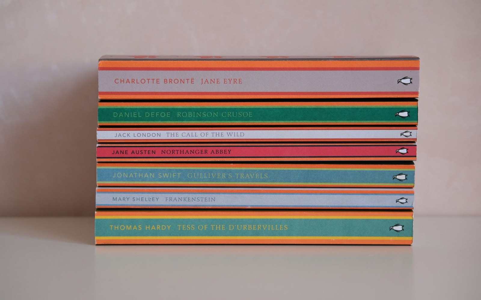
The band colour did the shelving: orange fiction, green crime, blue biography, decided before the cover was designed.
Photo: Esra Afşar / Pexels
The Essays and the Argument
By the late 1980s the magazine had become the primary American venue for postmodern typography debate — a position it held without institutional backing, without a university affiliation, and without advertising from the major type companies. VanderLans edited; contributors came from the overlapping worlds of design education and practice that were then remaking themselves around the Macintosh.
Jeffery Keedy, who taught at CalArts, published critical writing in Émigré that interrogated the neutrality claimed by Swiss-style modernism and the International Style's assumption that form could be purged of cultural content. Ed Fella, whose hand-lettered exit posters from Detroit turned vernacular typography into a sustained critical practice, appeared in the magazine and influenced an entire generation of students who encountered his work there rather than in museums. The essays were polemical without being systematic, and the design of each issue — VanderLans laid out most of them, deploying Licko's and later other designers' typefaces in compositions that broke the column grid as a deliberate rhetorical act — made the argument formally as well as verbally.
The magazine also published writing that pushed back. The debate between proponents of the new expressivism and defenders of legibility-first practice played out partly in Émigré's pages, with figures from both camps given space. That editorial willingness to run the argument rather than settle it is what made the publication useful as a historical document: it recorded the disagreement in real time.
The Foundry That Came Out of It
Émigré Fonts grew from the magazine's need to distribute what Licko was designing. By the early 1990s the foundry was licensing typefaces by a roster of designers who had come to prominence partly through the magazine itself — Keedy's Keedy Sans, Barry Deck's Template Gothic, Ed Fella's display lettering adapted into digital forms. Template Gothic in particular circulated so widely after its 1990 release that it became, briefly, the visual shorthand for a certain strain of early-nineties American graphic design: raw, deliberately unfinished, hostile to the polish of pre-Macintosh professional typography.
The magazine published its final issue in 2005, having run 69 issues over two decades. By then the foundry had separated from the editorial operation as a viable standalone commercial entity, and Licko's typefaces — including Mrs Eaves, a 1996 revival of Baskerville that softened the pixel-grid aesthetic toward something warmer and historically grounded — were in wide enough use to constitute a commercial library rather than a polemical pamphlet. Mrs Eaves appeared in the same decade that Matthew Carter was solving screen legibility for Microsoft; the two projects addressed the same technological moment from almost opposite directions.
Émigré's significance is institutional as well as typographic: it demonstrated that a small, self-published periodical could set the terms of a professional debate, distribute new typefaces as part of its editorial content, and build a lasting foundry from what began as a printer's workaround.
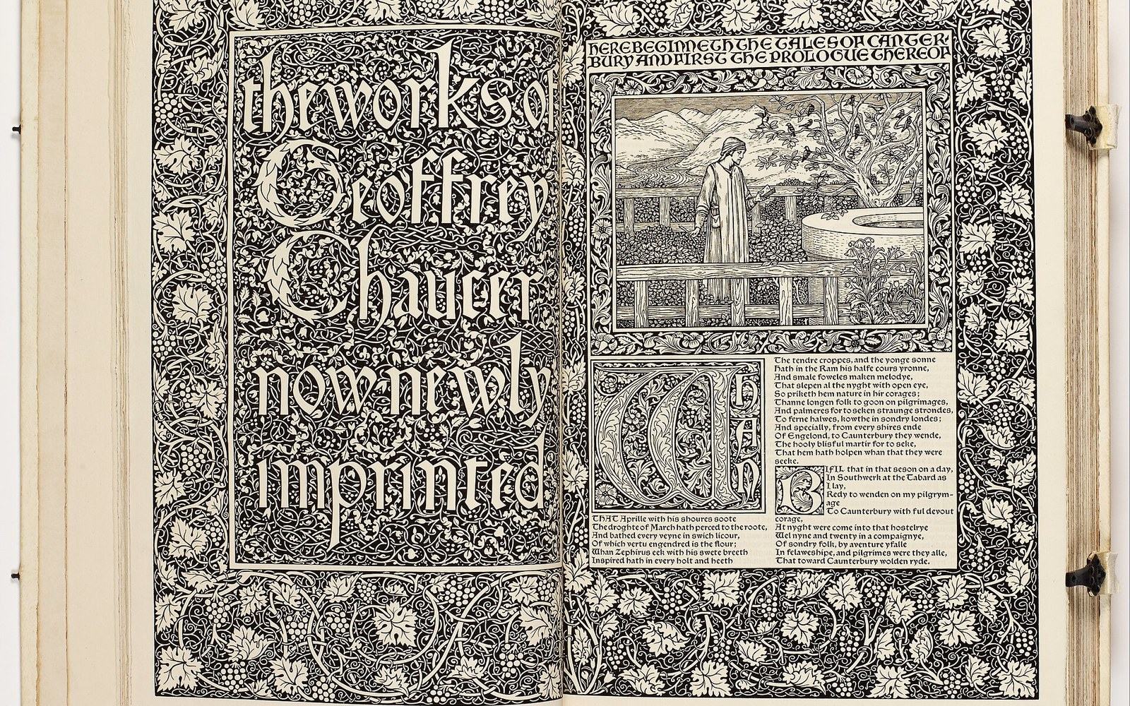
The next plate in Books: The Kelmscott Chaucer: Four Years, 556 Pages.
Photo: William Morris - The Works of Geoffrey Chaucer (The Kelmscott Chaucer) - Google Art Project · Wikimedia Commons