
The Original Grid, 1935
Edward Young, then a production assistant at Penguin Books, devised the tripartite cover format in 1935 for the imprint's founding list. The formula was elementary: a broad horizontal band of colour across the top, white in the middle for title and author, and another coloured band at the foot. Orange identified fiction, green crime, blue biography. The logic was industrial rather than aesthetic — the same grid printed across every title, with only the text changing, kept unit costs low enough to hit sixpence.
The typeface was Gill Sans throughout, partly because Stanley Morison had already made it the standard face of the London and North Eastern Railway and it read as both modern and British. The Penguin device — a small, slightly awkward penguin drawn by Young himself — sat inside a double-rule oval on the central panel. It was an identity system before that phrase existed, held together by colour and repetition rather than by any governing typographic theory.
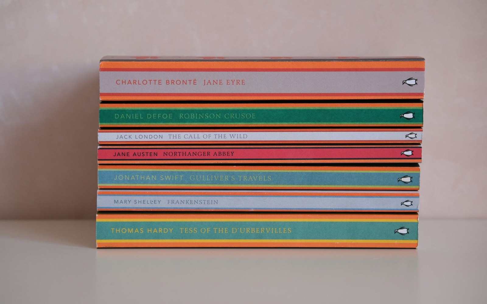
The band colour did the shelving: orange fiction, green crime, blue biography, decided before the cover was designed.
Photo: Esra Afşar / Pexels
Tschichold's Intervention, 1947
Penguin's founder Allen Lane recruited Jan Tschichold in 1947 to impose rigour on what had become, over twelve years and hundreds of titles, a progressively inconsistent product. Tschichold stayed until 1949 and produced the Penguin Composition Rules — a four-page document specifying typeface, spacing, capitalisation, and the placement of every element on the page, inside and out.
He redrew the penguin, replaced Gill Sans with more carefully considered serif and sans pairings on individual series, and tightened the margins so the white panel breathed properly. His insistence on typographic discipline ran counter to the casual hand-correction that had governed the covers before his arrival. The Tschichold covers are identifiable by their exactness: the lettering sits on the baseline with no apology, and the colour bands are cleanly abutted against the white.
Named editions from this period include the Pelican — Penguin's non-fiction imprint — which kept its own blue ground rather than the orange used for fiction, and the Penguin Shakespeare series, which received a restrained Renaissance-style frame within the white panel while keeping the tripartite structure intact.
Marber's Grid, 1961
The Penguin Crime series in 1961 posed a different problem. Crime fiction had migrated toward photographic and illustrated covers at rival houses, and Penguin's green-band formula read as dowdy beside them. The designer Romek Marber was commissioned to produce a new cover system, and the result — known as the Marber Grid — became one of the most analysed layouts in mid-century British graphics.
Marber divided the cover into an asymmetric grid: the top third carried a horizontal strip for the author name, the bottom two-thirds held a photographic or illustrative image that bled across the space, and the Penguin Crime identifier was locked to a fixed baseline. The green band survived, but it was compressed to a footer rather than a structural element. The grid gave art directors and illustrators working latitude while guaranteeing every cover would register as a system — the International Style's discipline brought to the paperback rack without the austere blankness that Swiss design sometimes produced.
Covers art-directed under the Marber Grid include editions of Raymond Chandler titles, paired with photomontage and illustrative imagery by a range of designers. Each one is distinct as an image and identical as a grid.
What the System Did
The three-band structure was never trademarked, never defended in the way a corporate identity programme might be today. It spread into public memory through sheer repetition across millions of copies. By the time Penguin commissioned full illustrative covers from the 1960s onward, the orange ground had already become so deeply associated with the fiction list that departures from it read as deliberate statements — proof that a grid can become a language without anyone formally declaring it one.
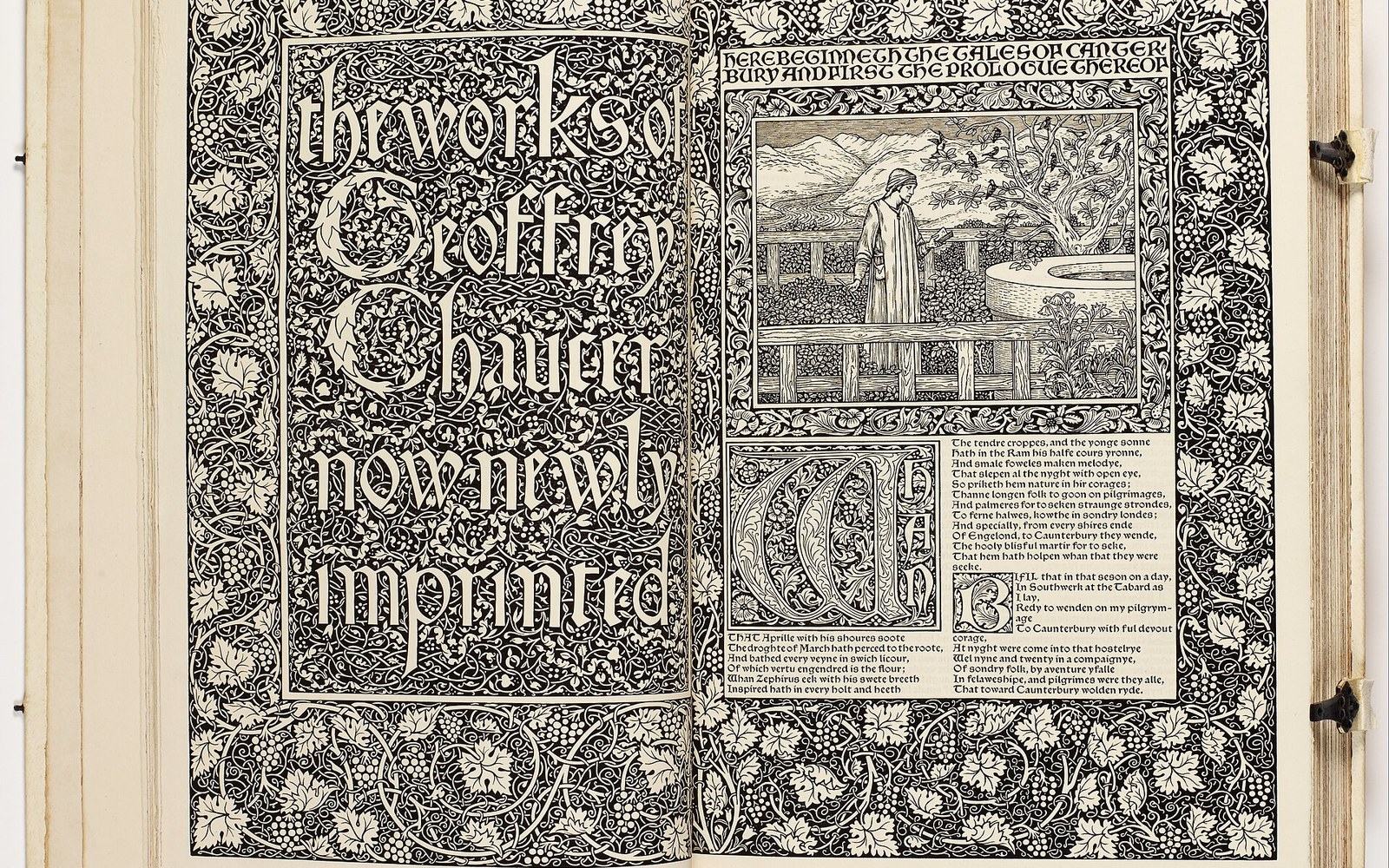
The next plate in Books: The Kelmscott Chaucer: Four Years, 556 Pages.
Photo: William Morris - The Works of Geoffrey Chaucer (The Kelmscott Chaucer) - Google Art Project · Wikimedia Commons