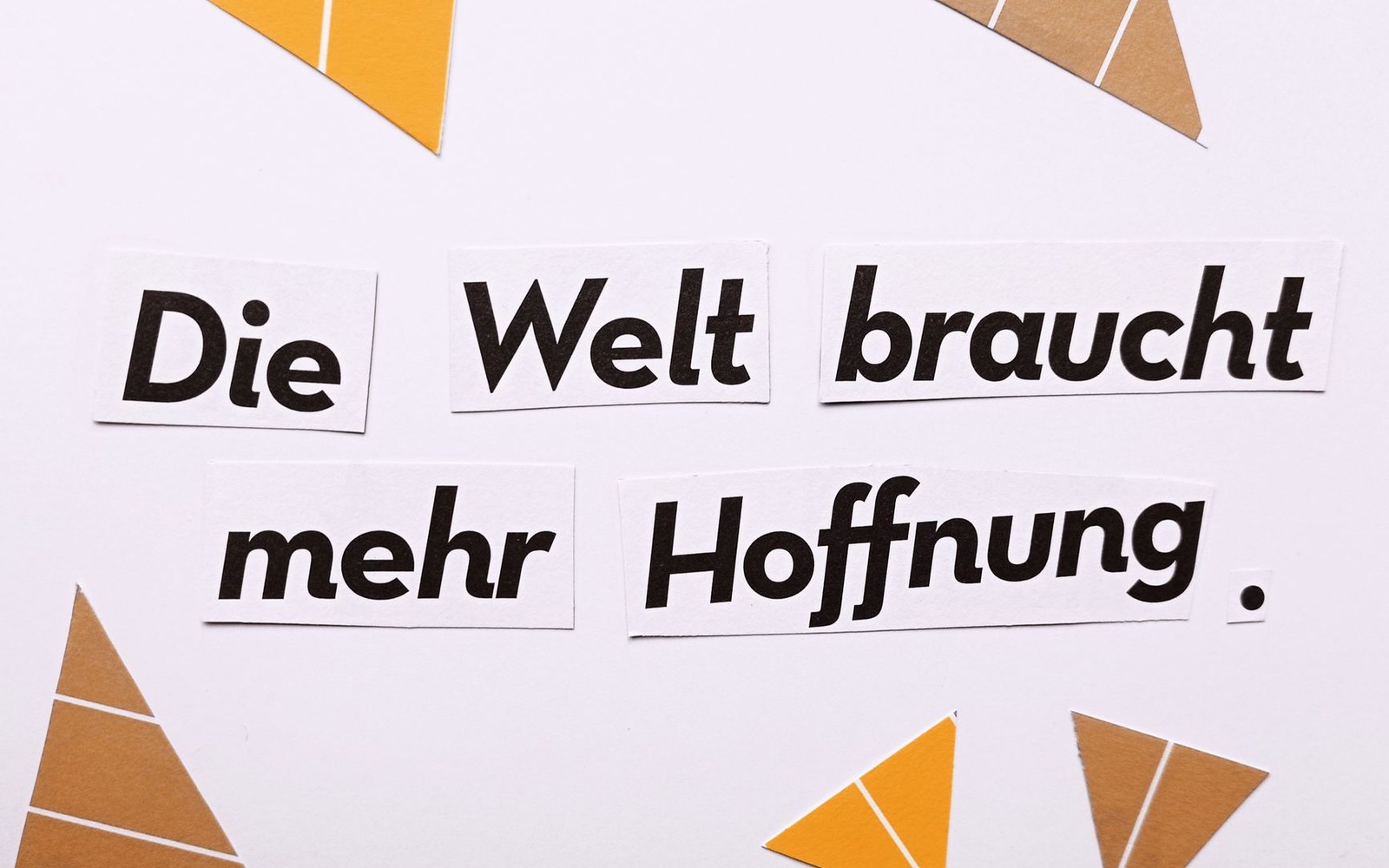
The man who wrote the rules, then broke them — deliberately
In 1928, Jan Tschichold published Die neue Typographie, a book so prescriptive it reads less like design theory than legislation. Centred layouts were banned. Serif typefaces were declared incompatible with the modern world. Asymmetry was not a preference but a moral position, grounded in the argument that industrial society required a new visual language — direct, unornamented, rationally organised. Tschichold was twenty-six years old. Within two decades, he would renounce almost everything in it.
The reversal is frequently misread as capitulation or cowardice. It was neither. It was a finely reasoned argument about the difference between an avant-garde manifesto and the daily obligations of a working typographer — and it played out most visibly in the two years Tschichold spent reordering the covers and interiors of Penguin Books.
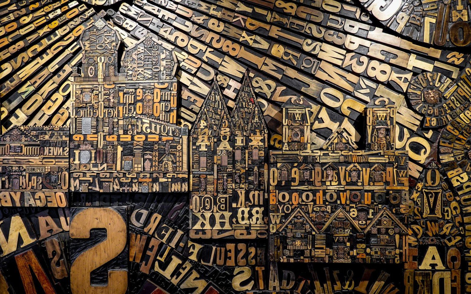
Metal and wood type were sorted, stored and locked up by face and size — the composing room was a filing system before it was a press.
Photo: Magda Ehlers / Pexels
Leipzig to London, by way of Munich
Tschichold was born in Leipzig in 1902, the son of a sign-painter, and trained in calligraphy and lettering before encountering the 1923 Bauhaus exhibition in Weimar. That encounter was catalytic: he absorbed the constructivist premises circulating through the European avant-garde — the work of El Lissitzky in particular — and converted them into a practitioner's handbook. Die neue Typographie was the result, followed in 1935 by Typografische Gestaltung, a somewhat more temperate sequel. Both books circulated among professional typographers across Germany and Switzerland, and the first made Tschichold briefly notorious.
The Nazis, whose instincts in typographic matters ran to blackletter nationalism, arrested him in Munich in 1933 on charges of producing "un-German" typography. He and his wife were held for six weeks before being released. They left Germany for Basel, where Tschichold taught and practised for the next fourteen years, working at a distance from the programmatic certainties of his twenties. Basel was not a retreat from the design world — Armin Hofmann and others were building what would become the Swiss method in that same city — but it was an environment in which Tschichold began reading, seriously, the history of European typography: Aldus Manutius, Nicolas Jenson, the tradition that Die neue Typographie had declared obsolete.
By the time Allen Lane's Penguin Books invited him to London in 1947, Tschichold had already written that the rules he had laid down in 1928 were fit for advertising and propaganda, not for books. The invitation gave him the laboratory.
What Penguin Was and What It Needed
Penguin in 1947 was a publishing operation of significant scale, printing millions of paperbacks for a mass readership. Edward Young's 1935 tripartite cover grid — colour-banded by genre, with Gill Sans throughout — had given the list a coherent identity, but wartime production pressures had degraded the standards badly. Covers were inconsistent, interiors were sloppy, and the house rules that should have governed composition across dozens of titles were either absent or ignored.
Tschichold's response was systematic. Over two years he is documented to have redesigned or supervised the redesign of more than five hundred titles, and he produced a set of composition rules — later known informally as the Penguin Composition Rules — that governed everything from the handling of chapter headings to the spacing of punctuation. What is striking, given his 1928 positions, is the instrument he used: classical typographic convention. Centred title-page layouts. Careful symmetric spacing. And for the text work, classic serifed book faces, as deeply embedded in the tradition of the printed book as anything available in metal type.
This was not carelessness. Tschichold argued in print, explicitly, that the asymmetric modernism of Die neue Typographie was appropriate for ephemeral commercial work — posters, advertisements, jobbing print — where the reader was to be arrested and directed, not settled into reading. A novel or a work of history presented different demands: the reader was to be sustained over hours, through hundreds of pages, in conditions of trust between the text and the eye. For that purpose, the accumulated solutions of the roman tradition — proportioned margins, optically centred headings, the familiar rhythms of a serifed text face — were not reactionary. They were correct.
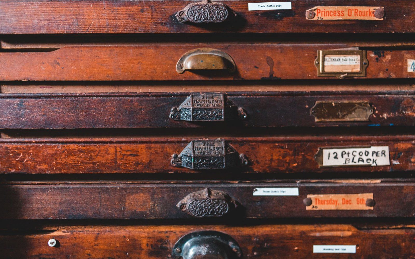
Wood type was cut for sizes too large to cast in metal, and sorted by face and size rather than by alphabet.
Photo: Erik Mclean / Pexels
His critics, Max Bill among them, accused him of abandoning principle under commercial pressure. Tschichold's reply, documented in his essays of the late 1940s and 1950s, was that his earlier positions had been the ones lacking principle — that the dogmatic prohibition on serifs and centred composition was itself a form of fashion, as arbitrary as the blackletter nationalism he had fled Germany to escape.
The Argument Underneath
What the reversal clarifies, when read carefully, is that Tschichold never changed his actual underlying conviction: that typography must serve the reader, and that every formal decision must be answerable to the conditions of production and reception. In 1928 that conviction produced one answer, because he was theorising for commercial printed communications aimed at a modern urban audience. In 1947 it produced another answer, because he was solving a production problem for mass-market books consumed in leisure.
The two positions are only contradictory if you mistake the manifesto for the principle. The manifesto was a period document — heavily indebted to constructivism and the Bauhaus moment — that Tschichold later described as the work of a passionate but dogmatic young man. The Penguin work was evidence that the underlying principle had matured. Typography as a service discipline, responsive to function: that idea runs unbroken from Die neue Typographie to the Composition Rules, even when the formal language reverses entirely.
Tschichold left Penguin in 1949 and returned to Basel. His later career included the design of the Sabon typeface, commissioned jointly by a consortium of German foundries and released in 1967 — a roman based on Garamond's models, optically unified across hot-metal and early phototypesetting systems, and about as far from the sans-serif absolutism of 1928 as it is possible to travel. Sabon is sometimes read as the final statement of the reversal. It is more accurately read as a demonstration that Tschichold's deepest interest was always craft, not ideology.