A Single Hand Across Every Surface
In 1907, the Allgemeine Elektricitäts-Gesellschaft — AEG, Berlin's electrical manufacturing giant — appointed Peter Behrens as its artistic director. The title was almost without precedent. Behrens was not hired to design a logo or produce an advertisement; he was handed authority over the company's typefaces, its product catalogues, its consumer goods, its exhibition stands, and its buildings. The scope was total, and the intention was explicit: AEG wanted every surface it touched to read as the work of a single intelligence.
That ambition, systematically executed between 1907 and roughly 1914, is the reason historians routinely call the AEG programme the first corporate identity in the modern sense of the term — a unified visual programme in which typeface, form, and architecture argued the same thing simultaneously.
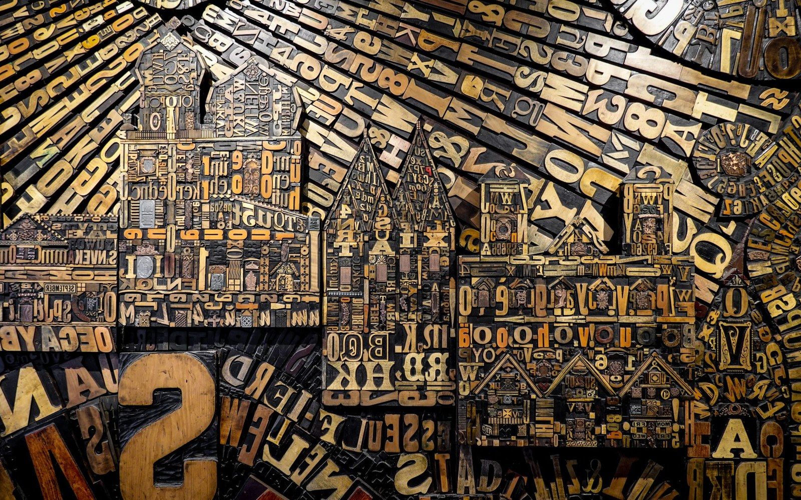
Metal and wood type were sorted, stored and locked up by face and size — the composing room was a filing system before it was a press.
Photo: Magda Ehlers / Pexels
Behrens arrived at the commission already formed as an artist and designer. He had been director of the Düsseldorf School of Arts and Crafts since 1903, and before that had been a founding member of the Darmstadt Artists' Colony. He was not a typographer by training, but typography was among the first problems he addressed. Working with the Klingspor foundry, he developed a series of typefaces bearing his name — Behrens-Schrift, Behrens-Kursiv, and the typeface most closely associated with the AEG identity: Behrens-Antiqua, issued around 1908. Behrens-Antiqua is a roman with a distinctly monumental quality, its proportions drawn more from inscription than from the book page, suited to the weight and permanence AEG wanted to project across its printed communications.
The Turbine Factory as Argument
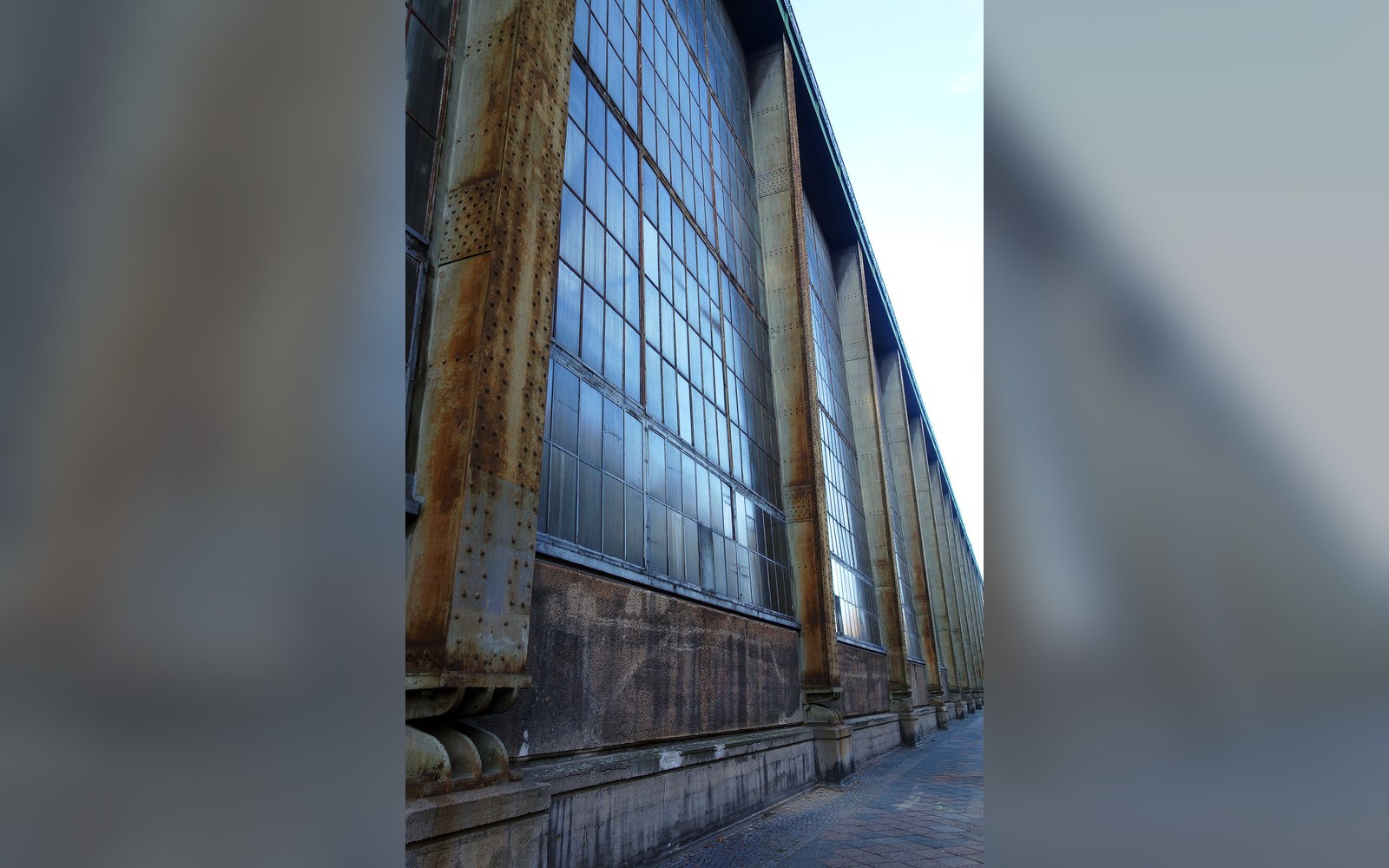
The printed identity and the built identity arrived in parallel. Between 1908 and 1909, Behrens designed the AEG Turbinenfabrik — the turbine factory — on the Huttenstrasse in Berlin's Moabit district. The building is now recognised as one of the defining works of early industrial modernism: a steel-and-glass hall that held its structure honestly at the corners while allowing the long glazed walls between to flood the factory floor with daylight. The corner pylons read as masonry temples even as the material reality was an exposed steel frame, a deliberate tension that gave the building civic presence without historical pastiche.
What the Turbinenfabrik shared with Behrens-Antiqua was precisely this quality: authority derived from geometry and proportion rather than from ornament. Both objects spoke the same formal language. An AEG arc lamp housed in a Behrens-designed casing, an AEG catalogue set in Behrens-Antiqua, and the Turbinenfabrik facade were all products of the same overarching argument about what industrial manufacture could look and mean.
The year of Behrens's appointment also saw the founding of the Deutscher Werkbund, the German association of manufacturers, designers, and craftsmen established to improve the quality of German industrial goods through the alliance of art and industry. Behrens was a founding member. The AEG programme became, in effect, the Werkbund's most visible proof of concept: that a designer embedded inside an industrial corporation could raise the standard of every object it produced.
What the Office Held
The appointment also functions as a pivotal node in design history because of who passed through Behrens's office. Walter Gropius, who would found the Bauhaus in Weimar in 1919, worked as Behrens's assistant between 1907 and 1910. Ludwig Mies van der Rohe worked there from 1908 to 1911. Le Corbusier passed through briefly in 1910. The three architects who most shaped twentieth-century built form each received part of their formation inside the same office, working on the same commission, watching Behrens hold graphic design and architecture to a single standard.
That is not a footnote. The Bauhaus would later institutionalise the principle Behrens had demonstrated at AEG — that industrial production required artists trained across disciplines, not craftsmen trained in a single medium. The turbine factory and the type specimen are the evidence behind the theory.
The AEG programme did not use the term corporate identity; that vocabulary belonged to a later generation. But the thing itself was fully present by 1910: one typeface, one formal sensibility, one visual authority applied without exception from the smallest printed label to the largest building the company owned.
The next plate in Punchcutters: What Garamond Cut and What Came After.
Photo: Regan Dsouza / Pexels