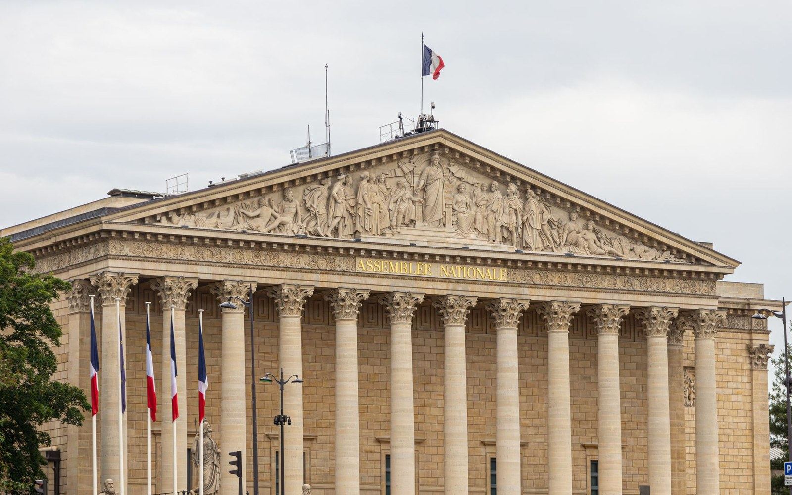
The punchcutter and his actual punches
Claude Garamond worked in Paris in the second quarter of the sixteenth century, cutting type for printers at a moment when the roman letter was still being settled into the form it would hold for the next five hundred years. His models were the types cut around 1495 for Aldus Manutius by Francesco Griffo — the Venetian roman that set the proportions of the humanist lowercase — but Garamond refined them: a slightly narrower set, a more consistent slope to the bracketed serifs, a calligraphic quality in the joins that is legible as his own hand even across reproductions. He sold type commercially, operating as one of the first independent type founders in France rather than cutting exclusively for a single press, and his romans circulated widely through the French, German, and Low Countries book trades.
The punches themselves — the actual steel master tools from which matrices are struck — survive in two significant deposits. A group of Garamond punches is held at the Plantin-Moretus Museum in Antwerp, part of the extraordinary archive of the Plantin printing house. A second and more consequential deposit sits in Paris. When Jean Jannon, a Protestant printer working in Sedan, cut a roman type in the 1620s in conscious imitation of the Garamond manner, his materials were eventually seized and transferred to the Imprimerie Royale — the royal printing office established in Paris in 1640. There they sat, mislabelled. For more than two centuries, Jannon's punches and matrices were catalogued as Garamond's own.
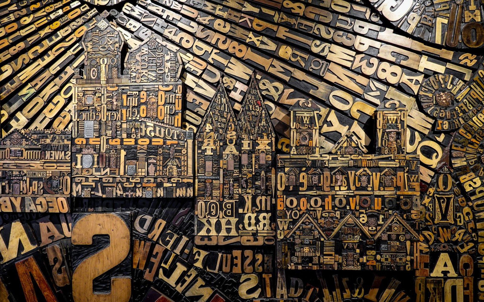
Metal and wood type were sorted, stored and locked up by face and size — the composing room was a filing system before it was a press.
Photo: Magda Ehlers / Pexels
The confusion that produced the revivals
The error had concrete consequences. When early-twentieth-century type designers went looking for Garamond to revive, they found Jannon. The Imprimerie Royale's misattributed specimen was the primary visual source for most of what was subsequently released under the Garamond name. The Stempel foundry's revival of 1925 — the version that became the standard reference for German-language fine printing and the ancestor of several contemporary digital Garamond cuts — derives directly from the Jannon specimen held in Paris, not from any Garamond original. American Garamond, issued by the American Type Founders company in 1917 and designed by Morris Fuller Benton, draws from the same Jannon source. So does the Monotype Garamond issued in Britain in 1922.
The implication is exact: the Garamond in most books printed between roughly 1920 and 1990, and the Garamond bundled with most desktop software today, is a revival of a seventeenth-century type that was itself an imitation of a sixteenth-century type, misattributed for 250 years and then reproduced at industrial scale under the wrong name. The letterforms are coherent and well-crafted; they are simply not Claude Garamond's.
Two revivals do work from genuine Garamond sources. Robert Slimbach's Adobe Garamond of 1989 — before he issued the later, wider Adobe Garamond Premier Pro — drew on Garamond punches and specimens in the Plantin-Moretus archive. The typeface cuts released under the name Garamond Premier Pro (2005) made the Plantin connection even more explicit, with optical sizes calibrated from historical models rather than from a single normalised master. The other careful recovery is Claude Garamond by Frantisek Storm, which similarly returns to Plantin-Moretus materials. These remain minority choices in a market dominated by the Jannon line.
Stempel, Sabon, and the line forward
The Stempel foundry's 1925 Garamond was commercially significant enough that it became a reference for the next generation of Garamond-derived type. When Jan Tschichold designed Sabon in the 1960s — a type he intended to work identically whether set by Linotype machine, Monotype machine, or hand-composition, a practical problem nobody had solved before — he named the Stempel Garamond specimen as one of his explicit starting points, alongside letters attributed to Jacques Sabon, a Frankfurt punchcutter and former associate of Garamond. Sabon was released in 1967, simultaneously by Linotype, Monotype, and the Stempel foundry, solving the three-way setting problem by fixing a common design specification that all three could render within their different mechanical tolerances. It is the most disciplined engineering exercise ever run on what is essentially a Jannon-derived roman.
Sabon's influence on book typography in the second half of the twentieth century was substantial: the type read as classical and authoritative without the specific period associations of, say, Times New Roman, and it reproduced well across offset lithography as rotary letterpress declined. Its descendant in digital type is Sabon Next, which the Linotype library issued in 2002.
The Garamond-to-Stempel-to-Sabon line is worth tracing as a single argument: what type designers were recovering, refining, and commercialising over four centuries was not a single object but a set of proportional relationships — the ratio of cap height to x-height, the degree of contrast between thick and thin strokes, the angle and depth of the serif bracket — that had first been calibrated in Venice around 1495, refined in Paris in the 1530s, imitated in Sedan in the 1620s, and industrialised in Frankfurt, New York, and London in the 1920s. The name Garamond travelled with these proportions regardless of which hands had shaped them.
What the surviving Garamond punches at Plantin-Moretus actually show, when examined against the Jannon-derived revivals, is that the historical Garamond was narrower and more tightly spaced than most versions in circulation suggest — consistent with the conventions of sixteenth-century French printing, where the page was smaller and the ink spread into damp paper differently than it does under modern conditions. The revivals widened and lightened the forms partly to suit twentieth-century paper and presswork, partly because the Jannon model was itself slightly more open, and partly because commercial type had to fill a wider range of setting sizes than Garamond's original punches were designed to cover. None of this makes the Stempel or the ATF revival dishonest; it makes them translations, shaped as much by their moment as by their source.
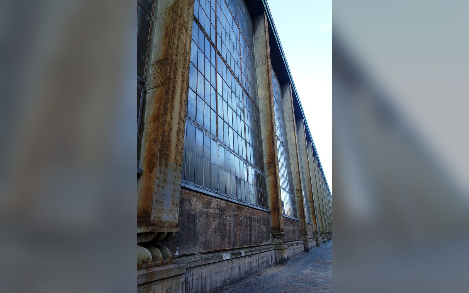
The next plate in Punchcutters: Peter Behrens at AEG, 1907.
Photo: AEG-Turbinenhalle, Huttenstraße 12-19, Berlin-Moabit, Bild 2 · Wikimedia Commons