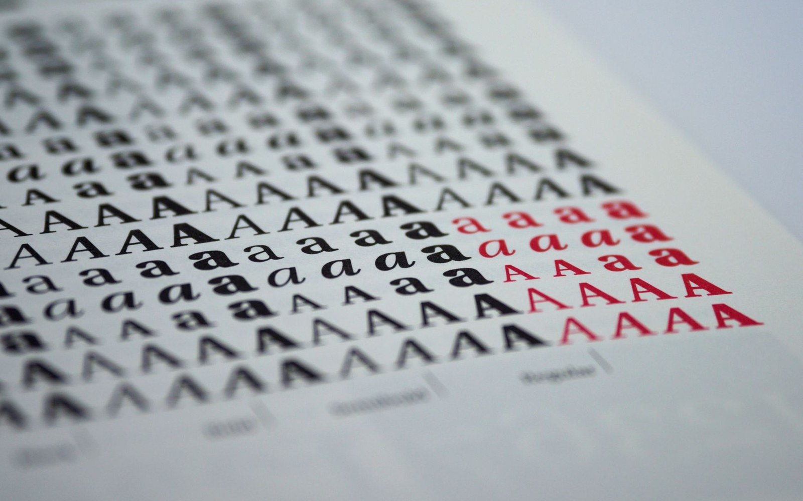
The Problem on Hoffmann's Desk
By the mid-1950s, Swiss designers had already begun reaching past their own country's foundries. Akzidenz-Grotesk, the grotesque — sans-serif, in European nomenclature — that the Berthold foundry had released in 1896, was the face they kept pulling from the drawer: neutral, serviceable, commercially proven. Eduard Hoffmann, director of the Haas Type Foundry in Münchenbuchsee, could see the problem plainly. Haas had its own grotesque, Haas Grotesk, but it was an inconsistent thing, its characters varying in stroke weight and proportion across sizes in ways that made disciplined composition difficult. If Swiss designers were going to use a grotesque, Hoffmann wanted it to be a Haas grotesque — and he wanted it to be better than what Berthold was selling.
In 1956, Hoffmann engaged Max Miedinger, a former Haas sales representative who had since established himself as a freelance graphic designer in Zurich. Miedinger knew the foundry's type intimately from his years selling it. The commission was specific: revise Haas Grotesk, correcting its optical inconsistencies while preserving the genre's essential character — the even stroke, the closed aperture, the absence of ornamental detail. Hoffmann tracked the project in his working notes, a correspondence and annotation record that documented each round of drawings and the decisions that shaped them.
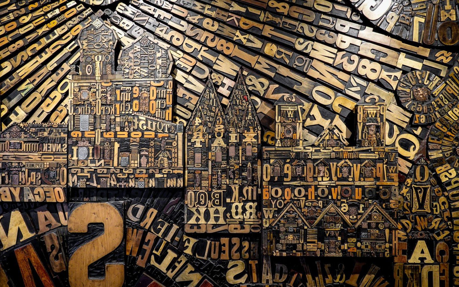
Metal and wood type were sorted, stored and locked up by face and size — the composing room was a filing system before it was a press.
Photo: Magda Ehlers / Pexels
Drawings, Corrections, and the Name That Sold It
Miedinger worked iteratively. His drawings were tested as metal type, proofed, and returned to him for adjustment. Hoffmann's notes — later studied by design historians working to establish an accurate production chronology — show a close dialogue between director and designer over the regularisation of stroke widths, the geometry of the bowl forms, and the spacing of the character set. The result, ready in 1957, was sharper and more internally coherent than the Haas Grotesk it replaced. The Haas foundry released it that year under the name Neue Haas Grotesk.
The name did not survive the foundry's commercial ambitions. When the German Stempel foundry — which held a stake in Haas — moved to distribute the design more widely and to adapt it for Linotype machine composition, a new name was needed. Neue Haas Grotesk was accurate but regional; it said Switzerland in German. Hoffmann proposed Helvetica, the Latinised adjective for Switzerland, derived from Helvetia, the Roman name for the territory. The rename landed in 1960. It was a marketing decision as deliberate as any design choice in the project: the Latin form felt international, classical, and rootless in the best sense — belonging to no single country.
The Stempel and Linotype adaptations that followed the 1960 renaming brought Helvetica to a vastly wider market than Haas could have reached alone. Phototypesetting, then digital formats, extended its reach further. By the time D. Stempel AG and Linotype had rationalised and expanded the family through the 1970s and 1980s, Helvetica had accumulated weights and widths that Miedinger's original drawings never anticipated.
Attribution remained a persistent complication. Miedinger received a flat fee for his work, no royalties, and limited public recognition during his lifetime; he died in 1980. Hoffmann's role as the directing intelligence behind the brief — the person who defined the problem, managed the process, and chose the name — was equally underacknowledged in popular accounts that preferred the simpler narrative of a single designer and a single stroke of inspiration. The Haas archive, and Hoffmann's own notes, tell a more collaborative and more commercial story.