Section 06 · 4 plates
When the work moved off paper it lost the ornament and kept the grid
From the Macintosh icon set to flat design — when graphic design moved off paper.
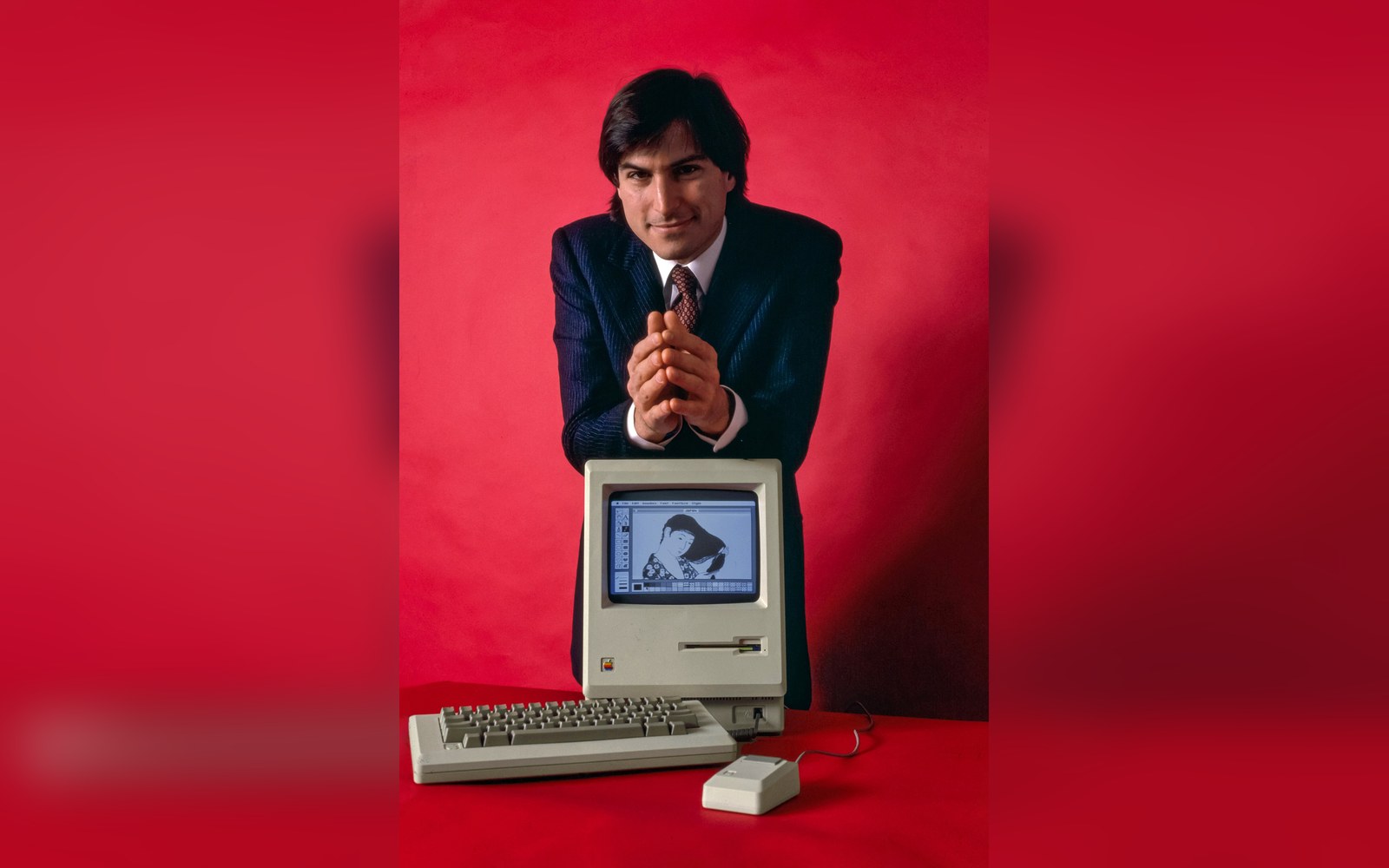
512 by 342 pixels, one bit deep: every icon on the screen had to survive being drawn on a 32-pixel square.
Photo: Steve Jobs and Macintosh computer, January 1984, by Bernard Gotfryd - edited · Wikimedia Commons
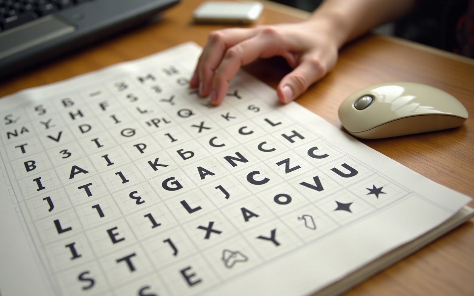
Plate 26 · leads the section
Susan Kare's Icons and the Vocabulary They Invented
Documents Susan Kare's 1983–84 work designing the Macintosh icon set — the 32×32 pixel grid, the trash can, the paint bucket, the Chicago typeface — as the first systematic attempt to make a graphical user interface readable to a general audience, and traces which metaphors she introduced that are still in operating systems today.
Read the piece-
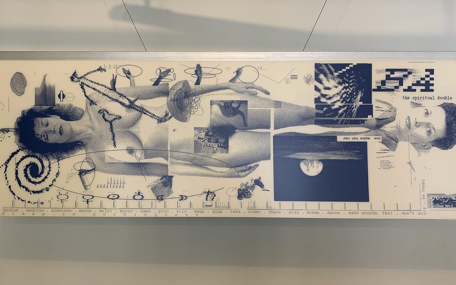
April Greiman Put a Computer on the Page in 1986
Covers Greiman's 1986 Design Quarterly poster — a single poster-sized Macintosh file, printed at actual scale, treating the computer's low resolution as texture rather than limitation — as the document that placed the Macintosh inside serious design discourse.
Plate 27 -

Neville Brody: From The Face to FontShop
Traces Brody's art direction of The Face (1981–86) and Arena, then his 1990 co-founding of FontShop with Erik Spiekermann, as two connected moments: the visual argument made on the printed page and its translation into a digital type distribution model that changed how designers bought faces.
Plate 28 -
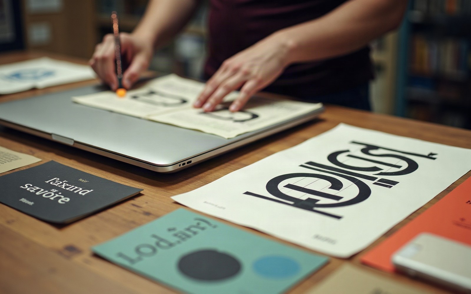
Flat Design After 2013: An Argument That Won Too Fast
Examines the shift from skeuomorphic to flat design in iOS 7 (2013) and the simultaneous move by Google's Material Design — treating it as a historical event with a traceable cause in mobile screen density rather than a pure aesthetic preference — and identifies what visual information was discarded when drop shadows and gradients were removed.
Plate 29
The other sections