The Document That Changed the Argument
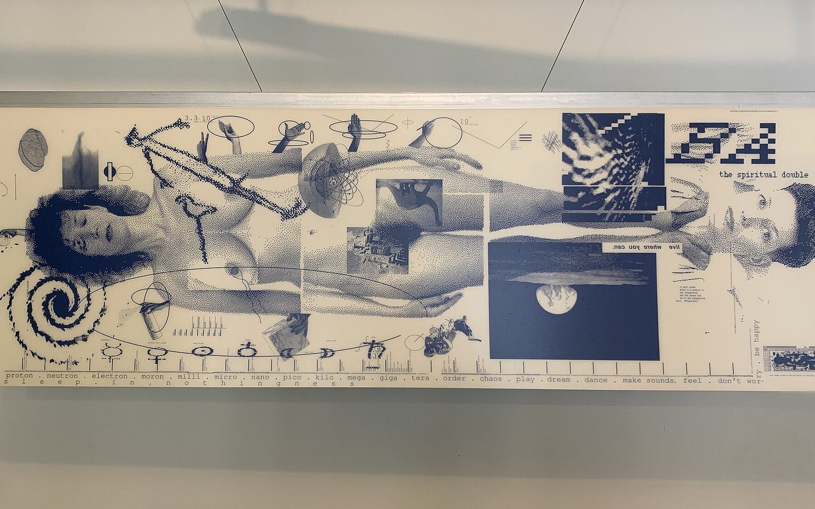
In 1986, Walker Art Center's Design Quarterly commissioned April Greiman to edit issue 133. She delivered not a magazine but a single sheet: a two-foot-by-six-foot poster, folded into the journal's format, that unfolded to reveal a full-length self-portrait assembled entirely on a first-generation Macintosh. The piece was titled Does It Make Sense? and it was produced two years after Greiman acquired her machine in 1984 — making the Macintosh itself the visible subject of the work, not merely its instrument.
Greiman built the image in MacPaint and MacDraw, the two applications Apple bundled with the original 128K Mac. MacPaint operated at 72 dots per inch — a resolution fine for a nine-inch screen, coarse at poster scale. Rather than disguise this, Greiman printed at actual size, letting the pixel grid read as texture. The jagged bitmapped edges of letterforms and body scans became compositional marks in their own right. What competing designers were treating as a technical embarrassment she treated as a formal property, continuous with the layered, hybridised imagery she had already developed through her studies at the Basel School of Design under Armin Hofmann and Wolfgang Weingart.
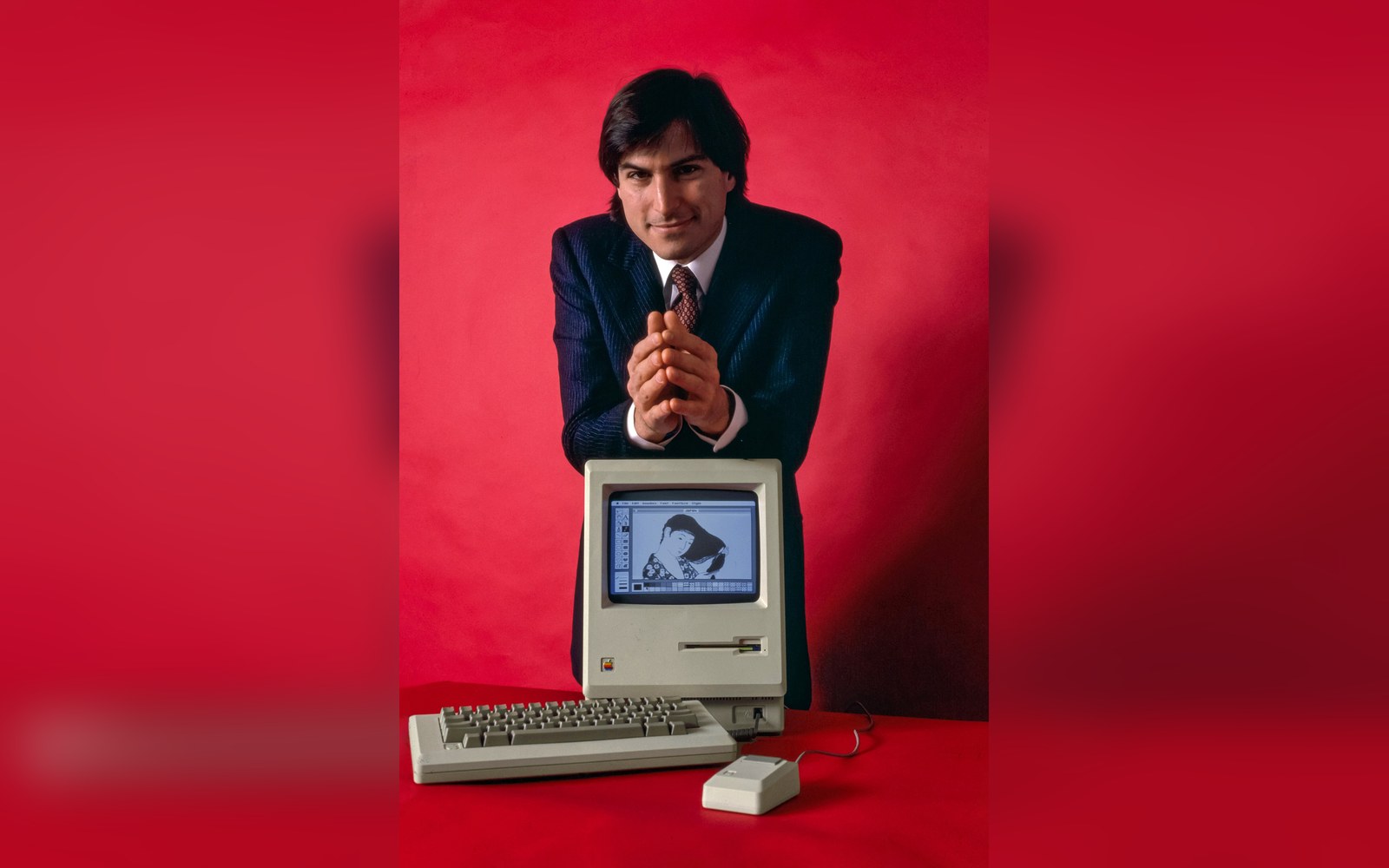
512 by 342 pixels, one bit deep: every icon on this screen had to survive being drawn on a 32-pixel square.
Photo: Steve Jobs and Macintosh computer, January 1984, by Bernard Gotfryd - edited · Wikimedia Commons
The output device was an Apple LaserWriter, introduced in January 1985, which printed at 300 dpi — enough to carry fine type but nowhere near enough to smooth the bitmap image data at two feet wide. The gap between screen resolution and print resolution was exactly what the poster documented. Greiman tiled and reassembled sections, working around the machine's memory limits, to construct a composite that was simultaneously a nude self-portrait, a meditation on digital space, and a desktop publishing argument made in public.
The Design Quarterly piece arrived at the moment when most of the profession regarded the Macintosh as a tool for secretaries producing newsletters. Greiman's poster did not argue that resolution was adequate; it argued that adequacy was the wrong standard. The pixelated body held the same compositional logic as her earlier layered transparencies and California New Wave work — eccentric, chromatic, densely collaged — transposed onto a medium the design establishment had not yet taken seriously.
The poster entered the collection of the Museum of Modern Art and is now routinely cited as the document that brought the Macintosh into serious design discourse — not when the hardware improved, but when a designer decided the hardware was already interesting enough.