The Screen Made the Decision
In June 2013, Apple unveiled iOS 7 under Jony Ive's design direction, replacing Scott Forstall's leather-stitched, linen-textured skeuomorphic interfaces with white space, thin letterforms, and translucent colour washes. The design press declared a revolution. What the press covered less carefully was the physical trigger: by 2013, the iPhone's Retina display had reached 326 pixels per inch. At that density, the rendered depth cues of skeuomorphism — drop shadows, bevels, embossed text — no longer read as sophisticated simulation. They read as noise. The screen had grown too precise for the metaphor.
Google formalised the same conclusion in 2014 with Material Design, a specification that retained a single structural idea from the old vocabulary — the shadow — but codified it as an elevation system rather than decoration. A card sits 2 dp above its surface; a dialogue sits 24 dp above it. Shadow became data, not atmosphere. The two largest software platforms had, within eighteen months, agreed that dimensionality belonged to logic, not illustration.
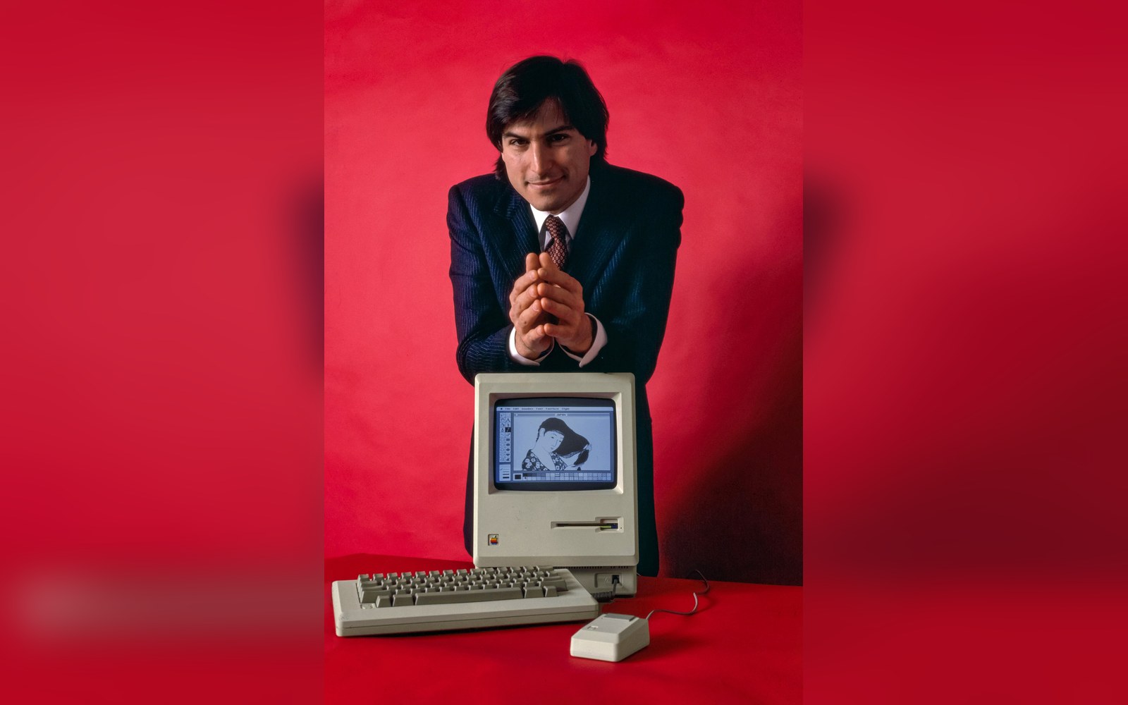
512 by 342 pixels, one bit deep: every icon on this screen had to survive being drawn on a 32-pixel square.
Photo: Steve Jobs and Macintosh computer, January 1984, by Bernard Gotfryd - edited · Wikimedia Commons
What Was Discarded
Skeuomorphism had real communicative work to do. A button that appeared raised invited a press; a toggle that looked mechanical suggested it had two states. These cues were not arbitrary nostalgia for physical objects — they were affordances in the technical sense first described by the psychologist James Gibson and applied to design interfaces by Donald Norman in The Design of Everyday Things (1988). When iOS 7 flattened those buttons, it removed the visual grammar that told a first-time user: this is pressable, this is not.
The immediate consequence was a wave of invisible buttons. Designers across the industry, following Apple's lead, stripped borders and shadows from interactive elements and replaced them with text in a brand colour. Blue meant tap, apparently — but only if you already knew. Accessibility researchers documented the problem promptly: users with low vision, older users, and users encountering a new interface without prior smartphone fluency consistently struggled to locate interactive regions when depth cues were absent. The flat turn had optimised for the experienced eye.
Type suffered a related problem. iOS 7 introduced Helvetica Neue Ultralight at display sizes, a choice that prioritised the aesthetic of thinness on a high-density screen without accounting for intermediate sizes, low-light conditions, or the full range of human vision. Apple replaced it with San Francisco by 2015 — a correction delivered quietly, without the announcements that had accompanied the original redesign.
The Argument and Its Limits
The flat turn was not wrong. At 326 ppi, a rendered leather texture is a category error: the screen cannot simulate grain convincingly, and attempting to do so wastes pixels on fiction rather than information. The International Style precedent — Josef Müller-Brockmann's insistence that form serve communication rather than decorate it — had a legitimate heir in the argument that interface elements should signal their function without mimicking physical materials they are not made of.
What flat design revealed, however, is that the Swiss grid argument translates imperfectly from print to touch. A printed page has no interactive regions; a reader never needs to guess which rectangle can be pressed. The entire vocabulary of affordance cues — highlights, shadows, borders — existed in interface design precisely because screens do something paper cannot: they respond. Stripping those cues in the name of visual cleanliness removed functional information in the name of aesthetic preference, then blamed the users who could not navigate the result for lacking design literacy.
The argument that flat design won was correct. The argument that it won on merit alone was not. Screen density forced the hand; the specific answers chosen — invisible buttons, ultralight type, colour as the sole wayfinding signal — were not forced by anything except the aesthetics of the moment. That those choices are now being quietly rolled back, through border returns, filled buttons, and increased weight in system fonts, suggests the field is finishing the calculation that started in 2013.
The next plate in Screens: Susan Kare's Icons and the Vocabulary They Invented.