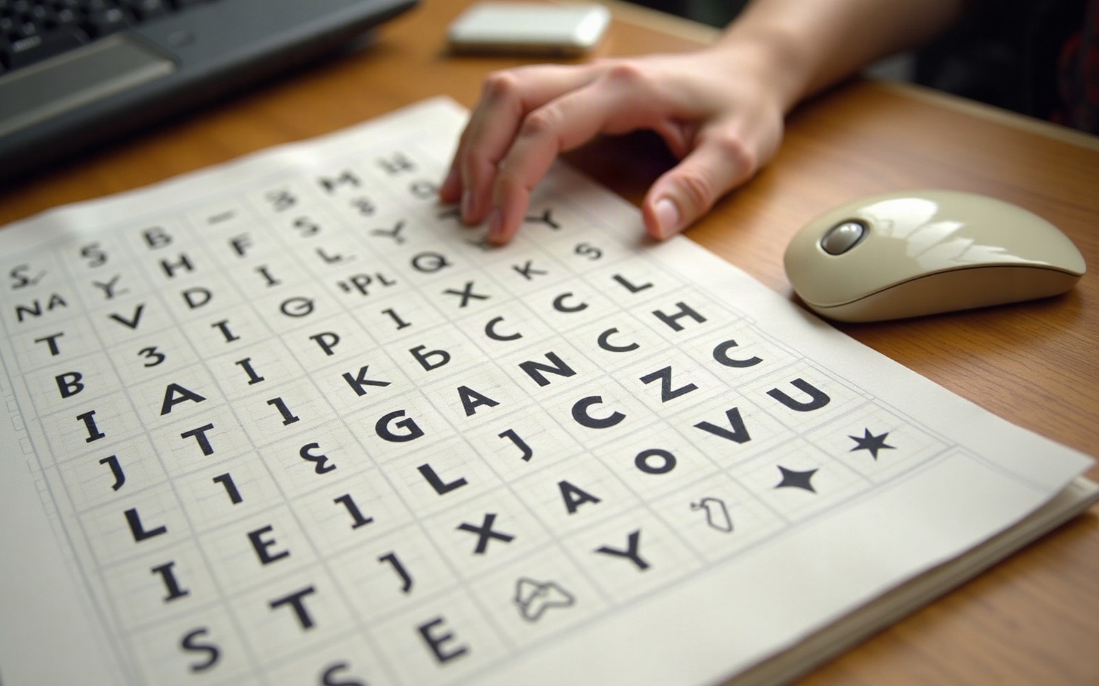
Icons for a machine nobody had used before: how a single designer gave the graphical interface its first working language.
A Grid as a Starting Point
In 1983, Apple hired Susan Kare — a sculptor by training, a calligrapher by practice — to solve a problem that had no precedent in commercial design: how to make a computer's graphical interface immediately legible to someone who had never operated a computer. The Macintosh, then still in development, would ship without a command line. Every action a user might take had to be readable as a small picture. Kare began with a sketchbook of grid paper, each square standing for one pixel on the 32×32 bitmap grid the system allowed. The constraints were absolute: no gradients, no anti-aliasing, no curves that the hardware could smooth. Every form had to read at 72 dots per inch on a nine-inch screen.
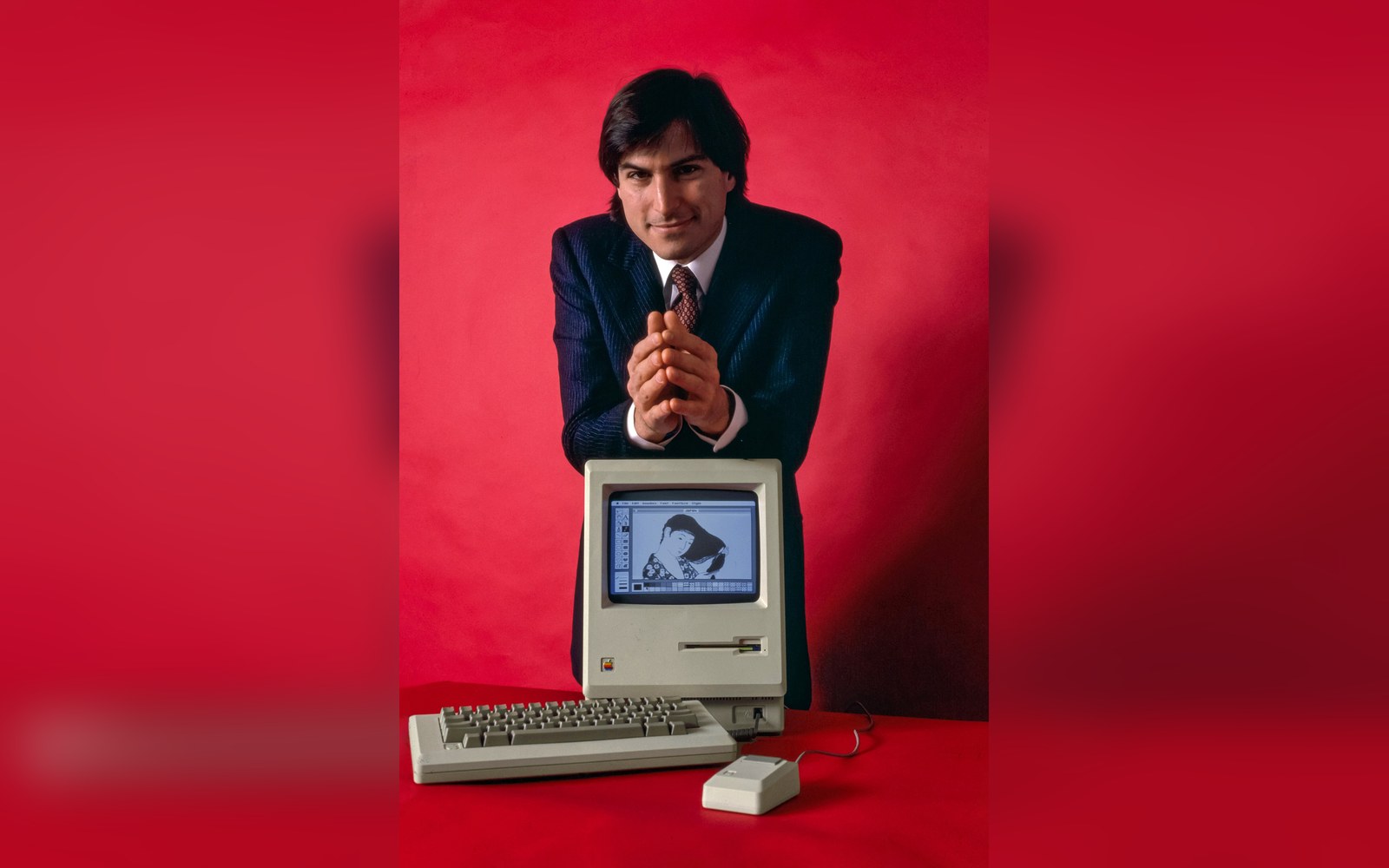
512 by 342 pixels, one bit deep: every icon on this screen had to survive being drawn on a 32-pixel square.
Photo: Steve Jobs and Macintosh computer, January 1984, by Bernard Gotfryd - edited · Wikimedia Commons
What Kare produced on that grid became the Macintosh icon set, released with the machine in January 1984. The trash can accepted files dragged to its position and bulged visibly when it held something — a detail of expressiveness rare in functional software. The paint bucket, the lasso, the pencil, and the hand cursor each named its own action without words. The wristwatch appeared when the system was processing, borrowing an object from everyday life to communicate the concept of waiting. These were not decorations appended to a product. They were a visual language written for general literacy, not specialist training.
Metaphors That Stayed
The desktop metaphor — files, folders, a trash receptacle — had been prototyped at Xerox PARC in the 1970s, and Apple engineers had seen it. But PARC's implementation was internal; Kare's was the version built for a consumer product launching to an audience with no inherited vocabulary for it. Her translation of abstract computing operations into physical-world objects was precise enough that many of her choices have never been replaced. The folder icon, flat and tabbed, is structurally unchanged in macOS decades later. The trash can became the Recycle Bin in Windows. The magnifying glass for search is her idiom, not an engineering one.
Alongside the icons, Kare designed the Chicago typeface — a bitmap font created for the Macintosh menu bar and system interface, drawn in Apple's Font Editor on the same pixel grid. Chicago was a functional object: clear at small sizes, legible on a low-resolution screen, authoritative enough to carry every menu label the operating system produced. It remained Apple's system typeface until Mac OS 8 replaced it with Charcoal in 1997; Mac OS X later adopted Lucida Grande. The typeface and the icons were conceived as a single system, and that coherence — form answering form — is what distinguished the Macintosh interface from everything running on competing hardware at the time.
Kare also designed the Chicago and Cairo symbol fonts, the latter carrying pictographic characters that filled gaps the icon set could not cover, as well as the playing-card suits and the universally recognised Command key symbol — the looped square that Apple adopted in place of the Apple logo after Steve Jobs objected to the logo's overuse in menus. The symbol had appeared on Swedish road signs denoting a place of interest; Kare found it in a symbol dictionary and proposed it. It has appeared on every Apple keyboard produced since 1984.
Influence Without Equivalent
Susan Kare's practice after the Macintosh launch moved through Microsoft — where she produced icons for Windows 3.0 in 1990 — through IBM, through NeXT, and into a long independent career. The icons she designed for early Facebook's virtual goods in the 2000s demonstrated that the same pictographic clarity scaled to new consumer contexts without losing coherence.
What the Macintosh icon set established, and what no graphical interface since has fundamentally replaced, is the category: a confined pixel field in which a drawn object substitutes for a verbal instruction. Every emoji, every app tile, every notification badge on a contemporary smartphone screen is a descendant of decisions Kare made on grid paper in 1983. The vocabulary she invented was not the only possible vocabulary. It was simply the first one legible enough to teach an industry.
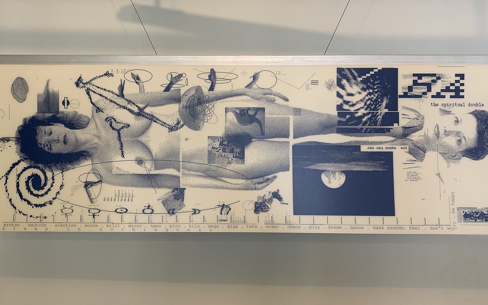
The next plate in Screens: April Greiman Put a Computer on the Page in 1986.
Photo: Design Quarterly 133 - Does It Make Sense · Wikimedia Commons