Section 04 · 4 plates
Signs are read at forty miles an hour, so they get drawn twice
Wayfinding as large-scale typography — Beck's diagram, Vignelli's subway, Kinneir and Calvert's roads.
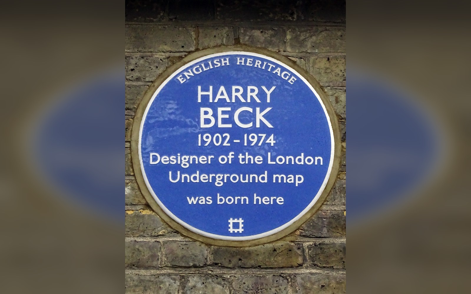
Beck drew the first diagram in his own time and on his own initiative, as a temporary draughtsman in the signals office.
Photo: Harry Beck 1902 -1974 designer of the London Underground map was born here · Wikimedia Commons
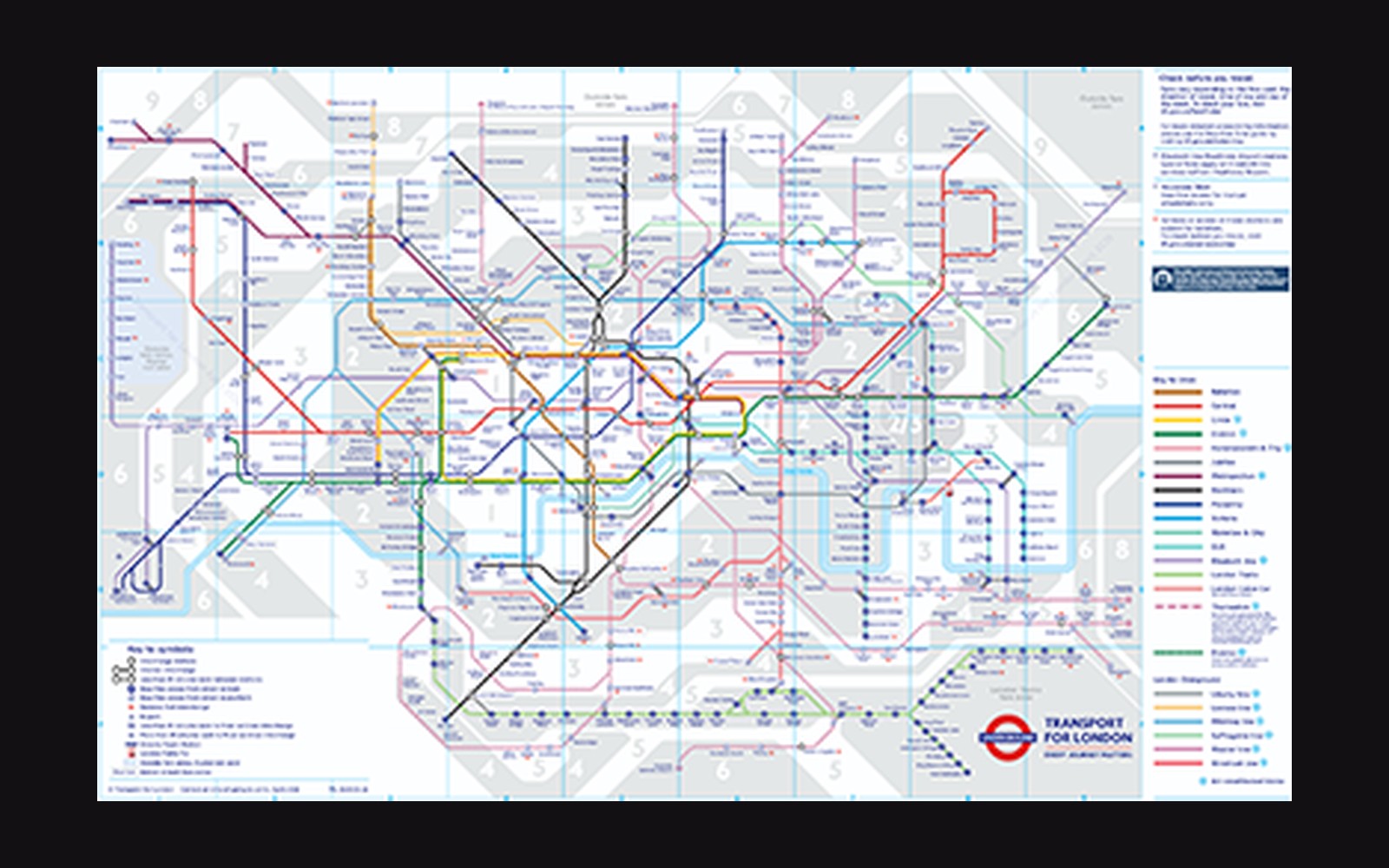
Plate 17 · leads the section
Beck's Diagram, 1933: Topology Over Geography
Examines Henry Beck's 1931 drawing and 1933 published London Underground map as an argument that a transit diagram should represent connections, not distances — the distortion of geography that makes the map usable, and the London Passenger Transport Board's initial reluctance to publish it. Uses the original printed poster as its primary document.
Read the piece-
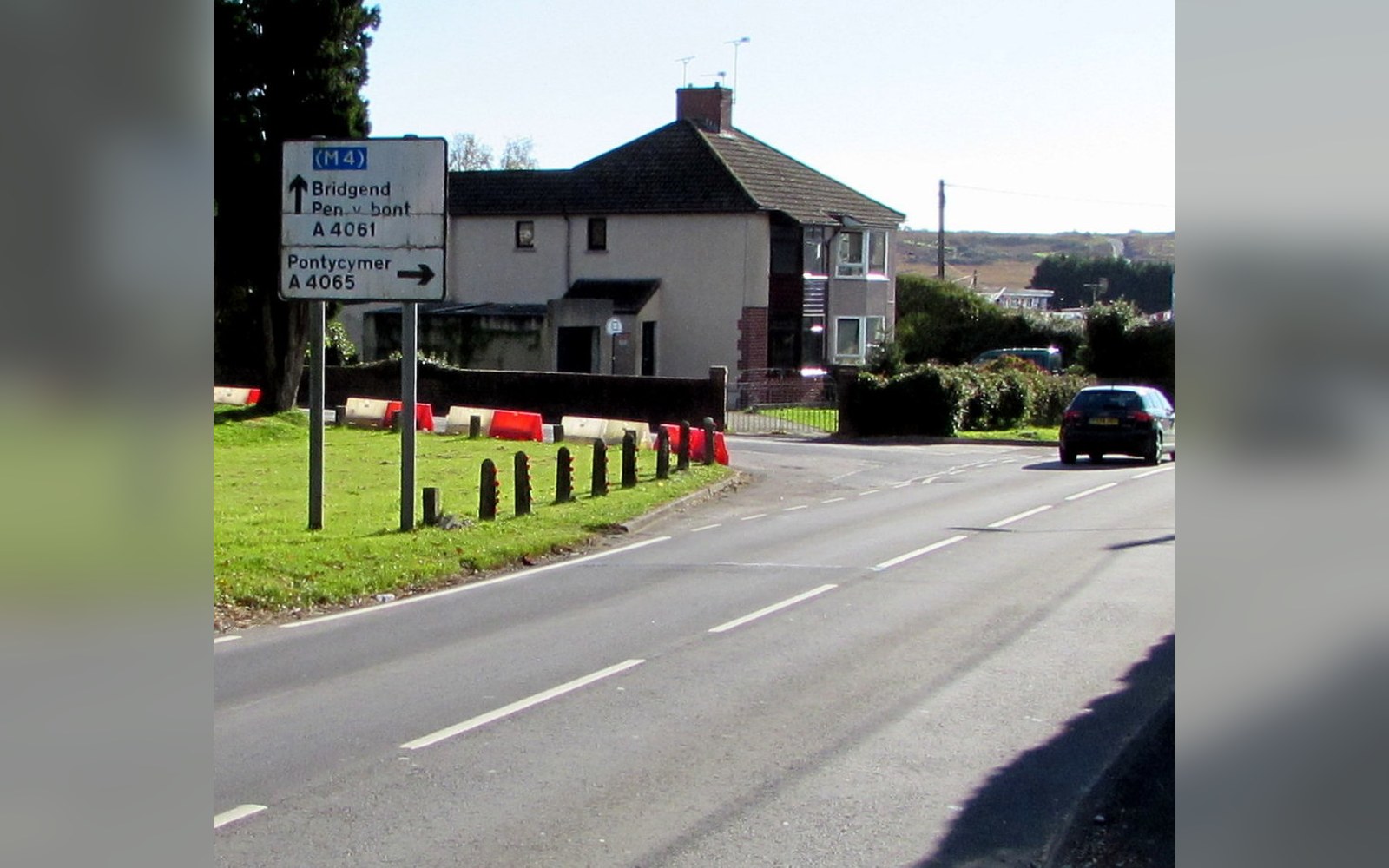
Kinneir and Calvert Redesigned Every Road in Britain
Follows the 1957 Anderson Committee commission that led Jock Kinneir and Margaret Calvert to design the complete British motorway and road sign system — the typeface, the symbols, the colour coding — implemented nationally between 1964 and 1966.
Plate 18 -

Vignelli's Map Was Right and the Riders Hated It
Reconstructs Massimo Vignelli and Bob Noorda's 1972 New York subway map for Unimark International — its strict 45-degree geometry, Helvetica throughout, the decision to misrepresent Central Park's shape — and the 1979 replacement by a geographically accurate version.
Plate 19 -
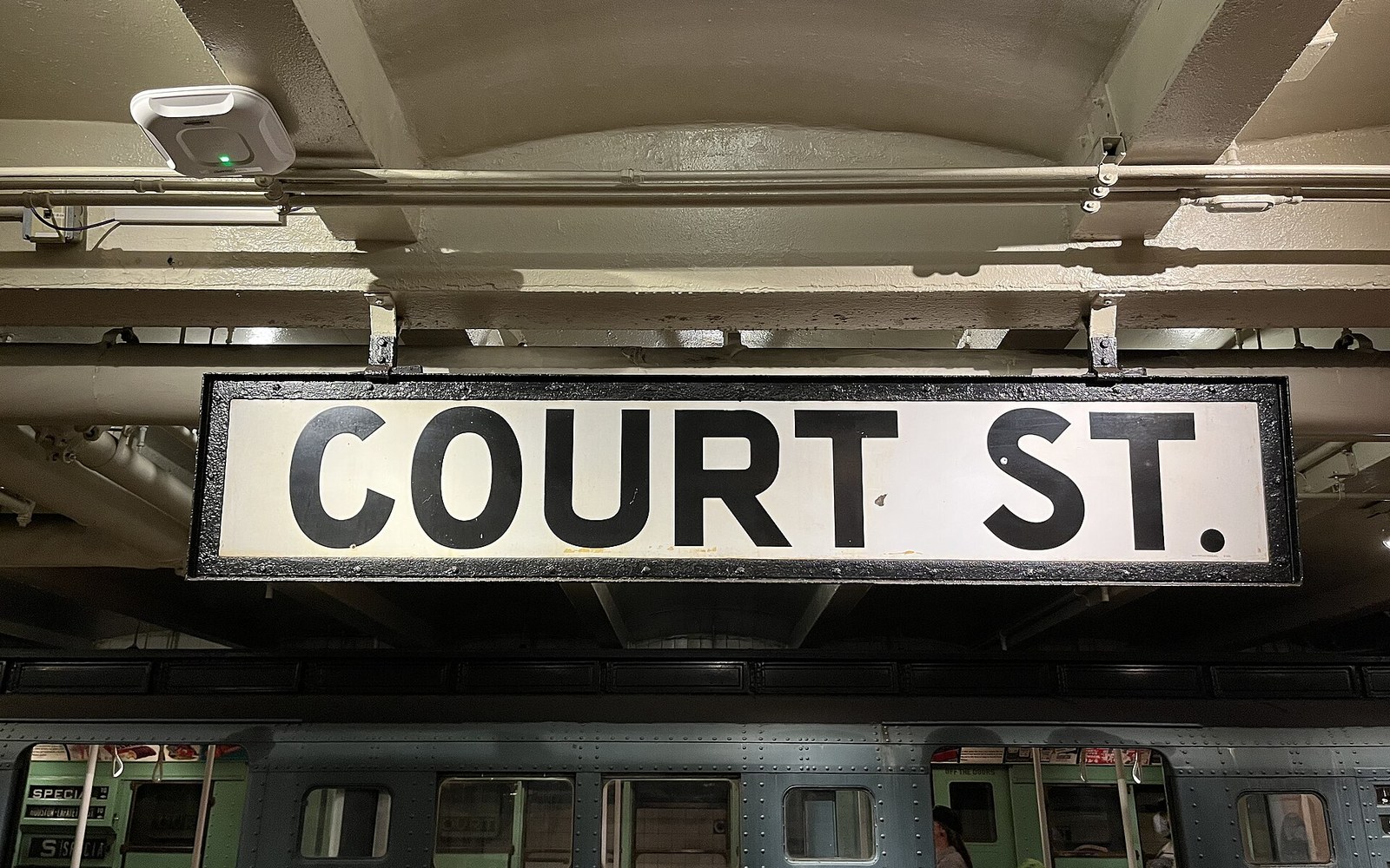
Unimark and the New York Subway Standards Manual, 1970
Describes the Unimark International standards manual commissioned by the New York Transit Authority — the grid system, Helvetica as the sole typeface, the colour-coded line identifiers — and how implementation was inconsistent enough that the system looked different at nearly every station.
Plate 20
The other sections