
The 1972 Map as a System
The New York City subway map Unimark International produced for the Metropolitan Transportation Authority in 1972 was not a depiction of the city. It was a diagram of a network. Massimo Vignelli and his Unimark colleague Bob Noorda — the same team behind the 1970 subway signage standards manual — applied the same logic to cartography that they had applied to wayfinding: strip the information to what a rider actually needs, and present it without interference from anything else.
Every line ran at zero, 45, or 90 degrees. Color coded the routes — a family of fifteen distinct hues, each assigned consistently. Helvetica set every label, at every scale, with no decorative variation. Geographic fidelity was treated as a competing value, and competition was resolved in favor of the diagram. Central Park, in reality a long rectangle running from 59th Street to 110th Street, was rendered as a square. The park's actual proportions were sacrificed to keep the Midtown grid legible. Queens appeared compressed; the outer boroughs shrank toward the center. What expanded was the dense subway network at the island's core, where the map's users most needed clarity.
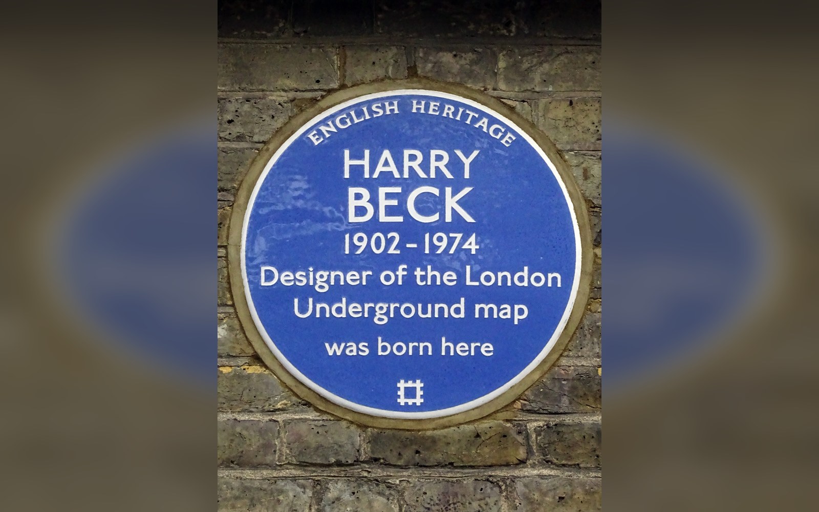
Beck drew the first diagram in his own time and on his own initiative, as a temporary draughtsman in the signals office.
Photo: Harry Beck 1902 -1974 designer of the London Underground map was born here · Wikimedia Commons
Henry Beck had made the same argument for London in 1933, and his diagram became canonical within a decade. Vignelli knew the precedent. A transit map, he consistently maintained, exists to tell riders which line to take and where to transfer — not to teach them the street grid or the shape of a borough.
What Riders Actually Objected To
The map appeared in 1972 and the objections were immediate. Riders in the outer boroughs complained that their neighborhoods had been made to look farther from one another than they were, or had disappeared from recognizable relation to anything they knew on the surface. The compressed geography of Brooklyn and Queens made transfers seem closer or farther than the street-level reality. A rider emerging from an unfamiliar station could not orient herself to the surrounding neighborhood by consulting the map, because the map had no interest in neighborhoods.
This was not a misuse of the map — it was, by Vignelli's own logic, outside the map's purpose. But that purpose was not one the MTA had successfully communicated, and it was not a purpose that felt self-evident to someone holding the map on a platform in Flatbush. New Yorkers were already mistrustful of city institutions after years of fiscal crisis, and a map that visibly distorted their borough registered as institutional condescension toward residents who didn't live in Manhattan.
The criticism was sustained. Coverage in newspapers framed the map as an aesthetic experiment imposed by designers who privileged theory over usability. The MTA, under ongoing financial pressure and public scrutiny, lacked the institutional confidence to defend the diagram on its merits.
The 1979 Replacement
In 1979 the MTA replaced Vignelli and Noorda's diagram with a geographically faithful map drawn by John Tauranac and produced under his direction. Streets ran at the angles they actually ran. The parks approximated their real shapes. The outer boroughs expanded to something closer to their proper scale. It was legible to anyone who already knew New York from the street. It was also, by most measures of information design, harder to read as a transit network — the diagonal lines crossing the grid at non-45-degree angles, the visual density at transfer points, the competing demands of geography and route logic pulling against each other on a single surface.
Vignelli called the replacement ugly for the rest of his life, and he was not alone in that judgment. The 1972 map has since been exhibited at the Museum of Modern Art, which holds it in its permanent collection as a designed object of record. A limited reissue in 2008 sold rapidly. The argument it embodies — what a map is actually for, and who gets to decide — has not resolved. The Tauranac map's descendants are still in service. Vignelli's diagram remains on museum walls.
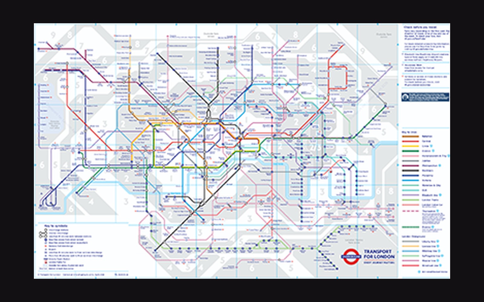
The next plate in Sign Systems: Beck's Diagram, 1933: Topology Over Geography.
Photo: Tube map · Wikimedia Commons