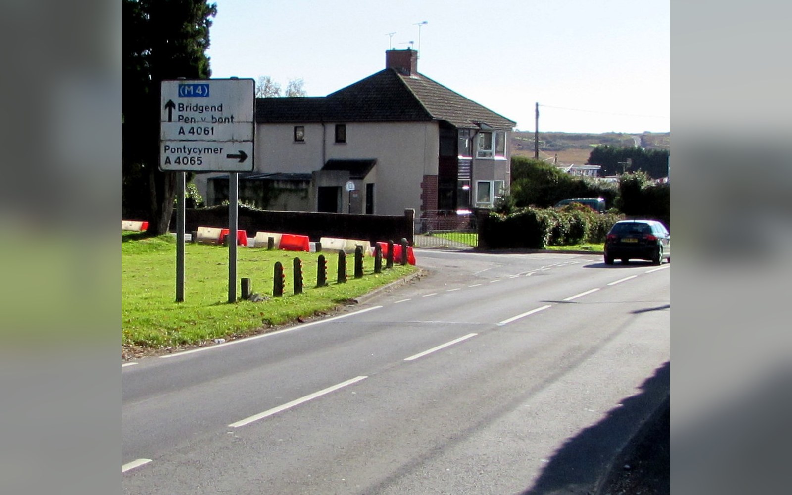
The Commission That Came From a Crisis
Britain's postwar road network was growing faster than anyone had planned for. The existing sign system, developed piecemeal since the 1920s, mixed typefaces, proportions, and conventions in ways that made little sense at speed. In 1957 the Ministry of Transport appointed the Anderson Committee — formally the Committee on Traffic Signs — to recommend a complete overhaul. The committee turned to Jock Kinneir, a designer who had already lettered the signs for Gatwick Airport, and his junior collaborator Margaret Calvert.
Kinneir had studied at Chelsea School of Art and established an independent practice before this commission found him. Calvert, then in her early twenties, had trained under him at Chelsea and joined his studio in 1957. The partnership would prove definitive: Kinneir led the strategic relationship with government, while Calvert took an increasingly central role in the design work itself. By the time the system reached its final form, her contributions had shaped its visual identity as much as his.
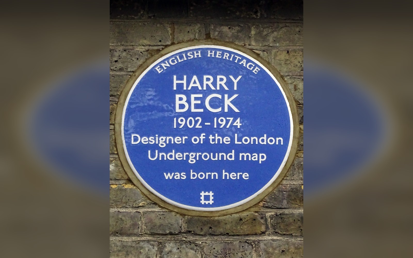
Beck drew the first diagram in his own time and on his own initiative, as a temporary draughtsman in the signals office.
Photo: Harry Beck 1902 -1974 designer of the London Underground map was born here · Wikimedia Commons
Their first task was the motorway network. The M1, Britain's first long-distance motorway, opened in November 1959, and its signs — white lettering on blue, in a new typeface Kinneir and Calvert had drawn specifically for the purpose — went with it. That typeface, Transport, used mixed-case letters rather than capitals throughout: the descenders and ascenders of lower-case letterforms create a more distinct word-shape at a glance, making identification faster at motorway speeds. The decision ran against common sign-making practice of the time, and it was right.
From Motorways to Every Road in the Country
The Anderson Committee's interim recommendations addressed motorways, but the Worboys Committee, appointed in 1961 and named for its chairman Walter Worboys, extended the brief to the entire British road network. Kinneir and Calvert retained the commission. What followed was a typographic and pictographic system designed to work at every scale, from the motorway gantry to the village junction.
The Transport typeface was refined through this period, eventually issued in two weights — Medium for light lettering on dark backgrounds, Heavy for dark lettering on light — the lighter Medium weight compensating for the optical effect of halation around pale lettering on night-time signs. Colour-coding distinguished road category: blue for motorways, green for primary routes, white for local roads. The logic was clear enough to be learnt in minutes and retained permanently, which is precisely what a wayfinding system requires.
Calvert's specific contribution to the pictograms is well documented. She redrew many of the symbolic warning signs that the British system had previously borrowed from European conventions, replacing stylised figures with images drawn from her own observation. The silhouette of a child used in the school warning sign is based on a girl at the primary school Calvert herself had attended. The cattle sign uses a Friesian cow she studied directly. These are not decorations: they are functional images engineered for recognition at a distance and in peripheral vision, and the deliberateness of their sourcing is part of what makes them work. The symbols Calvert produced remain on British roads without meaningful alteration.
The completed system was implemented nationally between 1964 and 1966 under the Traffic Signs Regulations and General Directions 1964, which gave the design statutory force. Every local authority was required to conform. The signs that went up were not suggestions.
What Endured and Why
The Kinneir–Calvert system has survived more than six decades of road policy, successive governments, and periodic reviews that each arrived at the same conclusion: there is nothing to replace. The Transport typeface was extended and digitised to allow more recent production methods without disturbing the letterforms. The colour conventions have remained untouched. The pictograms Calvert drew in the early 1960s were redrawn for digital use but not redesigned.
What makes the system durable is not nostalgia but fitness. Kinneir and Calvert solved a specific problem — legibility, hierarchy, and comprehension under the particular conditions of vehicle travel — with enough rigour that the solution has not been improved upon. The Anderson and Worboys commissions produced, in the end, one of the most consequential acts of institutional design in British history, executed by two people working in a small studio, on a timetable, for a government that needed something to put on roads.
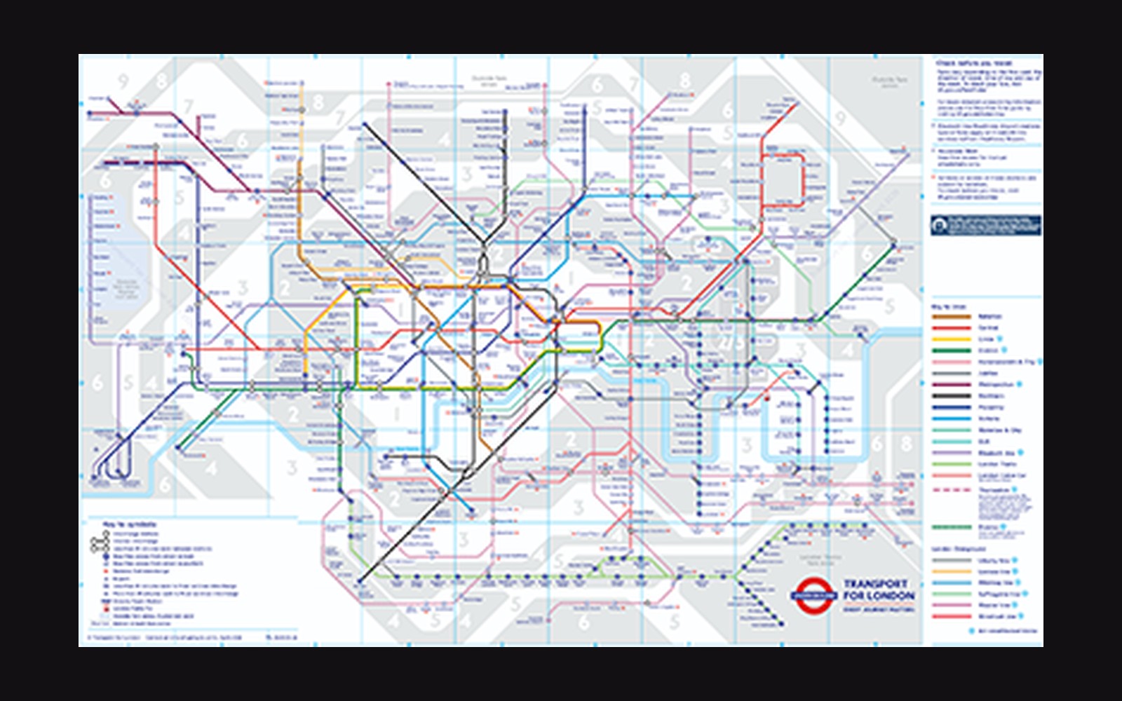
The next plate in Sign Systems: Beck's Diagram, 1933: Topology Over Geography.
Photo: Tube map · Wikimedia Commons