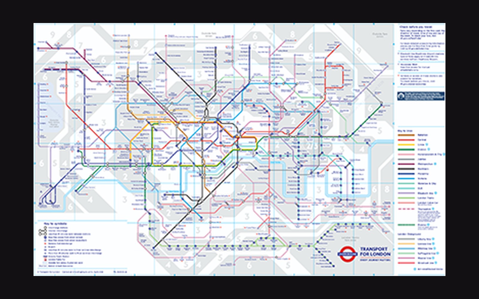
The Problem a Geographer Could Not Solve
By the early 1930s, the London Underground had accumulated roughly seventy years of incremental expansion without a map adequate to it. The official diagrams of the period plotted stations against actual surface geography: lines curved where tunnels curved, stations bunched together in the dense centre and spread thin at the suburban ends, and the River Thames wound through in approximate truth. The result was a document that told you where stations sat in relation to Mayfair or Bermondsey but gave almost no help to a rider deciding where to change trains. Accuracy, in this case, was the problem.
Henry Charles Beck was a twenty-nine-year-old engineering draughtsman employed as a temporary staff member by the Underground Group's signals office when, in 1931, he produced on his own initiative a reworked diagram of the entire network. His working method was direct: he set aside the surface map entirely and drew only the connections. Lines ran at horizontals, verticals, and forty-five-degree diagonals. Station spacing was regularised so that no single section of line dominated the sheet. The Thames was retained — compressed and schematised into a gentle curve — because Beck judged it the one geographic reference point riders needed to orient themselves. Everything else was topology, not cartography.
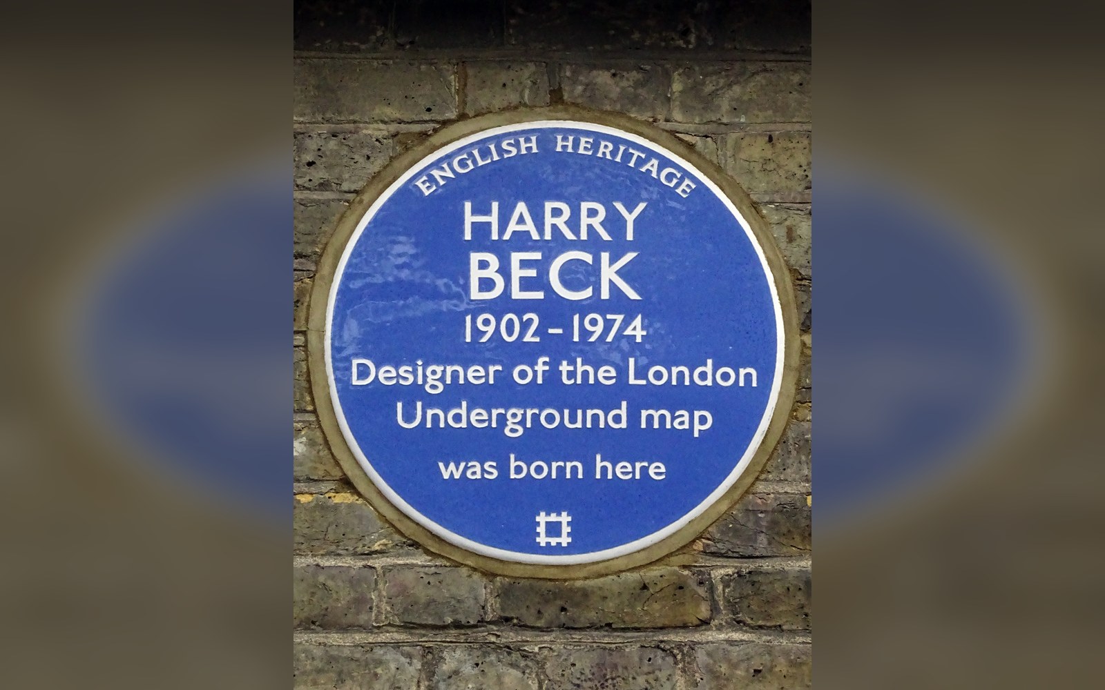
Beck drew the first diagram in his own time and on his own initiative, as a temporary draughtsman in the signals office.
Photo: Harry Beck 1902 -1974 designer of the London Underground map was born here · Wikimedia Commons
The Board's Reluctance and the 1933 Publication
Beck submitted his drawing to the publicity department of the Underground Group in 1931. The response was cautious. Staff who reviewed it doubted whether the public would accept, or understand, a map so openly distorted from the city it represented. It was a typical concern for the period: most transit authorities assumed passengers wanted geographic fidelity, even at the cost of legibility. The Underground's publicity manager at the time, Frank Pick, had done more than almost anyone to professionalize the network's visual communications — commissioning Edward Johnston's sans-serif lettering in 1916 and establishing a consistent poster programme — but even that framework offered no ready precedent for a diagram this abstract.
The department held Beck's design for two years. It was published in 1933 as a pocket-sized folding card distributed free at stations. The print run was small, intended as a trial. Riders requested more copies almost immediately. A larger folding version followed, and within a few years the diagram had become the primary public document of the network, displacing the geographic maps that had served since the 1880s.
What the 1933 edition showed was already substantially the design that has persisted. Coloured lines distinguished by hue; interchange stations marked with a distinctive ring or diamond; station names set in Johnston lettering at a consistent angle; the central area opened up and the outer reaches compressed relative to geography. Beck subsequently revised the diagram many times through the 1940s and into the 1950s as the network expanded, though his relationship with London Transport — the successor body formed in 1933 — became contentious over attribution and payment.
The Argument Embedded in the Lines
Beck's diagram made a legible and replicable argument: that a transit network is not a geographic object but a relational one. A passenger boarding at Hammersmith needs to know how many stops to Earl's Court, whether to change there or at South Kensington, and which direction to travel. They do not need to know that the line between those stations follows a specific curve or that the surface distance between them is larger or smaller than it appears. The map that answers the actual question is not the accurate one.
This insight — which seems obvious once stated — was resisted by cartographic convention and by institutional inertia for longer than the diagram's eventual success might suggest. Beck arrived at it through training in electrical circuit drawing, a practice in which schematic diagrams routinely substitute clear relational logic for physical fidelity. A wiring diagram shows what connects to what; it makes no claim about the lengths of the wires. Beck applied that logic to a transit system, and the fit was close enough that the diagram has never seriously been challenged on structural grounds.
The distortions it introduces are real and occasionally consequential. Stations that appear a short distance apart on the diagram — the cluster around King's Cross and St Pancras, or the run from Bond Street to Oxford Circus — may be walkable in ways that other apparently similar gaps are not. For decades, Transport for London has published supplementary walking-time maps precisely because the Beck diagram suppresses that information. The tool that makes the network navigable creates its own category of misinformation; the two documents coexist as complementary instruments.
Afterlife and Influence
Topological diagrams have since become the standard form for metro and rail networks around the world. The form spread rapidly: New York, Paris, Tokyo, and Moscow each adopted versions of the principle as their systems expanded beyond the point where geographic maps remained useful. Lance Wyman's work on Mexico City's metro in the late 1960s, which used graphic symbols at each station to assist non-literate riders, operated within the topological framework Beck had established without departing from it. The 1972 New York subway map by Massimo Vignelli — more geometric than Beck's, more aggressively schematic, and ultimately rejected by riders who missed their borough outlines — was in many respects a radicalisation of Beck's argument taken further than the public was willing to follow.
Beck himself received no royalty arrangement from London Transport and was eventually credited on the diagram only intermittently during his lifetime. He continued refining the design until the early 1960s, when London Transport began commissioning updates from other designers. He died in 1974. The diagram he drew without commission in 1931 and published in 1933 remains, in its essential structure, the operative map of the London Underground — and the founding document of transit diagram design worldwide.
The next plate in Sign Systems: Kinneir and Calvert Redesigned Every Road in Britain.
Photo: M4 motorway direction sign, Blackmill Road, Bryncethin - geograph.org.uk - 5958794 · Wikimedia Commons