The Object and Its Commission
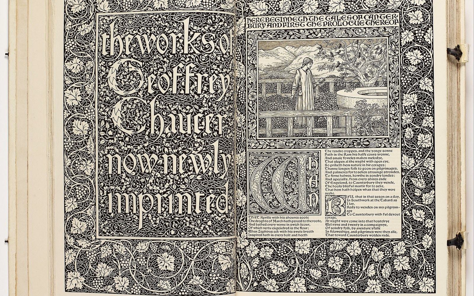
William Morris began planning the Kelmscott Chaucer in 1892, four years before it was finished and the year he died. The Press he had founded in Hammersmith in 1891 had already issued shorter books in smaller editions, but the complete works of Geoffrey Chaucer was a different proposition: a folio-format monument that would require a new typeface, a purpose-designed page grid, hand-made paper produced to specification, and eighty-seven woodcut illustrations drawn by his oldest collaborator, the painter Edward Burne-Jones. The colophon of the finished book — dated 8 May 1896, recorded in the British Library's copy — identifies the printer as William Morris and the publisher as Kelmscott Press. Every material decision embedded in that colophon represents a specific refusal: of machine-set type, of wood-pulp paper, of the industrial page.
The typeface chosen was the Chaucer type, a Gothic face and a smaller version of Morris's Troy type. Only the Golden type, by contrast, was cut from close study of Nicolas Jenson's roman of 1470 — Morris worked from photographic enlargements of Jenson's pages, tracing the optical weight and bracketed serifs that he believed industrial foundries had systematically thinned and weakened over four centuries. The Golden type, Morris's firsttypeface, established the model; the Chaucer type reduced it to fit the folio's text column without sacrificing its density. Morris regarded the colour of a page — the visual weight of inked type against paper — as a moral measure of a book's quality. His type needed to sit dark and solid on the page, the way incunabula did, not pale and mechanically even, the way Victorian book pages did.
The band colour did the shelving: orange fiction, green crime, blue biography, decided before the cover was designed.
Photo: Esra Afşar / Pexels
Paper, Ink, and Four Years of Making
The paper came from Joseph Batchelor's mill in Kent. Morris gave Batchelor detailed instructions: the sheet had to be made from linen rag, not wood-pulp; it had to carry a watermark — a perch with a spray of apple — specific to Kelmscott Press; and it had to be sized to take a dense impression without bleed. The mill produced paper to those specifications for the entire run of 425 copies on paper (a further thirteen were printed on vellum, itself sourced to separate order). The ink was mixed to Morris's direction: dense, high-pigment black with a slight warmth, closer to the iron-gall inks of medieval manuscripts than to the thin, fast-drying compounds favoured by commercial Victorian printers. Letterpress at this weight and on this paper required careful dampening of the sheet before impression and slow drying afterward. Nothing about the process was optimised for speed.
Burne-Jones began drawing the illustrations as early as 1893. His figures — pilgrim portraits, narrative scenes from the Tales, a title-page composition — were translated into woodcut by William Harcourt Hooper, a professional engraver who worked closely from Burne-Jones's pencil drawings rather than interpreting them freely. The Arts and Crafts movement had theorised a unity of design and craft, but the Chaucer's woodcuts were deliberately divided: Burne-Jones drew, Hooper cut, Morris composed the borders and ornamental initials that frame both. The borders — fourteen distinct designs running through 556 pages — were cut by Hooper from Morris's own drawings, dense with acanthus, vine, and rose. The page as Morris assembled it left almost no white; text, image, and ornament press against each other in deliberate imitation of the fifteenth-century manuscripts he kept in his study.
The edition sold out before it was bound. At twenty pounds per copy for the paper edition — many times the weekly wage of a skilled craftsman — it reached collectors, not the working-class readers Morris claimed in his lectures to want. That contradiction was not lost on contemporaries, and Morris himself acknowledged it. But the Chaucer was not primarily a commercial product. It was a demonstration object: proof that a book could be made as a unified visual system — type, paper, illustration, border, and binding considered as a single designed whole — at a moment when British book production had almost entirely surrendered that ambition to the machine.