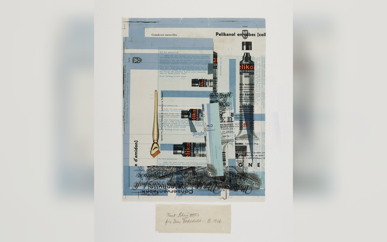
The Book and Its Prohibitions
Published in Berlin in 1928 by the Bildungsverband der Deutschen Buchdrucker, Die neue Typographie was Jan Tschichold's systematic case against everything typographic convention had sanctioned. Centred composition was declared irrational — an arbitrary distribution of weight that served aesthetics over communication. Serif typefaces were condemned as relics of a calligraphic past, incompatible with modern life and machine production. Historical ornament, decorative borders, and symmetrical layout were banned outright. In their place: sans-serif type, asymmetric arrangement, and a functional hierarchy guided by content rather than tradition.
The book practised what it preached. Set in a grotesque — the category of sans-serif then dominant in German print — and laid out with deliberate asymmetry, it was itself a specimen of its argument. Rule lines served as structural devices, not decoration. White space was load-bearing.
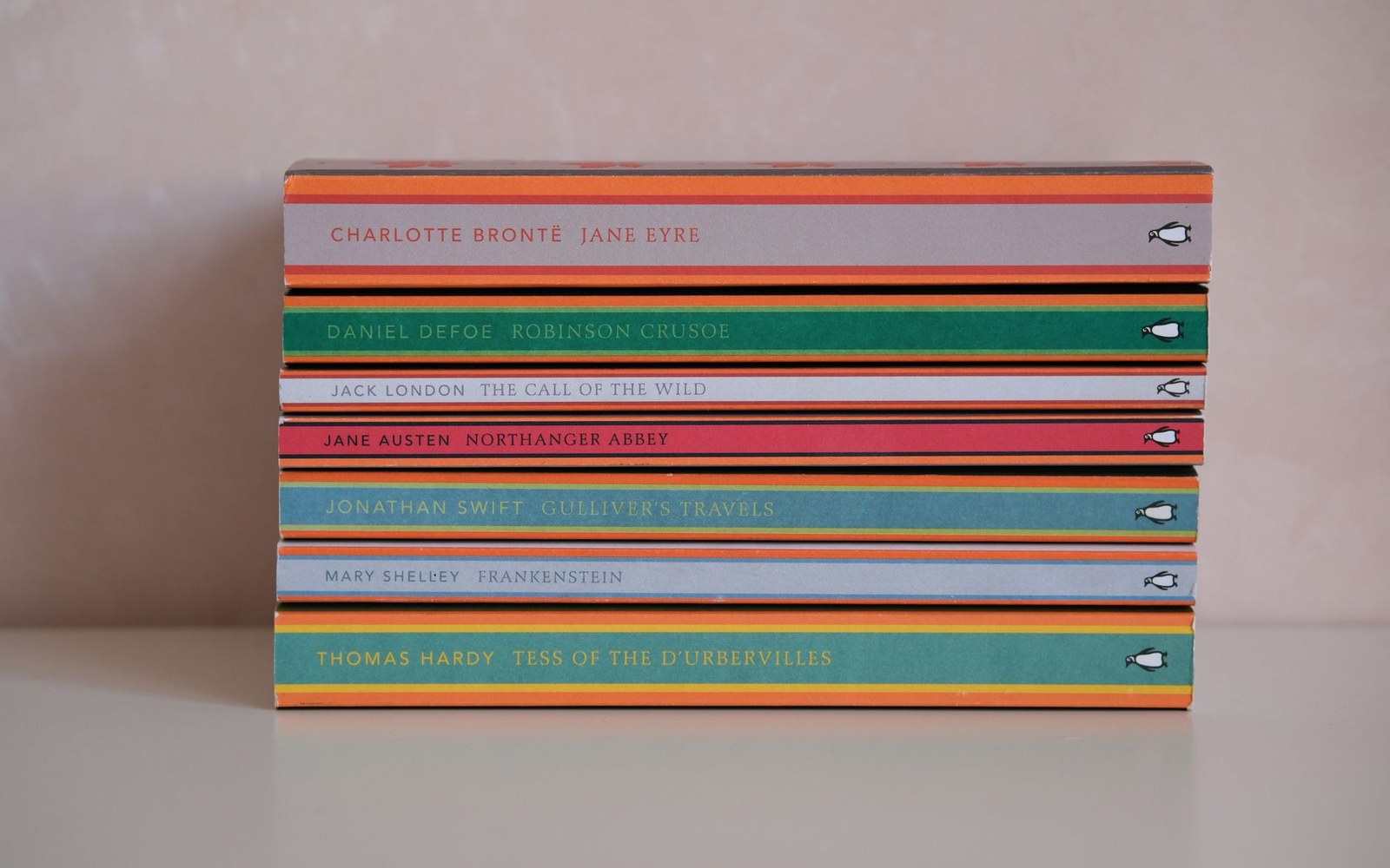
The band colour did the shelving: orange fiction, green crime, blue biography, decided before the cover was designed.
Photo: Esra Afşar / Pexels
Tschichold had absorbed the lessons of the Bauhaus and of El Lissitzky's constructivist typography. He synthesised them into a prescriptive manual aimed not at artists but at working printers across Germany. That audience — trained in compositors' rooms, not avant-garde studios — was precisely why the tone was legislative rather than exploratory.
What He Later Withdrew
By 1946, Tschichold had repudiated the manifesto's most absolutist positions. Working at Penguin Books in London from 1947, he redesigned the firm's entire list using classical typefaces and centred titling — the exact composition Die neue Typographie had condemned. He publicly described his earlier dogmatism as dangerously close to the totalitarian thinking he had fled when the Nazis arrested him in 1933.
The prohibition on serif type did not hold. The insistence on functional hierarchy — that every typographic decision should serve the reader's comprehension — survived, stripped of its ideological scaffolding, and entered the working vocabulary of every serious typographer who followed.