The Letter as Manifesto
Paul Renner began drawing what would become Futura in 1924, working from a conviction that the roman alphabet's classical forms could be reduced to their geometric essentials — circle, triangle, straight line — without losing legibility or dignity. The Bauer foundry in Frankfurt released the face commercially in 1927, and the specimen sheets issued that year made the argument explicit: here was a typeface for the present, free of the historical ornament that Renner believed German printing had carried too long.
The timing was deliberate. German typographic culture in the 1920s was a battlefield. Blackletter — the cluster of gothic scripts that nationalists associated with German identity — still dominated official and commercial printing. Against that, the Bauhaus had been promoting asymmetry, sans-serif type, and what Herbert Bayer called a universal alphabet stripped of upper-case letters. Renner occupied different ground: he was not a Bauhaus member, and Futura retains capitals and classical proportion. But the typeface's geometric discipline put it firmly on the modernist side of the argument.

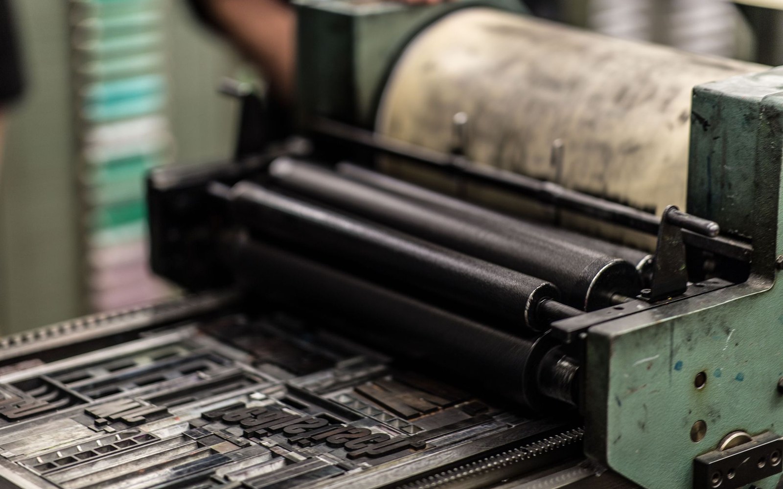
Wood type was cut for sizes too large to cast in metal, and sorted by face and size rather than by alphabet.
Photo: Erik Mclean / Pexels
The Bauer foundry's campaign to sell Futura internationally was aggressive and well-organised. Specimen sheets reached printers in Britain, the United States, and across continental Europe. The foundry positioned the face explicitly as die Schrift unserer Zeit — the typeface of our time — a phrase that appeared on promotional material and lodged in the profession's memory. Bauer also released Futura in a systematic range of weights, from Light through Bold to the extra-condensed Display variants, giving designers a coherent family rather than an isolated cut.
Futura Against Gill Sans
By 1928 the commercial competition had a name: Gill Sans, issued by the Monotype Corporation and designed by Eric Gill in Britain. The two faces occupied similar market territory — the progressive, modern, sans-serif end of the type catalogue — and competed directly for the same advertising agencies, publishers, and progressive printers throughout the early 1930s.
Gill Sans and Futura are not, however, the same argument. Gill drew humanist forms, with stroke variation and proportions that recall the broadpen letterforms underlying the roman tradition. Futura's strokes are mechanically even; the o is a near-perfect circle; the lowercase a is the single-story form derived from geometric construction. Renner was proposing that the letter could be rebuilt from scratch on rational principles. Gill was proposing that the best sans-serif would remember where letters came from.
Both claims had adherents. Futura moved rapidly into European advertising, where its geometry photographed cleanly and scaled well across large formats. Gill Sans became, through Penguin Books and London and North Eastern Railway, the face of a certain kind of British institutional modernity. Renner's typeface found its way into the work of American advertisers and modernist designers who had seen the Bauer specimens; it was, by the mid-1930s, among the most widely used typefaces in the world.
The Longer Consequence
Renner's own politics complicated Futura's nationalist reception. He was publicly critical of National Socialist cultural policy, and in 1933 was dismissed from his directorship of the Munich School of Master Book Printers. The regime he had implicitly argued against, by producing a geometric and internationalist typeface, had no use for him personally. Futura itself persisted in German printing regardless, its geometry apparently legible to more than one ideology.
The face's durability lies precisely in what made it polemical in 1927: its refusal to lean on historical precedent. That quality made it portable across periods and cultures — Volkswagen, NASA's Apollo programme graphic materials, Louis Vuitton's luggage branding all drew on Futura's authority without requiring any knowledge of the original argument. The geometric structure carries conviction whether or not a viewer reads it as a position in a Weimar-era debate about German national identity.
What the Bauer specimen sheets announced in 1927 — that this was the letter form modernity had been working toward — turned out to be a claim that kept finding new buyers in every subsequent decade.
The next plate in Typefaces: Akzidenz-Grotesk: The Face Helvetica Answered.
Photo: Wendelin Jacober / Pexels