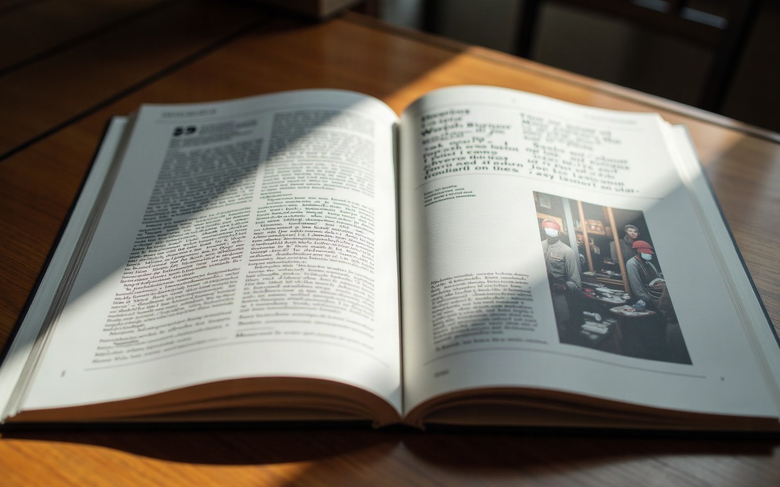
A magazine that treated reading as optional
Ray Gun launched in November 1992, published by Marvin Scott Jarrett in Santa Monica, California. Its subject was alternative music; its real subject, as David Carson's art direction made immediately apparent, was whether a magazine page could operate as pure visual experience, independent of whether anyone read the words.
Carson had come to typography without formal training — he worked first as a professional surfer and teacher — and his indifference to typographic convention showed in every spread. Columns rotated mid-article. Body text was set in typefaces chosen for texture rather than legibility: fonts designed for display at headline sizes were run at nine points across narrow columns. Type overlapped imagery, reversed out of itself, or simply disappeared into the background. The effect was not chaos administered by accident but chaos administered with extreme deliberation.
The band colour did the shelving: orange fiction, green crime, blue biography, decided before the cover was designed.
Photo: Esra Afşar / Pexels
The single most cited incident in Ray Gun's history appeared in 1994: a Bryan Ferry interview set entirely in Zapf Dingbats — the symbol font that replaces alphanumeric characters with arrows, ornaments, and pointing hands. Carson, finding the interview insufficiently interesting to read, replaced it with unreadable glyphs. The editorial content became texture.
This was the argument in operational form: visual interest precedes readability, and a page that fails aesthetically has already failed, however clear its text. The position collided directly with the Swiss-derived grid tradition — the belief, codified by Josef Müller-Brockmann and embedded in corporate publishing, that structure and legibility were moral categories, not merely practical ones.
Carson was not alone in the moment. Grunge typography — the term covering the rough, layered, deliberately impure visual language emerging from Emigré magazine and from designers including Ed Fella — was a recognisable tendency by 1992, documented in the design press and collected in Rudy VanderLans and Zuzana Licko's Emigré publications. Emigré magazine had been publishing experimental type since its 1984 launch, but Ray Gun applied the same impulse to mass-market newsstand distribution, making the argument inescapable.
Carson left Ray Gun in 1995. His work there was collected in The End of Print (1995), published by Laurence King, where the argument was finally stated in a title.