From Scaffolding to Font File
In 2000, GQ magazine commissioned Hoefler & Frere-Jones to design a typeface that felt "masculine" in a specifically American way — neither the geometric purity of Futura nor the corporate neutrality of Helvetica. Jonathan Hoefler and Tobias Frere-Jones answered with a photographic survey of New York City rather than a set of geometric axioms.
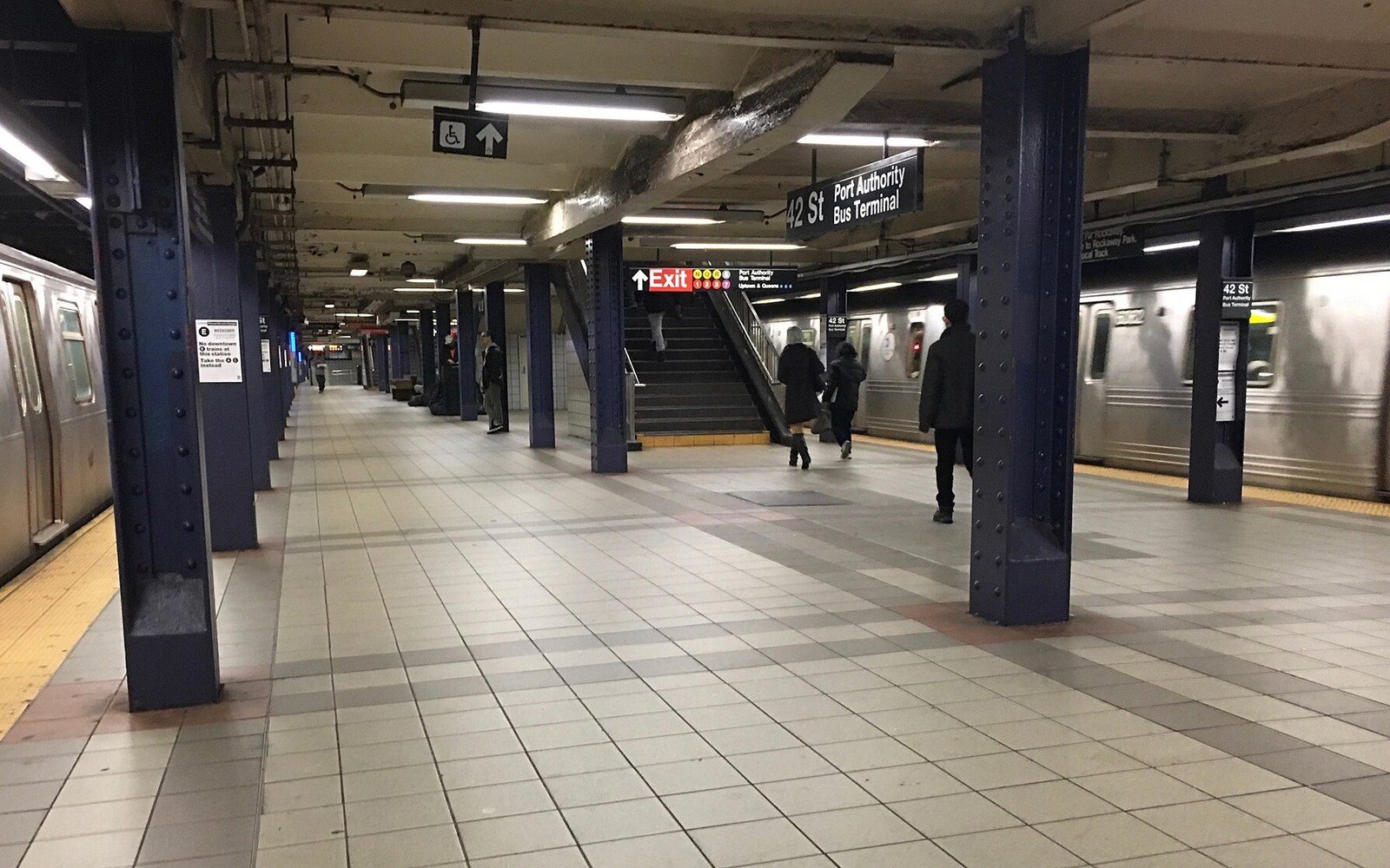
The source material was the hand-lettered and sign-painted sans-serifs that had accreted across mid-century New York — carved into the stone cornices of Port Authority buildings, stencilled onto loading-dock facades, pressed into brass door plaques across lower Manhattan. These letters shared a family resemblance: open apertures, a slightly condensed geometry, proportions that recalled the American gothic tradition without being grotesque in the European sense. They were vernacular marks made by craftsmen following no single system, yet they cohered into something recognisably regional.

Wood type was cut for sizes too large to cast in metal, and sorted by face and size rather than by alphabet.
Photo: Erik Mclean / Pexels
Hoefler and Frere-Jones treated this documentary photography as the equivalent of a type specimen. The drawings that followed rationalised what the camera had recorded — regularising weights, normalising spacing, constructing the full character set that no single building could supply — but the underlying forms were observed, not invented. The result was a typeface whose authority derived from the street rather than from theory. That distinction matters: Gotham is a documented revival from vernacular sources in the same methodological tradition as Jock Kinneir and Margaret Calvert photographing British road signs before drawing Transport.
Released commercially through Hoefler & Frere-Jones in 2002, Gotham expanded into multiple weights and widths over subsequent years. Its most visible deployment came in 2008, when Barack Obama's presidential campaign adopted it as the campaign's primary typeface — a choice that returned a piece of New York's built environment to national attention in a form its original fabricators could never have anticipated.