Acid Typography and the Art of Deliberate Illegibility
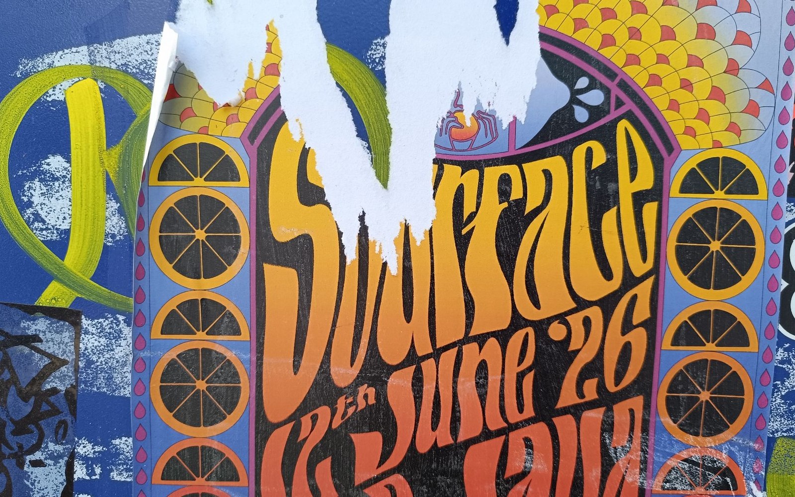
Between 1966 and 1968, a cluster of artists working for Bill Graham's Fillmore Auditorium and the Family Dog collective's Avalon Ballroom in San Francisco produced the most formally radical commercial posters of the twentieth century — and did so on weekly deadlines for rock concerts.
Wes Wilson and Victor Moscoso were the movement's central figures. Wilson, who designed the majority of early Fillmore posters, developed a letterform style in which letters swelled, folded, and crowded together until reading required active decoding. He drew directly from Jugendstil — the German variant of Art Nouveau — and specifically from the lettering traditions of Alfred Roller and the Vienna Secession, where type had already been treated as ornamental mass rather than transparent vehicle. Moscoso, who had trained under Josef Albers at Yale, applied Albers's colour theory with deliberate aggression: he paired hues of near-identical luminosity so that the boundary between letter and ground vibrated optically. This was simultaneous contrast weaponised — the eye cannot resolve the edge, and the image seems to pulse.
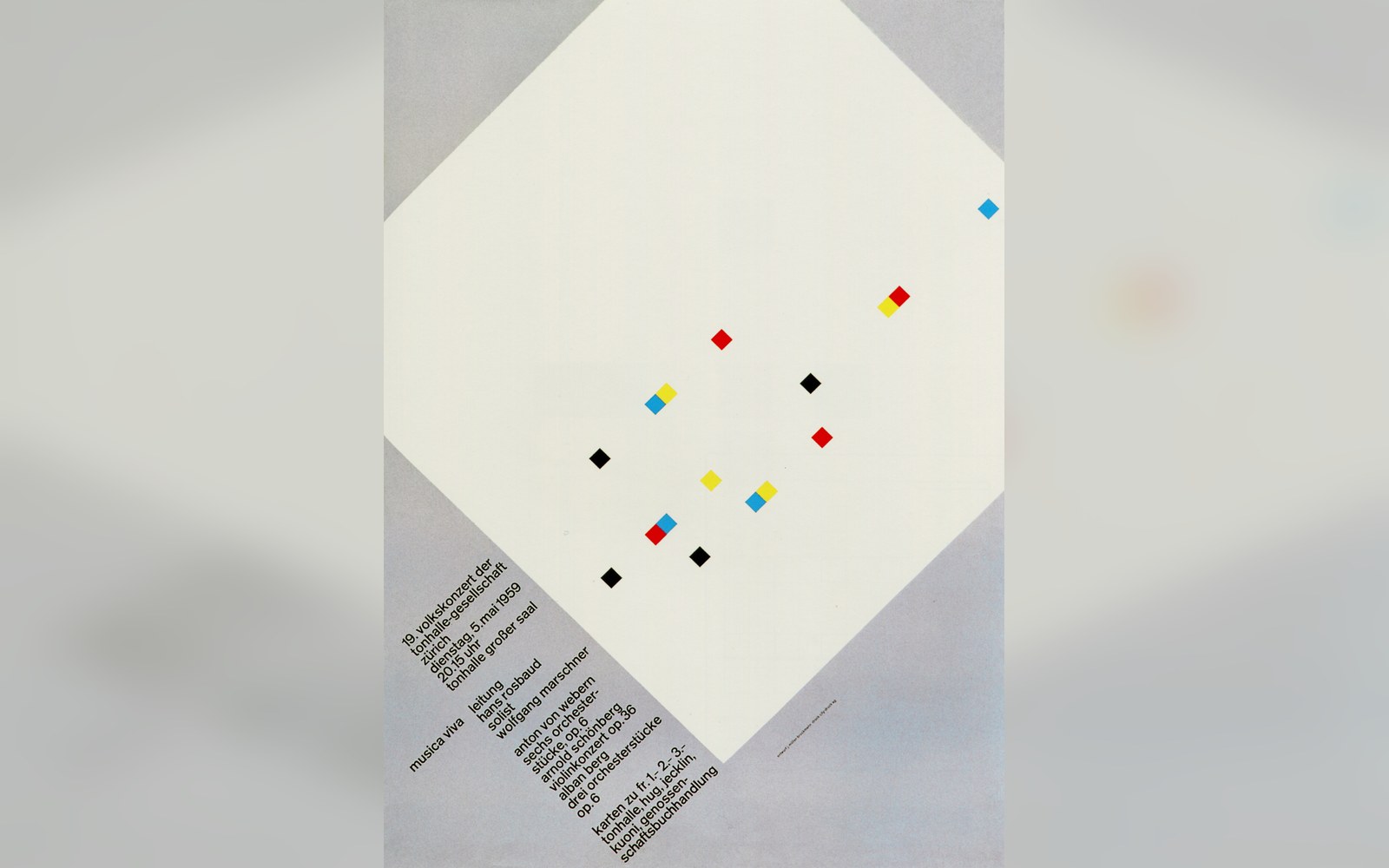
The Zurich concert posters were printed to one format and pasted in runs, so the grid had to hold at a glance.
Photo: Musica Viva. Müller-Brockmann · Wikimedia Commons
The printed sources were specific. Aubrey Beardsley's high-contrast black-and-white illustration, in wide circulation through paperback reprints of the 1960s, supplied the sinuous figure drawing and the ornamental density. Jugendstil poster artists, particularly those published in the Munich magazine Jugend (founded 1896), contributed the sense that letterforms and image could occupy a single decorative field without hierarchy. What the San Francisco artists added was colour lithography at psychedelic intensity, and a content — the countercultural concert — that made illegibility ideologically appropriate.
The posters were offset-printed, typically in five or six colours, and distributed as functional bills for specific events. Their ephemeral purpose did not prevent collection: by 1967, the Fillmore posters were being sold as art objects in their own right, and museums began acquiring them within the decade.
The movement compressed itself tightly. By 1969, the style had been absorbed into mainstream commercial graphics, and its original illegibility was being smoothed into readable pastiche. The two-year window — 1966 to 1968 — represents the moment before that assimilation, when swelling letters and vibrating colour were still a position, not a period style.