Against the Grid
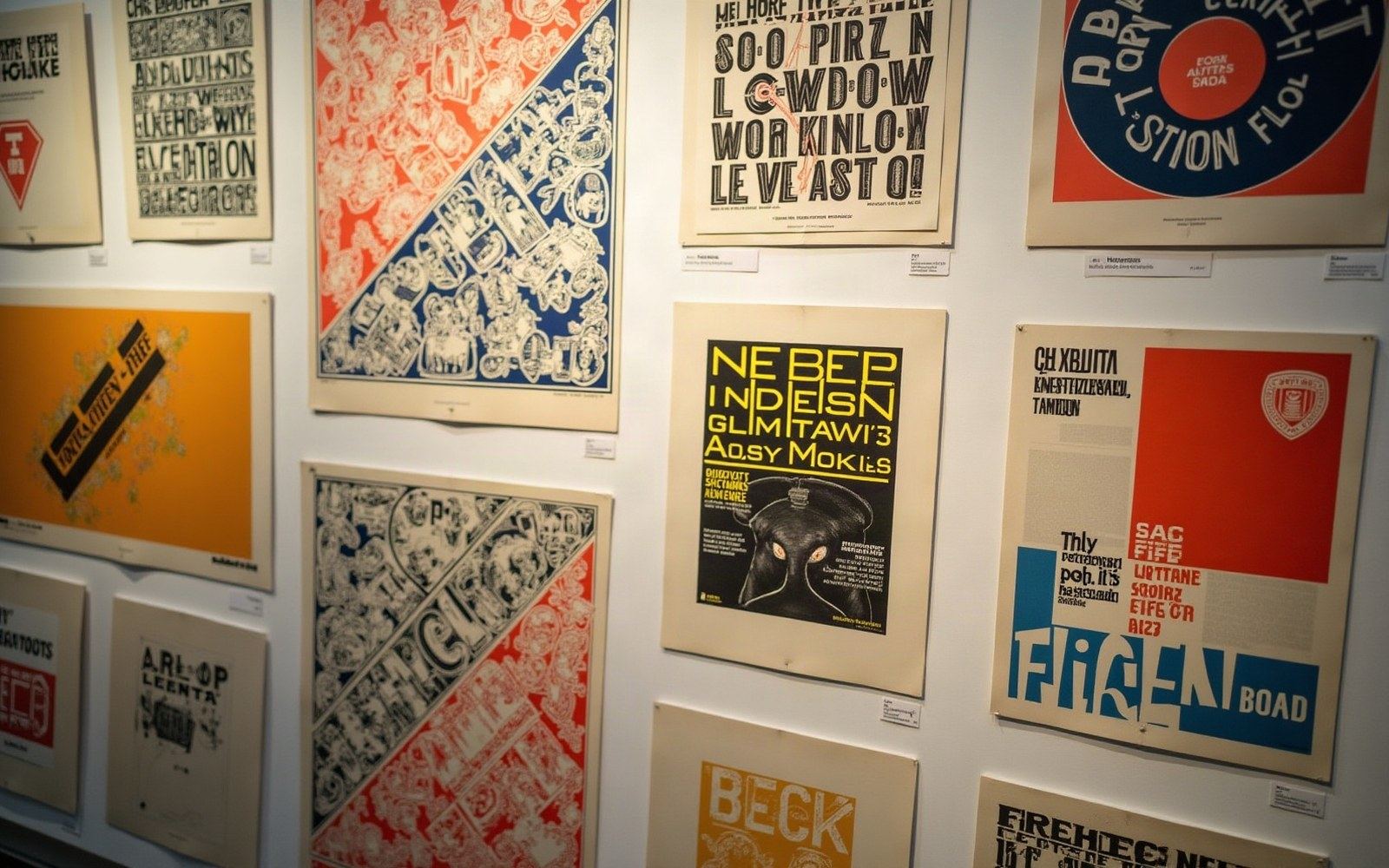
Milton Glaser and Seymour Chwast founded Push Pin Studios in New York City in 1954, the same decade that Josef Müller-Brockmann was systematising the grid poster in Zurich and the International Style was hardening into orthodoxy. Where the Swiss stripped typography to its structural minimum — sans-serif, asymmetric, photographically objective — Push Pin went the other way. Victorian woodtype, Art Nouveau tendrils, comic-book colour, hand-lettering, and deliberate historical pastiche all appeared without apology on work coming out of their Manhattan studio.
The studio's primary publication, the Push Pin Monthly Graphic (later Push Pin Graphic), issued from 1957 onward, served as both portfolio and manifesto. Each issue took a historical period or visual style as its theme — circuses, the 1890s, almanac typography — and reproduced it with enough wit and formal intelligence to make the exercise something other than nostalgia. Design historians treat the Graphic as a document of a counter-current that the decade's dominant discourse largely ignored.
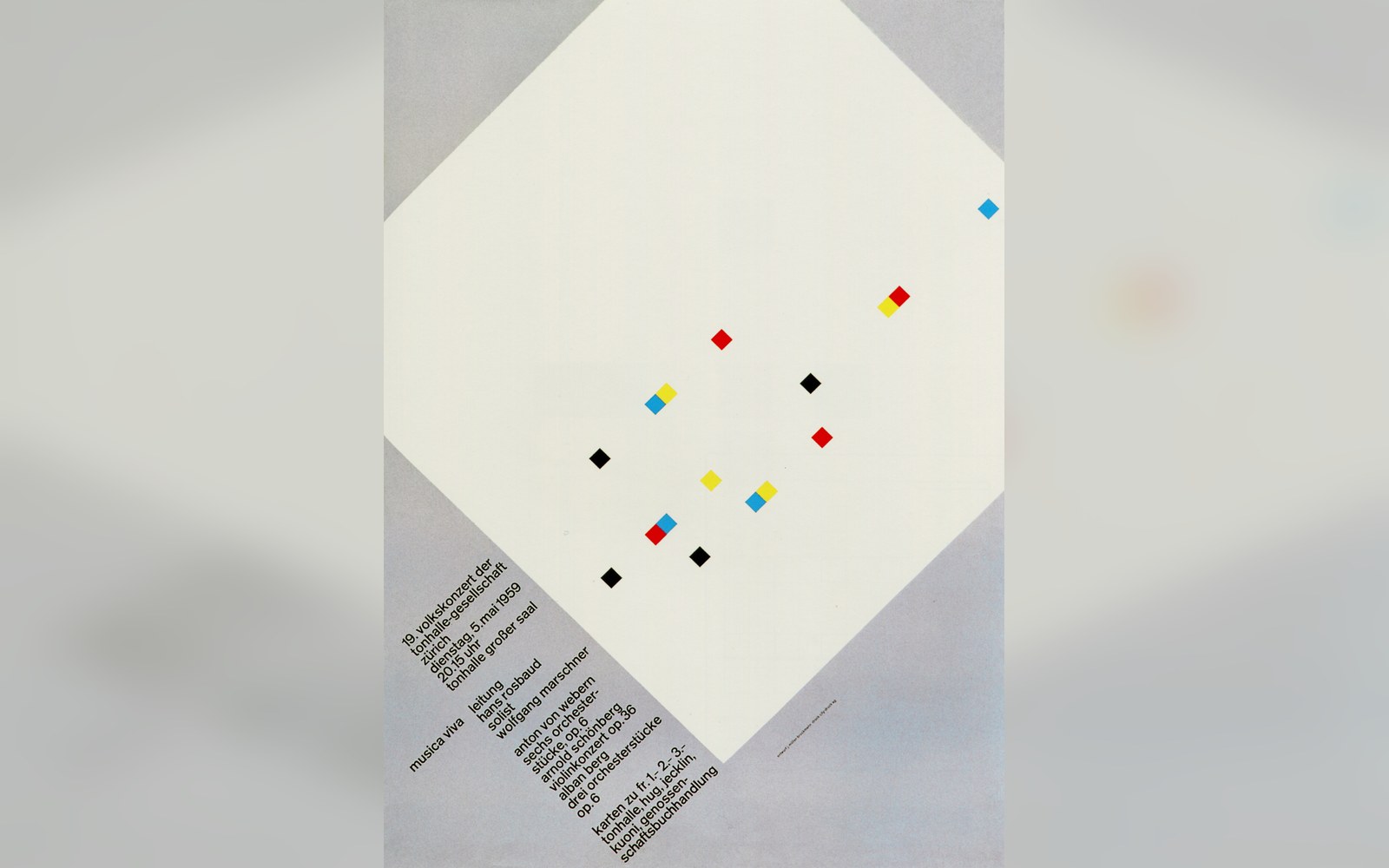
The Zurich concert posters were printed to one format and pasted in runs, so the grid had to hold at a glance.
Photo: Musica Viva. Müller-Brockmann · Wikimedia Commons
Chwast's poster work is saturated with the specific vocabulary the Swiss were banishing: decorative borders, mixed typefaces, illustrated letterforms, and a palette drawn from chromolithography rather than from the Bauhaus. His 1967 anti-war poster End Bad Breath appropriated Uncle Sam's pointing finger and redirected it as satire, using the visual language of nineteenth-century advertising to undercut patriotic iconography. Glaser, meanwhile, produced his 1977 I ♥ NY mark and the widely reproduced 1966 Bob Dylan poster — the latter drawing on a Marcel Duchamp silhouette and Art Nouveau hair-patterning — before either became the cultural wallpaper it is today.
The studio's position was a form of pluralism before pluralism had a name in design. Push Pin argued, through sheer output rather than through any written polemic, that graphic design history was a resource to be plundered and reassembled, not a linear progress toward rationalist clarity. That argument grew louder through the 1960s and found institutional recognition in a 1970 exhibition at the Musée des Arts Décoratifs in Paris, which brought the studio's work to an audience that had been living under the sign of Helvetica.